I have just set up my new Substack page: please visit and subscribe, it is free, there is no paywall and it is available for comments or discussions either on the post or in the pages.
I have chosen this painting as the emblem for the site .
The painting is held in a private collection. Oil on canvas 56.2 x 100.5 cm. c. 1892.
Best known for his vivid landscape paintings especially images in and around Sydney Harbour, Streeton was also a skilled genre artist. The painting above seems to have disappeared from public recognition, as it does not conform to the normative narrative about Streeton’s paintings. The way paintings exist in the public sphere, and then disappear from it, is one means by which art can become fugitive. Artists also think about fugitive colors, a well-established problem in oil-painting. Many well-loved colors used by artists over the years are fugitive: that is, they appear rich and strong when first painted, but over time and in unstable conditions they can lose definition and fade away.
Much art-writing is like this: our responses to art change so much, both personally and in terms of the Zeitgeist. A new generation is re-discovering forgotten art, sometimes bringing back genres and styles long considered old-fashioned and discredited. Here is a place for people who love and appreciate painting, who engage with art history and think about technique, to express their understandings. Neglected artists and art-styles, the commercial practice and presentation of art, appreciation and critique find a home here.
My Substack site is dedicated to recovering the fugitive in art, revealing the obscured, refinding the rejected and appreciating some of the strands of thought, mind and materiality which go to make up the world of painting.
It’s been a long time between posts on this site and I want to apologise. I have been increasingly absorbed by the experience of painting. My own painting has been moving in difficult directions and has raised all kinds of issues about art itself and the value of “doing it” as against just looking at it, or writing about it. I hope to take this up this up more in future posts. I have also neglected the still undeveloped site at annettehamiltonartist.com which has lain idle in the welter of activities. I have been fortunate to attend a number of classes and workshops with great old-school painters and I have continued work mainly on landscapes focussed on the Seven Valleys of the sandstone mountains. More or less at the same time I have gone back to my paintings based on the desert interior around Broken Hill.
My art site is being updated now, visit there for more of these works and recent reflections on painting.
Stunning light in the Megalong Valley: working on an oil of this scene
The Last of the Bitumen: Mundi Mundi, near Silverton: trying this one in acrylic
John Wilson’s stunning oil of road and trees in the Capertee Valley: I attended his workshop at this site in February 2021
My version of the same scene after rain: so much was wrong with it!
BY THE WAY: (Some self-promotion)As many of you know I have been pursuing my writing “career” over the past several years. Visit my writing site for further information and updates: annette-hamilton.com
My new collection of short stories, Revolutionary Baby, has appeared. It is available online from any e-book supplier for any device (Kindle, Kobo, Apple, Nook).
The paperback version was published in early August, and is now available for order from Amazon or other online retailers. Or, visit your local bookshop and put in an order. If it isn’t listed at your local library, ask them to purchase a copy, it is listed for Australian library purchases via Ingram Spark.
For more about the writing side of things visit my writing site annette-hamilton.com
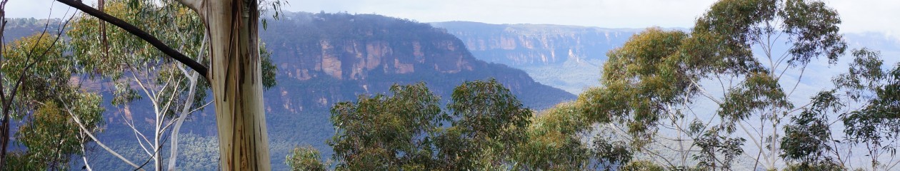
The banner headline above this post is from a remarkable watercolour of the Capertee Valley by Conrad Martens. So many artists have been fascinated by this remarkable place with its strange landforms and brilliant light. I will write more about Marten’s painting in another post.
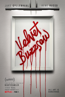
Toni Collette comes to a gory but artistic end in Velvet Buzzsaw
I love movies about art and artists. There never seem to be enough of them. I know they are often cheesy and the art is fake and the stories are inaccurate or overblown or just plain wrong, but it’s so rare to be able to enter the world of art at a visual level apart from going to galleries or looking at pictures online. Even the good movies can be hard to come by: they often have short releases and disappear completely unless you are old school and collect DVDs.
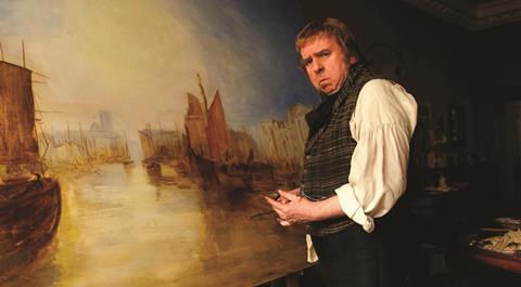
Mostly they are biopics. A recent unexpected hit was Mr Turner (2015), an interesting attempt to explore the art through the strangeness of the man.
Was Turner really such a sourpuss?
Other titles since 2000 include Frida (2002), Modigliani (2004), El Greco (2007), Shirley (2007), an attempt to bring to literal narrative some of Edward Hopper’s paintings. Probably the most famous movies (and books) are those about Vincent van Gogh, including the recent At Eternity’s Gate, with Daniel Defoe in the role (2018). Haven’t seen it yet, but no doubt will do so soon (and write a review).
Velvet Buzzsaw is something completely different. It is a kind of horror film, a kind of parody, a kind of postmodern fantasy and a trenchant critique of the excesses of today’s art world. A remarkable cast includes Toni Collette styled after a famous (real) museum director, Jake Gyllenhal as the awful but powerful art critic Morf and Rene Russo as the art dealer. It is also a great outing for British actor Zawe Ashton, playing Josephina, the only likeable character in the ménage.
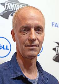
The Variety reviewer calls it “a tarted-up throwback to a certain kind of trashy ‘70s horror movie”. As a dedicated fan of trashy 70s movies, I disagree. While writer-director Dan Gilroy uses some of the tropes and gestures of that genre, he is also offering more than cheap thrills. Just as his creepy and unforgettable film Nightcrawler forced us to focus on what it means to “get the picture” (in that case, video footage of ultra-violent late night events in Los Angeles) VelvetBuzzsaw insists on the bizarre linkage between art, consumption and the ultra-wealthy elites who circulate and control the market in art and who destroy art (and truth) in the process.
Director Dan Gilroy: he doesn’t look happy either.
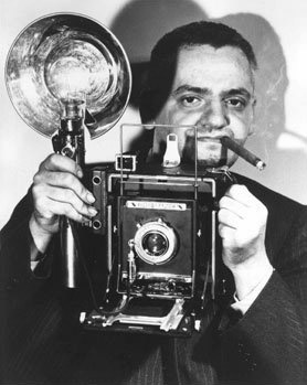
It is interesting that Gilroy originally wanted to make a film about Weegee, a crime photographer in New York in the 1930s.
Weegee was known as “The Father of Crime Scene Photography” and after being considered a weird outsider for decades he is now being recognized for his major innovations in photography, documentary and journalism. What he has in common with Gilroy is that he shows the kind of horror which everyone wants to see – a desire they can’t admit to. This would have made a fine follow-on from Nightcrawler but the logistics of recreating the era which calls for a brutalist noir approach would have been difficult and the result might have been too much altogether for the contemporary movie audience.
What matters to me in Gilroy’s work to date is that he is exploring the consumption of images, art, photography and the unconscious. He is tracking something about the hidden (or not-so-hidden) truths behind the emergent forces created by contemporary excess-capitalism. Art and media representation collide along a continuum of cruelty and inequality. The viewers want the gore: the super-saturated world of elite wealth and good taste masks a limitless violence against art in its deepest meaning. Although elements of the film jarred somewhat and the idea of a dead artist’s works having a kind of demonic intention is a bit OTT, see the film for its inventive depictions and wonder how much further the art world can go with its exuberant destruction of the concept of value and its embrace of very expensive cheap thrills. For Netflix fans, Velvet Buzzsaw is streaming now (February 2019).
Film Still used to advertise Never Look Away, 2019 release in the US
Gerhard Richter is the towering figure of contemporary European art. You’d never know it in Australia though. Apart from the brave retrospective at the GOMA in Brisbane (October 2017-February 2018) Richter’s art and reputation barely registers here. One can speculate about the reasons: his early art was weird (he painted full-scale black and white oils which were blurry copies of old photographs), his landscapes were almost abstracts and then when he started painting abstracts they looked like landscapes) but quite apart from the art, he has never comported himself like a suitably glamorous and dramatic/exotic figure and of course there is the contemporary sticking point, he is an old white male and a German at that.
Richter was born in 1932 and spent his boyhood in obscure Lower Silesia, now Bogatynia, Poland, and in the Lusitian countryside. The family moved to Dresden where his father, a teacher, struggled under the emerging Nazi education system. He was forced finally to join the Nazi party. Gerhard aged 10 was conscripted into the Hitler Youth but was too young to be an official member. Somehow the worst effects of the war passed the family by, and Gerhard was able to study at the Dresden Academy of Fine Arts, where his first application was rejected because his work was too “bourgeois”. Now he was living under the DDR, but managed to escape to the West two months before the building of the Berlin wall.
So, an early life under the shadow of the Nazis and the Commies, then freedom in the West and a dazzlingly successful career in art. So has gone the accepted story. Richter has been extremely protective of his privacy and although he has given many interviews and written his own books (wonderfully stimulating books) he has never strutted the stage as the kind of glamour boy which the art world so adores. He hasn’t been a drug addict or murdered anybody and he has nurtured his reputation by judicious management and with a quiet sincerity which is so against the grain these days.
Perhaps this reticence has aided his growing reputation. As the international art scene became big business in the new millennium a strange phenomenon occurred: the older and quieter Richter became, the greater and greater were the sums being paid for his work. Richter has become beyond collectible. In 2012 one of his Abstraktes Bilde set an auction record for a living artist at $34 million US. In 2013 his 1968 piece, Domplatz, Mailand sold for $37.1 million and in 2015 another Abstraktes Bild sold for $44.52 million.
Richter himself has watched this bizarre development with no little distress. These staggering prices do not go to him, of course, but to whoever had the foresight to buy his work earlier. He has described the situation as “absurd” and “daft” in 2011.
As this huge and unstoppable process continues, he has been saying less and less about it.
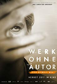
But now everything has changed. In this age of self-curation and self-revelation, everyone has to have a narrative and they have to share it with the world and if it contains a lot of bad stuff so much the better. For some unknown reason Richter permitted famous German film director and Oscar winner Florian Henckel von Donnersmarck (The Lives of Others, 2006) into his life and thoughts. For weeks they met and Donnersmarck recorded candid conversations with Richter about his life, on the understanding that the resulting screenplay would be “fictionalized”. The film, titled in German Werk Ohne Autor (Work WithoutAuthor) was released in Germany in 2017 and while its central character is not called Gerhard Richter and none of his actual paintings are shown (one of his assistants was hired to paint pictures like them for the movie) everyone is referring to it as the biopic about Richter. Now it is about to be released in the US, although at this date (January 2019) there has been no release planned for the UK or Australia.
Director Donnersmarck, 2018
What did he imagine would happen? Perhaps it speaks to the naivety of an older person about the operations of the new technologies of knowing (of knowing everything about everybody all the time whether they like it or not) or perhaps he trusted Donnersmarck as a fellow-artist. But the resulting film has resulted in a scandal of a horrible kind. No, it’s not allegations of sexual impropriety or dirty secrets, it’s somehow worse than that.
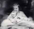
It turns out that between 1937 and 1967, while Richter was consolidating his art practice and developing his early career in East Germany he was benefiting from the support and patronage of his first wife’s father, a former Nazi officer who worked in the euthanasia program. One of Richter’s most famous early monochrome blurred photo-paintings “Aunt Marianne” is based on an image of his aunt, who was herself captured, sterilized and executed as part of the euthanasia program.
Tante Marianne, 1965: Oil on canvas 100 x 115 cm
Richter is very angry and upset about these revelations. He rightly judges that the fictionalization will become the truth. He has repudiated both film and director, although Donnersmarck says he hasn’t even seen the film yet, only the trailer. Never Look Away has been nominated for an Oscar and for the Golden Globes, and will be released in the US shortly, so everyone will be seeing it soon.
Donnersmarck’s film is an act of provocation, both to the art world itself and to the continuing German reluctance, or refusal, to face up to the realities of the twentieth century past. More and more films focusing on this issue have been emerging lately, and this can be seen as just another in the series. By putting this world-famous artist’s story, even in disguise, at the centre of an ethical demand it creates a compelling focus for the kind of coming-to-terms with the past which every Western nation needs to undertake. The role of art in collective self-recognition, and its role in the revelation of trauma under the unfolding of historical events, has never been more compelling. In a way Donnersmarck’s films make the psychoanalytic demand: live in the register of Truth!
Has Richter’s famous privacy been an effort to cover up or disguise his entanglements with German history? If so, why has he made these revelations to a film director famous for his work in disrobing historical disguises? Did he really think such a film would not be “about” him? Or is there some inner compulsion at work, where his own reality is demanding a release? In some ways the whole situation reminds me of what happened when Martin Heidegger’s “Black Notebooks” were published recently. Right-wing critics and philosophical conservatives went through them line by line, trumpeting “See we told you all along he was a Nazi” as if this disproves the validity of his writing and hence the whole of contemporary leftist philosophy.
Is this about to happen to Richter and the “value” of his art? Or will it only make it more valuable?
But there are more profound questions here. Is everybody always responsible for decisions they made in the distant past when everything was different including the meaning of behavior? Was Richter wrong not to denounce his wife’s father? How much did he in reality accept from her family, to what extent is his present success the result of these murky antecedents? Has his whole life been a kind of cover-up? And isn’t everybody’s?
Poster advertisement for the German release
In the poster for the German film (above) we are confronted with a beautiful young man who seems to be hiding behind his own blurry hands. This is the director’s message, perhaps. I haven’t seen the film and I look forward to it. At over three hours long it probably won’t receive a release in Australia but who knows, maybe SBS will get some cojones after the next election and go back to its original mandate.
READERS PLEASE NOTE: IN THE ORIGINAL VERSION OF THIS BLOG POST I INCLUDED IMAGES OF THE RICHARD PRINCE PHOTOGRAPHS AT THE CENTRE OF THE CASE. These are widely published and included in many discussions of the appropriation issue. However, the images were all removed from the post. I find it very interesting that it is not possible to discuss the issue using the examples of the images which caused the problem in the first place.
In the discussion which follows, a small icon appears at the points where I reproduced the images, with a brief reference attached. However the icon does not lead to anything. The use of these images should be regarded as Fair Dealing for the purposes of review and analysis – see the discussion below. However … if you want to know more about what Prince actually did, you’ll have to search through the many online images which are freely available, though many are without context or explanatory discussion. For reproduction of the main images at issue go to: https://hyperallergic.com/107150/the-art-of-art-lawsuits/
—————————————————————————————–
Appropriation art takes a piece of existing art work, borrows and transforms it. The end product is obviously not a copy, since the purpose of the artist is to create something new and notably different. No-one would mistake the new piece for the original although it will be obvious what it is. All those famous comic pictures of the Mona Lisa with a moustache, or in disguise, are a commonplace example. How far can appropriation art go and still stay within the boundaries of the law? This question has been tested recently especially with regard to the works of Richard Prince.
In US copyright law a Fair Use test exists to determine the legitimate re-use of someone else’s works including photographic works. It consists of a number of elements which singly or in combination can give protection to someone wishing to re-use another’s work.
There are four factors in the test. Only a Federal Court judge can give a definitive answer on whether a particular use meets that test. The four factors are:
The purpose and character of the use
The nature of the copyrighted work
The amount and substantiality of the portion taken
In 2000 French photographer Patrick Cariou published a book, Yes Rasta (Powerhouse) about the lives of Rastafarians. His striking photographs were the main element of the book.
Portrait, from “Yes Rasta”. Republished in the NY Times, from Cariou’s blog.
In 2008 artist Richard Prince created a series of 30 art works which were based on Cariou’s paintings for a show, “Canal Zone”, at New York’s prestigious Gargosian Gallery. In 2009 Cariou brought a copyright infringement suit against Prince, his gallerist and the publisher of the exhibition catalogue. In March 2011 US District Judge Deborah Batts ruled against Prince and ordered the defendants to destroy remaining copies of the catalogue and the unsold paintings which were closely based on Cariou’s photographs.
Cariou’s original photograph at left; Prince’s modification at right.
The decision was overturned on appeal in 2013, except for five paintings which were referred for further evaluation of claims of Fair Use.
The argument in favour of Prince was supported by the Andy Warhol Foundation for the Visual Arts. Along with the Robert Rauschenberg Foundation they argued that the intellectual content and aesthetic meaning of a work of art is not always visible outside of art-historical context. The court decided that the case would depend on whether or not a reasonable observer would find Prince’s works to have been transformative, and thus protected under Fair Use. Because the case for the five paintings was settled out of court there was no legal ruling on them which has been seen as a loss for those seeking clarity in the operation of the law with regard to appropriation art.
In the latest copyright suit against Prince, photographer Donald Graham has claimed that Prince used a photograph of a Rastafarian which he took. The photograph was used in Prince’s 2014 Gargosian exhibition “New Portraits” which present prints of other people’s Instagram posts with comments.
Grahamn’s original at left: Prince’s version at rightPart of Prince’s “New Portraints” exhibition: the Graham photograph in context.
This case differs from Cariou’s in several respects. In terms of the fourth element, the market infringement test, Cariou had made no fine art prints of his work and had not exhibited them as prints. But in the Graham case, the photographer has ONLY sold his work as prints and has never licenced the copyrighted photograph or made it available for any commercial purpose other than sale to fine art collectors. Another element of Fair Use relates to whether or not it has been used for commentary. In the present case the new photographs may be thought to be commenting on the way social media is intersecting with photography.
Another factor is the amount of copyrighted work taken. In this case, the photograph uses almost all of Graham’s image. There is a change in the framing and presentation. Moreover, the image, and the others appropriated for the show, is a striking and compelling image. It is not just the random snappings of amateurs.
However others disagree. Conceptual and appropriation art cannot be judged only on its formal and aesthetic qualities. One NYU law professor says it is “the art-law equivalent of Zombie Formalism”.
The rise and rise of Zombie Formalism – or is it just The Blur?
[Zombie Formalism is a new art movement based on the long discarded principles of Clement Greenberg. For a discussion see an upcoming post].
Also the market test is different because Graham has a track record as a fine art and commercial photographer and makes his living from those photographic activities. If the court finds in favour of Prince, it profoundly affects the concept of copyright in photography and maybe other forms of art.
CONCLUSION: Appropriation art has increased in the Fine Art field at a rapid pace in recent years. Cases such as those of Richard Prince described above serve to highlight the extremely uncertain situation of current copyright law and tests of Fair Use. The fact that each nation has its own Copyright law makes it even more complicated when cross-national jurisdictions must decide what is legal and what is not and even then cannot necessarily impose any penalties.
UPDATE: I am doing some research at present regarding the Australian law regarding the use of others’ photographs/paintings in fine art. This is a difficult issue given the increasing popularity of original paintings referencing other Australian artists and their work. It is estimated that there are hundreds (or more) of such paintings now in circulation in the secondary market. Some of these may be deliberate fakes, but others are works done using the styles and techniques of well-know contemporary artists. The question of what constitutes a “copy” is very unclear.
Recently a Victorian court quashed the conviction of two painters who were said to have created imitation Brett Whiteleys, for instance.
In reproducing an image of this allegedly “fake” painting here, without permission, I may also be offending against copyright law. If the painting in question is indeed a deliberate fake, is it nonetheless covered by existing copyright law?
Big Blue, Lavender Bay: Allegedly a fake Brett Whitely painting, but a court cleared the painter and the dealer in 2017.
Gerhard Richter: Portrait by Lothar Wolleh. Wikimedia Commons.
More thoughts on the Germans. Gerhard Richter is by far the leader in the top ten most expensive living German artists. But even leaving Richter aside, German art, particularly painting, is experiencing a dramatic upsurge in popularity among international collectors. Alexander Forbes writing for Artnet News in April 2014 reported that the power of German art in the market has actually increased since the 2008 recession. There is no sign of it slowing down. Richter himself believes the market for art generally, and for his own art in particular, has gone crazy. Richter criticizes the art market.
Forbes suggests that German art’s penchant for “stringent conceptualism and a highly art historical approach likely proves a safe bet for value retention regardless of economic conditions.
I want to hold that idea. It suggests that art which reflects both conceptual thought – a philosophical element – as well as an embedded engagement with history is likely to hold its value best. On this analysis the German art market is likely to continue to ever higher peaks.
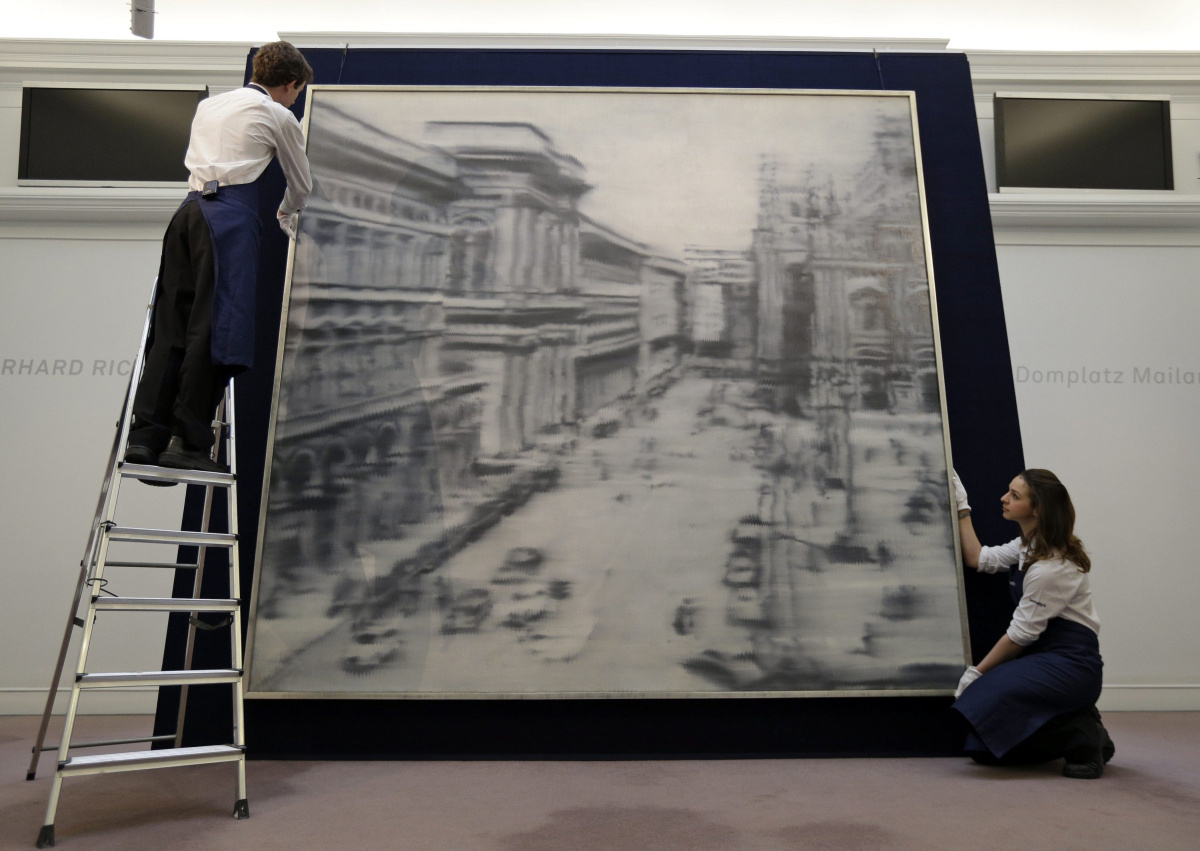
Richter’s mysterious Domplatz, Mailand (Cathedral Square, Milan) painted in 1968 during the height of his blurred monochrome period sold recently for $37,125,000 at Sotheby’s 2013 contemporary art sale. His paintings hold the first 53 places on the top achieving auction sales of German art, 33 achieving over $10 million.
Auction house employees pose for the photographers in front of a 1968 oil on canvas painting by artist Gerhard Richter, entitled: ‘Domplatz, Mailand’ (Cathedral Square, Milan), in central London, Friday, April 12, 2013. (AP Photo/Lefteris Pitarakis)
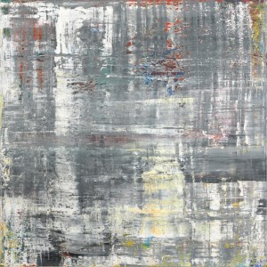
The range of Richter’s work is astonishing. Probably best known for his “blurred monochromes” of the 1960s, his abstract works have also taken on a special aura of mystery, seeming to move away from figuration and narrative completely. You really need to read Richter’s own writings (which are extensive) to get an idea of what he is thinking in this strand of his work, which seemingly just gets better and better. Cage 5, 2006, (below) is a vastly large oil painting reflecting back on his early vision, yet imbued with endless hints and depths of experience which could be landscape or water-surface or a close-up of a lot of brushstrokes – something he also explored in the 1980s. But he invites us to think of a cage, and that opens up a whole different set of associations.
Gerhardt Richter Cage 5, 2006
The sheer scale of Richter’s work is entrancing, but so is the sense of our shared collective history, that mid-twentieth century Europe with its horrors and excesses which he opens up to us from the 1960s on. Neo Rauch, my second favourite German artist, does the same, although it a totally different way. You can read my academic article on Neo Rauch here.Neo Rauch Post Socialist Vision, Collective Memories
It is overwhelming in so many ways to enter the Richterian world. Fortunately it is also easy, as Richter’s own website is an absolute miracle of clarity, order and revelation. You can find (almost) anything he has ever done there, complete with full references, links to written and audio discussions and interviews, the ability to zoom in onto details, and the complete presentation of his Atlas project, which really is no more than a full record of every image he has collected (or photographed) in his life. Explore the miracle of Richter’s work here.
Unbelievably there is almost nothing of Richter’s art in pubic collections in Australia. The AGNSW at least made some effort and holds three items, a painted monochrome sphere from 1989, a photograph from 1967, and his strange version of a nude descending a staircase, titled Ema, from 1992.
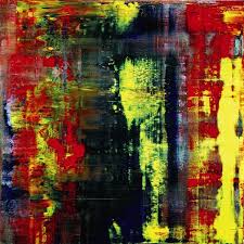
The Art Gallery of South Australia holds one of his luminous abstracts (Abstraktes Bild) from 1977 (Catalogue Raisonne: 424). * (Eric Clapton sold another in the Abstraktes Bild series for 21.3 million British pounds in 2013). One of Richter’s finest 1990’s abstracts CR:752-3, 1990, 225 x 200cm) is held in the National Gallery of Victoria in Melbourne, purchased with corporate funding assistance from Westpac Bank, and the NGA in 2003 purchased Juno, oil on canvas 300 x 250 (NGA 2004.2).Richter’s 1995 Abstract at the NGV
Sold by Eric Clapton: Abstraktes Bild at Sotheby’s for 21.3 million
Gerhard Richter’s work is now so valuable that there will be little or no opportunity to ever acquire it in Australia. Should public collections in Australia be more open to contemporary work from outside Australia? Why German artists, and not those from Romania, Holland, or wherever? Should we just focus on local art and artists and make a kind of nationalist stand? This might be a valid position but when you consider the extent of Australian gallery holdings of recent American and UK artists you just cannot help but conclude that the good old neo-colonial world order underpins every level of public culture, including public art. Sensible use of public assets or parochialism and subservience to a highly limited Anglophone culture sphere?
*Strangely though this rare work hardly features on the Gallery’s site. No image of it is available there. It has been shown only once in public as part of the exhibition “Making Nature: Masters of Early European Landscape Art” (June-September 2009). Why it was included in that collection is a mystery as Richter can hardly be considered “early” and this painting is very far from one of his landscapes. An image of it is available on Richter’s website – just click on the “Abstracts” collection with the CR number 424.
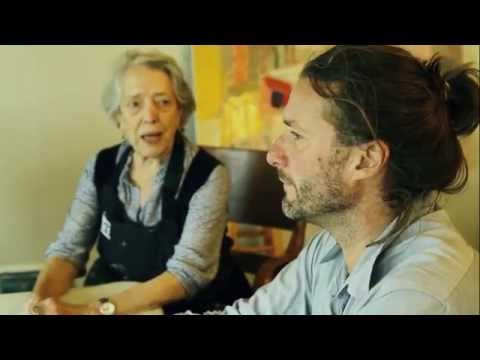
Was so delighted to see the ABC interview with Elisabeth recently. She expresses herself vividly on camera and you get to see a little more of her beautiful bush studio and workspace, and of the bush around which so invigorates her perceptions. The interview was prompted by her participation in the Destination Sydney three-gallery exhibit meant to showcase Sydney and its surrounds. Does this mean she is now officially “discovered”? (Or is this, as she would say, a ridiculous concept?)
The link is here – in an earlier version of this post I used an outdated link, sorry, and thanks to Cultural Conversations for the correction.
And if you go to Youtube, there are some great interview segments with Elisabeth, as well as one with her and Luke Sciberras.
She is showing at Manly Art Gallery and Museum, along with Brett Whitely and Lloyd Rees – stellar! – but the show finishes soon (February 14th) so if you are a Sydney local and a big fan better get there soon.
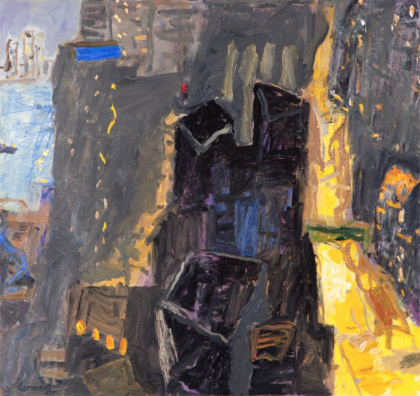
I think this is actually a picture of Darwin Harbour but the feeling could be Sydney.
Not long ago I wrote an appreciation of Elisabeth Cummings here (see Elisabeth Cummings: Slow Art, March 24th 2014). The theme of the piece echoed comments by art critic John McDonald, who has repeatedly championed Elisabeth’s work and expressed dismay at its failure to receive the acknowledgment it deserves. He expressed astonishment that her work had not been included in the NGA show of 200 years of Australian landscape painting headed for London in 2013 (SMH, January 21 2012). She had also been excluded from the Wynne Prize more than once, although that was not the case in 2013 when her Sunrise, theKimberley out-glowed everything else on the walls, although it did not win. Imants Tiller’s Namatjira was a puzzling although not unworthy choice.
Elisabeth Cummings. Sunrise, Kimberley. Oil on canvas, 175 x 300 cm.
When I sent my 2014 post to Elisabeth, a personal friend for decades, she protested mildly at my emphasis on the scandalous lack of critical recognition and my reference to her being “overlooked”. She was right to do so. If certain precious art-world critics and habitues had nothing to say about an older woman landscape artist … Excuse me? A what? … many others especially collectors have no doubt about her worth. Her paintings (and prints) sell reliably from her long-time gallery (King on William) at show after show, some at astronomical prices for a living artist.
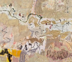
Over the past couple of years a new appreciation of her work has become widespread. By late 2015 you could hardly move in fine art circles in Sydney without someone mentioning her name. She was being described as “Australia’s greatest living female landscape artist”. At a lively discussion around Luke Sciberras’ Hill End diner table in October the question was raised whether or not the “female” descriptor could be omitted. Hmmm. Luke, her semi-protege, who could reasonably think the title should be his, didn’t know how to respond. This year she and Luke collaborated on a stunning show in Hong Kong, responding to that spectacular Asian city with the same kind of delicacy and intelligence as she had long shown for remote Australia’s dry creek-beds and scrubby sandhills.
From on High 2015. Oil on canvas 91 x 86 cm
Such a tragedy that this exhibition will never be seen in Australia! Most of the pieces have been snapped up by private collectors and will rarely if ever emerge again in their lifetimes.(“Flying Goose Hill” at the Nock Art Foundation, Hong Kong, October 17 – November 14)
Elisabeth and Luke being interviewed for the Hong Kong show, 2015.
Now she is named alongside John Olsen among Australia’s greatest living artists, along with Cressida Campbell, Peter Kingston and Kevin Connor. The summer exhibition (Mosman, Manly and S.H Ervin galleries), offers 140 paintings and drawings celebrating Sydney as a source of artistic inspiration. The SMH arts and books writer Linda Morris hails the group as the living successors of Brett Whitely, Lloyd Rees, Grace Cossington Smith and Margaret Preston.
Both Connor and Kingston have had recent major exhibitions in Sydney while Cummings’ current King on William show ( until 19th December) was an astonishing record of recent work and almost sold out by the opening night.
Stemmed Flow 2015. Oil on canvas 115 x 130 cm
It is so wonderful to see Elisabeth moving to this level of recognition. She has been utterly consistent in her vision and commitment over her entire career as an artist but the development of her work has been powerful beyond expectation over the past ten or so years. She shuns fame and all the hoop-la but we should be so grateful for everything she has offered not to mention what is yet to come.
Ryan Hoffmann: Liverpool St Gallery Sydney 11th August – 3rd September
Ryan Hoffmann is a young artist from Sydney’s National Art School, one among few to have been given a solo show in a reputable gallery while completing his Masters of Fine Arts degree.
There has been a buzz around Hoffmann for some time, and this show gives him an opportunity to demonstrate why. It doesn’t entirely succeed although the concept is great. But the “hang” and the lack of documentation are a problem. Most pictures in gallery shows exist in their own right, each with its unique qualities, capable of standing alone. Hoffman’s are part of a larger vision and the viewer needs to know more about how they relate to each other and we should care about them.
As pictures they are of varying quality. Overall they seem barely painted, more like gestures, although they look much stronger as photographs for example on the gallery website. The images are thrown together on varying supports, some very small. The smaller paintings are no better resolved than the larger ones, if anything they are even more random and sketchy.
The gallery wall is covered with what looks like cloth or paper or maybe paint in a vague wash of pastel colours. Most of the paintings are hung close together in what seems to be a random array, large and small, bright and monochrome, square and rectangular. A few of the larger paintings – the “hero” pieces- occupy spaces of their own and two of these are especially striking (more on this later). Art lovers like to see paintings in a show as separate entities, each existing in its own terms, able to be translated to a different space, for example to a wall at home or in an office. Diptychs or triptychs are fine, creating a single visual statement, but otherwise each painting is seen as its own entity. Are these images telling a story? Is there something we should know but haven’t been told? Well yes there is, and it is quite complicated.
Installation, Liverpool St Gallery
Hoffman has exhibited these, or related, paintings in at least two previous shows. While Artist in Residence at the Glasgow Art School earlier in 2015 he offered a similar show with more paintings, at least fifty. Some of them, many in fact, are also being shown here. The concept for the hang was the same: a single wall, a lot of pictures jammed up together in seemingly random order.
Later, in a show called RREALITY PROJECTIONS, part of the requirements for the MFA at Sydney’s National Art School, the same layout includes many of the same paintings. An exegesis accompanied the show, called “Readymade digital photographs: Virtual reality as autobiography”.
The show is engaged with digital photography, and is telling a kind of autobiographical story. This story can be told in many ways. No images take any particular priority, they can be arranged in any order. They are not art photography but the kind of images which everyone now shoots on their phone. If they bother downloading the images at all they can rearrange them in any order, make new “albums” from them, send them round the world in various forms, pin them on Pinterest, send them to their Instagram account. These seem to be paintings of casual snapshots on the digital device, to be treated in the same random way.
Ryan Hoffmann, RREALITY PROJECTIONS (exhibited as a requirement of a MFA at the Nation Art School accompanying the exegesis ‘Readymade digital photographs: Virtual reality as autobiography’ ) room #2, 2015; oil on linen; dimensions variable (Photo courtesy of Peter Morgan).
Earlier still a show called The Inter Galactic Image Factory at Liverpool Street brought together four of the NAS 2014 cohort including Hoffmann (with Seth Birchall, Mason Kimber and Conor O’Shea). Hoffmann’s paintings in this show are different to those in the later shows but clearly show the same impulse. An artist’s statement appears on Hoffmann’s website which explicitly connects his practice to the use of smart technologies and the Internet. While this statement is in a rather tortured form, it illuminates what this work is about.
Images are now simultaneously representing, existing and omnipresent as a form of “virtual reality”. By regarding the digital image as a form of readymade imbued by its time, place, culture, Hoffmann’s practice investigates the potential for a new paradigm in painting which courts a contest between photographic representation and painterly application. Through the negation of linearity and hierarchy in subject, Hoffmann locates images in painting from this “virtual reality” to form an autobiography.
And so we see that, without explicit reference, Hoffmann is in Gerhard Richter territory, struggling with the same issues about reality, image, painting and autobiography, now in the digital age.
It would have benefited the Liverpool St show if something to this effect had been made available in the catalogue or on the wall. There is an argument against spoon-feeding the art public but in a case like this the “sense” of the work shifts into a radically new position when it becomes clear that we are looking at deliberate engagement with a specific problem in contemporary representation. There is a difficulty with work which lives on the border between commercial art practice and art theory: how to connect the results of such a practice with the conventions of the art-buying public. Around less than half of these works had been purchased in the first two weeks of the show. Some were the smallest works, barely sketches, priced very modestly. The others were the strongest and generally the most “stand-alone” pictures in the show, with the very strange exception of the main hero-piece, “Penumbra”, which in spite of its striking qualities and painterly aesthetic had not been snapped up.
Penumbra, 2015, oil on polyester canvas, 90 x 78 cms
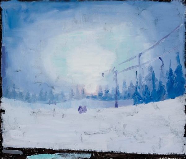
By far the most effective works for me were those expressing the manifold possibilities of semi-monochrome. Small works such as Alpine Resort shine with hidden depths as, on the very small canvas lights beam out in pale reflection.
Alpine Resort, 2015, oil on linen, 30.5 x 35.5 cm
Some of the most interesting works feature grids and shadows on windows, or views through windows into empty spaces. In the relatively large-scale I forget where we were there is the sense of the sudden experience of light and dark which opens up to an unexpected which could be anywhere.
I forget where we were, 2015, oil on canvas, 63 x 138cm
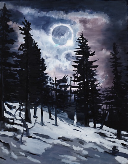
In the tiny very sketchy Passing the viewer looks out of a window at a building in a snowy landscape. Inside, there is a sense of enclosure or capture, but also a feeling of relief at being safely in an interior while the outer world is unknown.
Passing, 2014,oil on polyester canvas, 26 x 31 cm
One of the most effective pieces in the show is the graceful, well-balanced landscape Tracks. The eye moves between the snowy peak on the horizon and the network of traces proceeding from the viewer’s position into the distance. The trees form a kind of entryway into the mid-distance, where the traces disappear. The absence of human figures is contradicted by their presence, the landscape could not look like this had they not been there but now they are evacuated. The subtle colouration in this painting is picked up clearly in photographs although in bright sunlight on the gallery wall it is much harder to discern.
Tracks, 2015 oii on canvas, 94.5 x 115cm
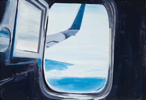
Among the numerous small pictures are several sketches which suggest the reality of a journey which could be universal, any airplane, any seat, any destination. The composition in Untitled is very powerful but on such a small scale and with so little depth on the canvas it is hard to feel engaged. If this was a painting on a much larger scale – one which emphasised the abstract aesthetics of these moments of everyday life – it would be extremely effective. As it is, it is easily overlooked.
Untitled, 2015, oil on polyester canvas 61 x 89cm
Another striking image is offered in Sniper. In earlier work Hoffman clearly reflects on military themes. But this sniper might not be military. He (or at a pinch it could be a she) is sighting down the barrel at an unknown target: it could be people coming out of a picture theatre or some other expression of the random mayhem in the contemporary world. The thin vagueness of the paint and the limited use of tone and colour in this little picture makes it particularly effective.
Untitled (Sniper), 2015oil on linen43 x 56cm
This brings us to the key issue of whether the conceptual qualities of this work can engage with the commercial market. The ideas behind the project are compelling, but the images need to be able to stand alone, unless of course someone chooses to purchase the entire suite of works, which would make best use of them. Many seem to be barely painted, which creates an interesting quality at one level but is not what the art buyer is accustomed to. Hoffmann has a lot of raw talent and strong presence on the wall but the work needs to be re-oriented or harnessed differently if it is to move forward into the fraught terrain of post-art school life.
Anne Judell. “Void”. Janet Clayton Gallery, 2 Danks St. Waterloo NSW 2017. 10th September-4th October 2014.
Anne Judell is a quiet presence in Australian visual arts. Her public profile and challenging works are seldom out front in the hurly-burley of the contemporary art scene. Even those who deeply appreciate her achievements struggle to articulate what it is that compels and enchants them.
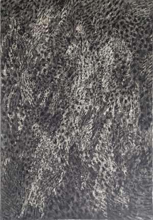
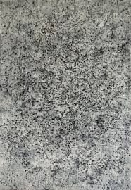
Her recent exhibition at Janet Clayton Danks St gives a glimpse of her subtle technique and surprising mark-making. Yes, these are “drawings”, but not in any ordinary sense. Two forms of vision are offered. Layers of pale pastel on Canson paper create an effect which seems to hover at a microscopic level while expanding into universality. These pastel works are small in size and mounted in white frames, so they seem to blend into the wall-space. The mixed media works on Hahnemuhle paper are loosely attached, the heavy paper slightly curved in places, creating shadows and depth behind the work itself. The pastels are profoundly dense and subtle, calming; the mixed-media pieces, constructed mainly in multiple dark and light tones, demand a different kind of attention. These works use acrylic, pastel, charcoal and gesso, worked deftly and pushed repeatedly into the surface of the paper. (Above, Left: Void 2). Judell has said:
I spend half my life closely observing the natural world. The other half I spend in the studio, attempting to translate this experience into two-dimensional form. I am always drawn to the minutiae exposing the evolution of form. Fragility, intimacy, cycles and sequences are what interest me, as opposed to the heroic and the sublime. (Judell 2005).
Judell’s work requires time: time to produce, and time to view, to sit with it quietly and let the subtle effects engage your consciousness. A somewhat noisy gallery is probably not ideal. The initial impression can be puzzling. What are we looking at here? A comment by Stella Rosa McDonald is offered to gallery visitors. She speaks of comparisons and similes, suggesting that Judell may have “figured out how to hit pause on the universe”. A lengthy interpretive essay by Luke Davies goes straight to quantum physics and Heisenberg’s uncertainty principle, seeing Judell’s work as embracing a negative capability, a border-zone between abstract and figurative, the felt and the known, the seen and the heard, the physical and emotional. Davies speaks of meditation and trance, suggesting that her work offers “portals” into another frame of experience, between “outward expansion and inner compression”.
These are strange claims for works created in small scale on paper. Such works are often associated with a feminine delicacy, and certainly Judell refuses the usual apparatus of heroic masculine art. Yet this work is far from gentle or decorative. The mixed media works have something of the visual impact of the older indigenous desert women’s dot paintings, without the colour field. Designs and suggestive associations emerge from dense marks which offer many possibilities. Nos 18 and 19 especially have an animal quality, reminiscent of fur or scales. Others might be reflections of the surfaces of tree-bark or the earth itself. Strong, deep shapes emerge without warning. Paleness, greyness, hints of blue, dark stripes in stipples, “Glory be to God for dappled things” (Gerard Manly Hopkins). We could be traversing roads, mountains, depths of earth, the night sky, the infinite universe, maybe even the reflection of stars in different galaxies of darkness.
And there is the “thump” of Rothko, especially the Houston chapel works. It may seem an odd comparison, the grandeur of Rothko’s huge paintings and these seemingly modest works on paper. But in both cases the longer you view the more a sense of shimmering depths and a shuddering emerges, almost as if we are at the edge of emergent Being itself.
Anne Judell, Void 1.
The title of the show, “Void”, points directly towards this philosophical realm. More than just a cute title, the idea of the Void has been emerging recently into a new significance for metaphysics, artistic and creative expression, and in scientific debate around the nature of human experience. The idea of the Void is usually seen as a manifestation of nothingness, associated with the contemplation of emptiness. An awareness of a void at the centre of phenomenal existence has long been central to Asian metaphysical traditions. In the Heart Sutra, “form is emptiness and emptiness is form”. The idea points towards an apprehension of a whole reality, before it is sliced up into concepts, especially via the effects of language. Yet the Void also points to a presence, rather than a lack of it, involving particles and antiparticles erupting into being, a constant hidden dimension of which we are usually unaware. Artists have tried to point in this direction: Alberto Giacometti’s Hands Holding the Void (Invisible Object) 1934 was an early example, while Yves Klein’s Leap into the Void 1960 tried to capture the sense of something in nothingness as the human body engages with space and gravity.
Recent research at the University of Ljublana, Slovenia brings together the need to redefine the problem of the Void, in particular the idea of the generation of “something” and ultimately of Being and the universe. Empty space, it turns out, is not empty but the seat of the most violent physics. The theory of relativity and quantum field theory have altered our understanding of the fabric of physical reality, in which the void becomes the key element in the structural functioning of existence itself. Heidegger, in his essay “The Thing” (Das Ding) poses the void as the deep essence of thing, as opposed to its manifestation in the form of material objects as such.
Ann Judell’s work seems to be guiding us towards these unsettling perceptions. The limitations and potentials of the human body, the vision system and its links into the sub-microscopic level of cells and life-forms are called into action in the contemplation of her work. It is as if she is telling us to Be carefully and cultivate our own awareness of the absolute mystery behind everyday existence.


 His striking photographs were the main element of the book.