Tag Archives: contemporary artists

Gerhard Richter and the market for German Art


Gerhard Richter: Portrait by Lothar Wolleh. Wikimedia Commons.

More thoughts on the Germans.  Gerhard Richter is by far the leader in the top ten most expensive living German artists.  But even leaving Richter aside, German art, particularly painting, is experiencing a dramatic upsurge in popularity among international collectors. Alexander Forbes writing for Artnet News in April 2014 reported that the power of German art in the market has actually increased since the 2008 recession. There is no sign of it slowing down. Richter himself believes the market for art generally, and for his own art in particular, has gone crazy.  Richter criticizes the art market.

Forbes suggests that German art’s penchant for “stringent conceptualism and a highly art historical approach likely proves a safe bet for value retention regardless of economic conditions.

I want to hold that idea. It suggests that art which reflects both conceptual thought – a philosophical element – as well as an embedded engagement with history is likely to hold its value best. On this analysis the German art market is likely to continue to ever higher peaks.

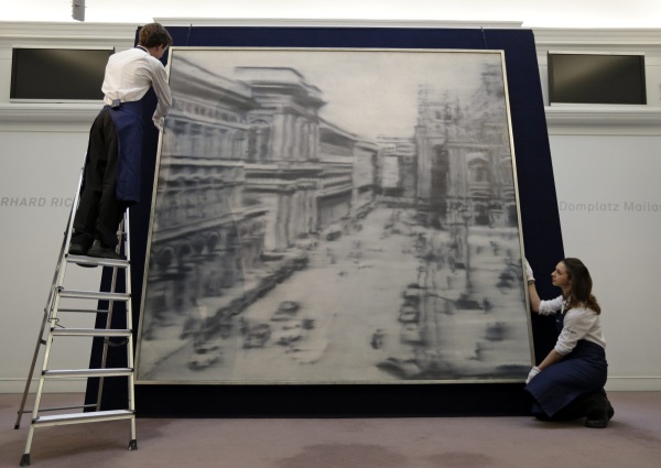
Richter’s mysterious  Domplatz, Mailand (Cathedral Square, Milan) painted in 1968 during the height of his blurred monochrome period sold recently for $37,125,000 at Sotheby’s 2013 contemporary art sale. His paintings hold the first 53 places on the top achieving auction sales of German art, 33 achieving over $10 million.


Gerhard Richter
Auction house employees pose for the photographers in front of a 1968 oil on canvas painting by artist Gerhard Richter, entitled: ‘Domplatz, Mailand’ (Cathedral Square, Milan), in central London, Friday, April 12, 2013. (AP Photo/Lefteris Pitarakis)

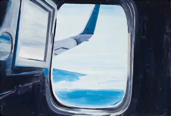
The range of Richter’s work is astonishing. Probably best known for his “blurred monochromes” of the 1960s, his abstract works have also taken on a special aura of mystery, seeming to move away from figuration and narrative completely. You really need to read Richter’s own writings (which are extensive) to get an idea of what he is thinking in this strand of his work, which seemingly just gets better and better. Cage 5, 2006, (below) is a vastly large oil painting reflecting back on his early vision, yet imbued with endless hints and depths of experience which could be landscape or water-surface or a close-up of a lot of brushstrokes – something he also explored in the 1980s. But he invites us to think of a cage, and that opens up a whole different set of associations.

Cage 5 2006
Gerhardt Richter  Cage 5, 2006

The sheer scale of Richter’s work is entrancing, but so is the sense of our shared collective history, that mid-twentieth century Europe with its horrors and excesses which he opens up to us from the 1960s on.  Neo Rauch, my second favourite German artist, does the same, although it a totally different way. You can read my academic article on Neo Rauch here.Neo Rauch Post Socialist Vision, Collective Memories

It is overwhelming in so many ways to enter the Richterian world. Fortunately it is also easy, as Richter’s own website is an absolute miracle of clarity, order and revelation. You can find  (almost) anything he has ever done there, complete with full references, links to written and audio discussions and interviews, the ability to zoom in onto details, and the complete presentation of his Atlas project, which really is no more than a full record of every image he has collected (or photographed) in his life. Explore the miracle of Richter’s work here.

Unbelievably there is almost nothing of Richter’s art in pubic collections in Australia. The AGNSW at least made some effort and holds three items, a painted monochrome sphere from 1989, a photograph from 1967, and his strange version of a nude descending a staircase, titled Ema, from 1992.

The Art Gallery of South Australia holds one of his luminous abstracts (Abstraktes Bild) from 1977 (Catalogue Raisonne: 424). * (Eric Clapton sold another in the Abstraktes Bild series for 21.3 million British pounds in 2013). One of Richter’s finest 1990’s abstracts CR:752-3, 1990, 225 x 200cm) is held in the National Gallery of Victoria in Melbourne, purchased with corporate funding assistance from Westpac Bank,  and the NGA in 2003 purchased Juno, oil on canvas 300 x 250 (NGA 2004.2).Richter’s 1995 Abstract at the NGV

Clapton's Abstraktes Bild
Sold by Eric Clapton: Abstraktes Bild at  Sotheby’s for 21.3 million

Gerhard Richter’s work is now so valuable that there will be little or no opportunity to ever acquire it in Australia. Should public collections in Australia be more open to contemporary work from outside Australia? Why German artists, and not those from Romania, Holland, or wherever?  Should we just focus on local art and artists and make a kind of nationalist stand? This might be a valid position but when you consider the extent of Australian gallery holdings of recent American and UK artists you just cannot help but conclude that the good old neo-colonial world order underpins every level of public culture, including public art. Sensible use of public assets or parochialism and subservience to a highly limited Anglophone culture sphere?

*Strangely though this rare work hardly features on the Gallery’s site. No image of it is available there. It has been shown only once in public as part of the exhibition “Making Nature: Masters of Early European Landscape Art” (June-September 2009). Why it was included in that collection is a mystery as Richter can hardly be considered “early” and this painting is very far from one of his landscapes. An image of it is available on Richter’s website – just click on the “Abstracts” collection with the CR number 424.


ELISABETH CUMMINGS: ONCE MORE, SO MUCH FEELING

Not long ago I wrote an appreciation of Elisabeth Cummings here (see Elisabeth Cummings: Slow Art,  March 24th 2014). The theme of the piece echoed comments by art critic John McDonald, who has repeatedly championed Elisabeth’s work and expressed dismay at its failure to receive the acknowledgment it deserves. He expressed astonishment that her work had not been included in the NGA show of 200 years of Australian landscape painting headed for London in 2013 (SMH, January 21 2012).  She had also been excluded from the Wynne Prize more than once, although that was not the case in 2013 when her  Sunrise, the Kimberley out-glowed everything else on the walls, although it did not win. Imants Tiller’s Namatjira was a puzzling although not unworthy choice.

Cummings Sunrise Kimb Wynne 2013
Elisabeth Cummings. Sunrise, Kimberley. Oil on canvas, 175 x 300 cm.

When I sent my 2014 post to Elisabeth, a personal friend for decades, she protested mildly at my emphasis on the scandalous lack of critical recognition and my reference to her being “overlooked”. She was right to do so. If certain precious art-world critics and habitues had nothing to say about an older woman landscape artist … Excuse me? A what? … many others especially collectors have no doubt about her worth. Her  paintings (and prints) sell reliably from her long-time gallery (King on William) at show after show, some at astronomical prices for a living artist.

Over the past couple of years a new appreciation of her work has become widespread. By late 2015 you could hardly move in fine art circles in Sydney without someone mentioning her name. She was being described as “Australia’s greatest living female landscape artist”.  At a lively discussion around Luke Sciberras’ Hill End diner table in October the question was raised whether or not the “female” descriptor could be omitted. Hmmm.  Luke, her semi-protege, who could reasonably think the title should be his,  didn’t know how to respond.  This year she and Luke collaborated on a stunning show in Hong Kong, responding to that spectacular Asian city with the same kind of delicacy and intelligence as she had long shown for remote Australia’s dry creek-beds and scrubby sandhills.

cummings hong kong 1
From on High 2015.  Oil on canvas 91 x 86 cm

Such a tragedy that this exhibition will never be seen in Australia! Most of the pieces have been snapped up by private collectors and will rarely if ever emerge again in their lifetimes.(“Flying Goose Hill” at the Nock Art Foundation, Hong Kong, October 17 – November 14)

lis and luke
Elisabeth and Luke being interviewed for the Hong Kong show, 2015.

Now she is named alongside John Olsen among Australia’s greatest living artists, along with Cressida Campbell, Peter Kingston and Kevin Connor. The summer exhibition (Mosman, Manly and S.H Ervin galleries), offers 140 paintings and drawings celebrating Sydney as a source of artistic inspiration. The SMH arts and books writer Linda Morris hails the group as the living successors of Brett Whitely, Lloyd Rees, Grace Cossington Smith and Margaret Preston.

[http://www.smh.com.au/entertainment/art-and-design/destination-sydney-names-elisabeth-cummings-john-olsen-among-greatest-artists-20151211-]

Both Connor and Kingston have had recent major exhibitions in Sydney while Cummings’ current King on William show ( until 19th December) was an astonishing record of recent work and almost sold out by the opening night.

Stemmed-Flow-oc-115x130cm-250x215
Stemmed Flow 2015.  Oil on canvas 115 x 130 cm

It is so wonderful to see Elisabeth  moving to this level of recognition.  She has been utterly consistent in her vision and commitment over her entire career as an artist but the development of her work has been powerful beyond expectation over the past ten or so years. She shuns fame and all the hoop-la but we should be so grateful for everything she has offered not to mention what is yet to come.


Ryan Hoffman Paintings: “Third Person”

Ryan Hoffmann:  Liverpool St Gallery Sydney 11th August – 3rd September

Ryan Hoffmann is a young artist from Sydney’s National Art School, one among few to have been given a solo show in a reputable gallery while completing his Masters of Fine Arts degree.

There has been a buzz around Hoffmann for some time, and this show gives him an opportunity to demonstrate why. It doesn’t entirely succeed although the concept is great. But the “hang” and the lack of documentation are a problem. Most pictures in gallery shows exist in their own right, each with its unique qualities, capable of standing alone. Hoffman’s are part of a larger vision and the viewer needs to know more about how they relate to each other and we should care about them.

As pictures they are of varying quality. Overall they seem barely painted, more like gestures, although they look much stronger as photographs for example on the gallery website. The images are thrown together on varying supports, some very small. The smaller paintings are no better resolved than the larger ones, if anything they are even more random and sketchy.

The gallery wall is covered with what looks like cloth or paper or maybe paint in a vague wash of pastel colours. Most of the paintings are hung close together in what seems to be a random array, large and small, bright and monochrome, square and rectangular. A few of the larger paintings – the “hero” pieces- occupy spaces of their own and two of these are especially striking (more on this later). Art lovers like to see paintings in a show as separate entities, each existing in its own terms, able to be translated to a different space, for example to a wall at home or in an office. Diptychs or triptychs are fine, creating a single visual statement, but otherwise each painting is seen as its own entity. Are these images telling a story? Is there something we should know but haven’t been told? Well yes there is, and it is quite complicated.

Installation, Liverpool St Gallery

Hoffman has exhibited these, or related, paintings in at least two previous shows.  While Artist in Residence at the Glasgow Art School earlier in 2015 he offered a similar show with more paintings, at least fifty.  Some of them, many in fact, are also being shown here.  The concept for the hang was the same: a single wall, a lot of pictures jammed up together in seemingly random order.

Later, in a show called RREALITY PROJECTIONS, part of the requirements for the MFA at Sydney’s National Art School, the same layout includes many of the same paintings. An exegesis accompanied the show, called “Readymade digital photographs: Virtual reality as autobiography”.

The show is engaged with digital photography, and is telling a kind of autobiographical story. This story can be told in many ways. No images take any particular priority, they can be arranged in any order. They are not art photography but the kind of images which everyone now shoots on their phone. If they bother downloading the images at all they can rearrange them in any order, make new “albums” from them, send them round the world in various forms, pin them on Pinterest, send them to their Instagram account. These seem to be paintings of casual snapshots on the digital device, to be treated in the same random way.

NAS final show

Ryan Hoffmann, RREALITY PROJECTIONS (exhibited as a requirement of a MFA at the Nation Art School accompanying the exegesis ‘Readymade digital photographs: Virtual reality as autobiography’ )  room #2, 2015; oil on linen; dimensions variable (Photo courtesy of Peter Morgan).

Earlier still a show called The Inter Galactic Image Factory at Liverpool Street brought together four of the NAS 2014 cohort including Hoffmann (with Seth Birchall, Mason Kimber and Conor O’Shea). Hoffmann’s paintings in this show are different to those in the later shows but clearly show the same impulse. An artist’s statement appears on Hoffmann’s website which explicitly connects his practice to the use of smart technologies and the Internet. While this statement is in a rather tortured form, it illuminates what this work is about.

Images are now simultaneously representing, existing and omnipresent as a form of “virtual reality”. 
By regarding the digital image as a form of readymade imbued by its time, place, culture, Hoffmann’s practice investigates the potential for a new paradigm in painting which courts a contest between photographic representation and painterly application. Through the negation of linearity and hierarchy in subject, Hoffmann locates images in painting from this “virtual reality” to form an autobiography. 

And so we see that, without explicit reference, Hoffmann is in Gerhard Richter territory, struggling with the same issues about reality, image, painting and autobiography, now in the digital age.

It would have benefited the Liverpool St show if something to this effect had been made available in the catalogue or on the wall. There is an argument against spoon-feeding the art public but in a case like this the “sense” of the work shifts into a radically new position when it becomes clear that we are looking at deliberate engagement with a specific problem in contemporary representation. There is a difficulty with work which lives on the border between commercial art practice and art theory: how to connect the results of such a practice with the conventions of the art-buying public. Around less than half of these works had been purchased in the first two weeks of the show. Some were the smallest works, barely sketches, priced very modestly. The others were the strongest and generally the most “stand-alone” pictures in the show, with the very strange exception of the main hero-piece, “Penumbra”, which in spite of its striking qualities and painterly aesthetic had not been snapped up.

Penumbra. Oil, polyester, wood and copper.99 x 78 cm

 Penumbra, 2015, oil on polyester canvas, 90 x 78 cms

 By far the most effective works for me were those expressing the manifold possibilities of semi-monochrome. Small works such as Alpine Resort shine with hidden depths as, on the very small canvas lights beam out in pale reflection.

Alpine Resort 2015

Alpine Resort, 2015, oil on linen, 30.5 x 35.5 cm

 Some of the most interesting works feature grids and shadows on windows, or views through windows into empty spaces. In the relatively large-scale I forget where we were there is the sense of the sudden experience of light and dark which opens up to an unexpected which could be anywhere.

I forget where we were I forget where we were, 2015, oil on canvas, 63 x 138cm

In the tiny very sketchy Passing the viewer looks out of a window at a building in a snowy landscape. Inside, there is a sense of enclosure or capture, but also a feeling of relief at being safely in an interior while the outer world is unknown.

Passing 2014

Passing, 2014,oil on polyester canvas, 26 x 31 cm

One of the most effective pieces in the show is the graceful, well-balanced landscape Tracks. The eye moves between the snowy peak on the horizon and the network of traces proceeding from the viewer’s position into the distance. The trees form a kind of entryway into the mid-distance, where the traces disappear. The absence of human figures is contradicted by their presence, the landscape could not look like this had they not been there but now they are evacuated. The subtle colouration in this painting is picked up clearly in photographs although in bright sunlight on the gallery wall it is much harder to discern.

Tracks 2015

Tracks, 2015 oii on canvas, 94.5 x 115cm

Among the numerous small pictures are several sketches which suggest the reality of a journey which could be universal, any airplane, any seat, any destination. The composition in Untitled is very powerful but on such a small scale and with so little depth on the canvas it is hard to feel engaged. If this was a painting on a much larger scale – one which emphasised the abstract aesthetics of these moments of everyday life – it would be extremely effective. As it is, it is easily overlooked.

Untitled 2015

Untitled, 2015, oil on polyester canvas 61 x 89cm

Another striking image is offered in Sniper. In earlier work Hoffman clearly reflects on military themes. But this sniper might not be military. He (or at a pinch it could be a she) is sighting down the barrel at an unknown target: it could be people coming out of a picture theatre or some other expression of the random mayhem in the contemporary world. The thin vagueness of the paint and the limited use of tone and colour in this little picture makes it particularly effective.

Sniper 2015

Untitled (Sniper), 2015oil on linen43 x 56cm

This brings us to the key issue of whether the conceptual qualities of this work can engage with the commercial market. The ideas behind the project are compelling, but the images need to be able to stand alone, unless of course someone chooses to purchase the entire suite of works, which would make best use of them. Many seem to be barely painted, which creates an interesting quality at one level but is not what the art buyer is accustomed to. Hoffmann has a lot of raw talent and strong presence on the wall but the work needs to be re-oriented or harnessed differently if it is to move forward into the fraught terrain of post-art school life.

The New Shock of the New

THE NEW SHOCK OF THE NEW

robert hughes b and w

Robert Hughes, eminent Sydney-born art critic, published his highly acclaimed book The Shock of the New in 1980. His longstanding position as art critic with TIME magazine gave him unprecedented access to artists around the world.  His criticism was often contentious and he was viewed as a “conservative”, although he had no particular philosophical axes to grind. In this DVD, he offers a revaluation of what has happened to both “shock” and “newness” since that time.  You can view the video at:

http://art.docuwat.ch/videos/the-shock-of-the-new/the-shock-of-the-new-09-the-new-shock-of-the-new/?channel_id=0

Hughes died at age 74 in New York in 2012 after a series of tragic events including a terrible car accident in Western Australia, which resulted in serious injury to Hughes and the three young men in the other car, and a court case.  It seemed Hughes’ position as an expatriate Australian and a high profile intellectual were enough to make the Australian press furious and accusatory. Details about the accident and the case are contained in the interview with Jana Wendt here:

http://sgp1.paddington.ninemsn.com.au/sunday/cover_stories/transcript_1445.asp

No doubt this terrible experience sharpened his perceptions and focussed his mind on issues of Being, life and death, and the moral obligations of the artist.

It is clear from the way this video is constructed, and from many of his interview questions, that he regarded much of the work of the contemporary art world darlings as a degradation of art, aimed at making the artist into a marketable commercial celebrity.  The kind of “shock” the art world produces today is mostly absurd, ugly and pointless, from his point of view.  He gives fascinating examples through interviews with stellar figures in today’s art world – Jeff Koons for one – and then offers examples of contemporary artists who in his view carry on the essential virtues of art.

His interview with Jeff Koons is really brilliant.  What comes through so strongly is that Hughes is teasing or sending up Koons,  who, in his well-tailored suit, is so sure of his own significance that he doesn’t realise it.  Hughes draws attention to the fact that Koons regards himself as a direct descendant, or perhaps even reincarnation, of Michelangelo, and looks at his Pieta-like sculpture of Michael Jackson with a very jaundiced eye.  I found this sculpture actually quite fascinating, and not horrible at all, although a lot of Koons’ work does seem to me trite, overblown and ridiculously overvalued.

Jeff Koons Pieta

Some of the other artists he considered included the little-known Paula Rego, b. 1935 in Portugal, whose brilliant disturbing images seem rich with narrative and engagement in a scarily familiar universe.  The idea of a “discreet undermining” and the confessional/psychiatric tone of her work opens a different kind of viewing. The violence of folk tales and the terrors of childhood, the truth of families and the fear of never knowing what is under the bed (a pig, in one case!) envelop her works.  Her work is political, traversing the line between private conscience and public responsibility.  Her paintings especially of the 80s and 90s seem to some degree close to Lucien Freud’s, but I see her real affinities to be with the German figurative post-socialist Neo Rauch.  She is a very fine painter technically, her figure work and composition is outstanding.  It is clear why Hughes would want to contrast her with the vapid posturing of the Britpack artists; on any measure she is so much the better artist, yet she has been almost entirely “off the radar”.  Her images are too deep, her vision too disturbing, and she is a figurative painter and a woman.  At least three strikes against her.

Below:  Celestina’s House.  2000-2001.  Pastel on Paper: 200 x 240 cms.  Look closely at the details of this amazing work, go to:  http://www.saatchigallery.com/artists/artpages/rego_paula_celestina_house.htm

celestinas house

Other painters discussed by Hughes included Anselm Kiefer.  Another political artist, it is much clearer to see his politics than in the case of Paula Rego.  One work discussed, Den Goldenen Haar Margarethe, is based on the poem by Paul Celan, Death Fugue,  which includes reflection on the phrase in the poem “Death is a master from Germany”. The inmates of the death camps will rise as smoke and their graves will be in the clouds.  The lines are:

He calls out more sweetly play death death is a master from Germany

he calls out more darkly now stroke your strings then as smoke you will rise into air

then a grave you will have in the clouds there one lies unconfined.

For the full poem, see:

http://www.english.txstate.edu/cohen_p/postmodern/Literature/Celan/Hamburger.html

kiefer-dein-goldenes-haar-margarethe

Kiefer’s painted images are dense and complex.  In many of his paintings he seems determined to pull the viewer into the recognition of perspective, even if it is only of railway tracks heading for the death camp, or some empty barracks stretching to the horizon.  Kiefer and Rego represent the need for an art which refutes the sterile irony of contemporary representation and asserts the primacy of a moral imagination.

Kiefer railway

Other better known artists discussed include Lucien Freud and David Hockney. I enjoyed these discussions less than the earlier ones, and felt Hughes himself had been drawn into a kind of hero worship. It was particularly odd to me that he went on to include such a long discussion of Sean Scully.  Scully is an Irish-born New York based printmaker and artist working from a downtown studio.  He has been nominated for the Turner Prize, and has had exhibitions all over the world, including in Australia.  Best known for his huge abstract colour field images he seems to me a kind of overblown Mondrian.  For his exhibition Colour of Light at the National Gallery in Canberra in 2004, he was quoted as saying of his paintings:

There’s a lot of physical force to them, a lot of tactile sexual energy, a lot of sensuality.  But there’s a lot of uncertainty about what the relationship between the parts actually means and I think that that’s a very important aspect of my work. I mean if I have to choose a course between Puritanism and extreme romanticism, I think it’s clear than I’m going to choose extreme romanticism. But I think what I can contribute is something that has both in it, something that has the possibility of both in it, and it’s that extreme stretch that I want to try to achieve in my work. That’s my ambition.

http://nga.gov.au/Exhibition/Scully/Default.cfm

Sean Scully 1

Scully seems to be well-regarded by fellow Irish expatriates and admirers, but the case for his art seems much less strong than that of others in this discussion.  What Hughes liked about it was the sense that it was meditative and contemplative, with its opaque and stone-like surfaces, density and lack of space.  His art looks like architecture, Hughes asserts. Without standing in the same space with these gigantic works, it is almost impossible to grasp them.  Yet, with a Rothko, you can look at almost any reproduction of one of his colour field paintings and feel immediately what it is doing, how it is drawing you in, what it means to think about meditation and contemplation.  To some degree this is true even of the great “black” paintings in the Rothko Chapel, Houston, although to see any image of them is nothing like standing or better still sitting in that mystical space and watching the apparently black surfaces begin to breathe, move and emanate the life force.

Rothko_Chapel_1

Hughes closes his revaluation with some very strange remarks, as if someone scripting his show has insisted that he make some comments on very banal and boring issues.  Can Art create Revolution?  Or just social change?  Is it enough to be “beautiful”?  Do people need beauty?  Are Museums (Art Galleries) the new Cathedrals?  Closing with images of the Weather Project in the Tate Modern, the suggestion that this represents a new Sun God worshipped by art lovers below seemed tacky and almost stupid.

weather project Tate Modern

I felt deeply sorry for Robert Hughes by the end of this show.  One of the greatest art critics of his era, a highly individualistic and sensitive man, Hughes seemed to be struggling against the very forces which he was condemning at the beginning of the film.  It would be so interesting to have a documentary showing the “behind the scenes” of the making of the New Shock of the New.  It might even be very shocking.