Category Archives: Shows and exhibitions

Sigmar Polke: Don’t mention the Germans

Australia has never had much of a taste for German art. Apart from the epic romances of Austrian born Eugene von Guerard (1811-1901) who towered over all others during his time in Australia from 1852-1992, and produced the most magnificent landscapes unrivalled in scale and grandeur then or maybe ever, German painting has never figured much in Australian galleries or exhibitions. Nor does it feature much on Australian art school curricula although Gerhard Richter turns up here and there.

300px-Eugene_von_Guerard00
Eugene von Guerard. Govett’s Leap and Grose Valley, Blue Mountains NSW 1873

It is true that Australian art tastes have generally been conservative and provincial anyway, so perhaps it is understandable that the work of contemporary German artists is of little interest. But in America the impact of German art has been powerful over several decades and shows no decline. The Americans however seem to pick up German artists and movements just as they start fading in Germany itself .

In 2014, New York’s MOMA offered a huge retrospective of the work of Sigmar Polke (“Alibis: Sigmar Polke 1963-2010”). Polke, a contemporary of Richter, is seen as a pioneer of the formal cleverness and ironic perspective which underlies much of today’s painting. The dark irony of much of his work seems to open up a bitter playground where the gesture sits side by side with dexterous painterliness while poking fun at our aesthetic convictions. Polke was both more and less serious than Richter. Put them together and one illuminates the absences in the other.

Polke Bunnies 1966
Bunnies, 1966, acrylic on canvas, 150 cm x 100 cm

Also unlike Richter, Polke played with everything: drawing, painting, sculpture, film, video and sound. Richter was obsessed with the visual image, the photograph in particular, and the peculiar position of painting given the existence of photography. Polke’s work is harder to assess if only because it is so much more various. And influences are far more visible: pop art, American abstraction, psychedielia, a rabid experimentalism which the far more restrained Richter eschews.

2003 Primavera
Primavera – playing with the framing

All this messing around with materials should make Polke a great favourite among contemporary artists who don’t actually want to paint. Creating abstractions on glass using old lamp soot, flinging about different kinds of paint, and attacks on the picture plane itself all have had a turn. These processes once were shocking although now they do seem fairly routine.

At times Polke seems to hover in Richterian shadows. Frau Herbst und ihre zwei Tochter (Mrs Autumn and Her Two Daughters, 1991) seems redolent of early Richter, with its base in a nineteenth century French engraving on a massive canvas where competing representations alternate across the canvas. Cheap conventional images of German guard posts in the “Watchtower” paintings reference historial trauma, almost mechanically.

03+Sigmar+Polke+.+Mrs.+Autumn+and+Her+Two+Daughters+.+1991
Frau Herbst and her Two Daughters, 1991.

No contemporary German artist can challenge the dominance of Richter, but the shame of it is that here in Australia we rarely get the chance to see any of them, let alone Richter, in a full show. My first encounter with a Richter painting in Australia was that wonderfully mysterious painting of Helga Matura with her Fiance. For me, this image is emblematic of everything Richter was trying to achieve in the 1960s. There it was, the sole Richter representative in a rather bedlamatic show, Pop to Popism a the Art Gallery of NSW, in 2014. There was a lot of fun to be had with the usual suspects, Andy Warhol, Roy Lichtenstein and Brett Whitely among them. (What? Brett Whitely as a Pop artist?) It was a good show but the inclusion of Richter as part of a Pop movement seemed very strange and his brooding, magical monochrome painting did not sit comfortably with the other male hysterics around it.

Helga Matura with Fiance
Gerhard Richter. Helga Matura and her Fiance.

Polke responded constantly to changes in technology and their meaning for the reproduction of the image. In the late 1990s he worked on an endless series of photocopied works which occupied whole rooms of display space.

photocopiarbeiten
Photocopyarbeiten, late 1990.

These days that generation of German artists is still influential, but maybe fading. The Leipzig school, the great Neo Rauch and his pals, also may be on the edge of exhausting their cred among the avant-garde. But if you don’t spend time in Germany and read the German art press there’s almost no way to find out. The Australian art scene is right to focus on our own, with its distinctive history and brilliant grasp of landscape, light and space. But there is a kind of underground urban sensibility which wells up now and then, and could gain a lot from exposure to German painting. I am thinking of it as opening up a counterpoint to the Australian brightness, a protected area where we can hide from all that light and insistent demand that everything be laid across vast landscapes which dwarf and minimize our presence. Australian Gothic is a recognized feature in Australian cinema. Maybe that sensibility is lurking around in painting as well.

For a really detailed discussion of Sigmar Polke, see:

http://capscrits.blogspot.com.au/2014/06/sigmar-polke-2014.html


Elisabeth Cummings: ABC Interview

Cummings in studio 2015

Was so delighted to see the ABC interview with Elisabeth recently. She expresses herself vividly on camera and you get to see a little more of her beautiful bush studio and workspace, and of the bush around which so invigorates her perceptions. The interview was prompted by her participation in the Destination Sydney three-gallery exhibit meant to showcase Sydney and its surrounds. Does this mean she is now officially “discovered”? (Or is this, as she would say, a ridiculous concept?)

The link is here – in an earlier version of this post I used an outdated link, sorry, and thanks to Cultural Conversations for the correction.

And if you go to Youtube, there are some great interview segments with Elisabeth, as well as one with her and Luke Sciberras.

She is showing at Manly Art Gallery and Museum, along with Brett Whitely and Lloyd Rees – stellar! – but the show finishes soon (February 14th) so if you are a Sydney local and a big fan better get there soon.

2015-Cummings-Darwin-Harbour-oc-45x45xm

I think this is actually a picture of Darwin Harbour but the feeling could be Sydney.


Ryan Hoffman Paintings: “Third Person”

Ryan Hoffmann:  Liverpool St Gallery Sydney 11th August – 3rd September

Ryan Hoffmann is a young artist from Sydney’s National Art School, one among few to have been given a solo show in a reputable gallery while completing his Masters of Fine Arts degree.

There has been a buzz around Hoffmann for some time, and this show gives him an opportunity to demonstrate why. It doesn’t entirely succeed although the concept is great. But the “hang” and the lack of documentation are a problem. Most pictures in gallery shows exist in their own right, each with its unique qualities, capable of standing alone. Hoffman’s are part of a larger vision and the viewer needs to know more about how they relate to each other and we should care about them.

As pictures they are of varying quality. Overall they seem barely painted, more like gestures, although they look much stronger as photographs for example on the gallery website. The images are thrown together on varying supports, some very small. The smaller paintings are no better resolved than the larger ones, if anything they are even more random and sketchy.

The gallery wall is covered with what looks like cloth or paper or maybe paint in a vague wash of pastel colours. Most of the paintings are hung close together in what seems to be a random array, large and small, bright and monochrome, square and rectangular. A few of the larger paintings – the “hero” pieces- occupy spaces of their own and two of these are especially striking (more on this later). Art lovers like to see paintings in a show as separate entities, each existing in its own terms, able to be translated to a different space, for example to a wall at home or in an office. Diptychs or triptychs are fine, creating a single visual statement, but otherwise each painting is seen as its own entity. Are these images telling a story? Is there something we should know but haven’t been told? Well yes there is, and it is quite complicated.

Installation, Liverpool St Gallery

Hoffman has exhibited these, or related, paintings in at least two previous shows.  While Artist in Residence at the Glasgow Art School earlier in 2015 he offered a similar show with more paintings, at least fifty.  Some of them, many in fact, are also being shown here.  The concept for the hang was the same: a single wall, a lot of pictures jammed up together in seemingly random order.

Later, in a show called RREALITY PROJECTIONS, part of the requirements for the MFA at Sydney’s National Art School, the same layout includes many of the same paintings. An exegesis accompanied the show, called “Readymade digital photographs: Virtual reality as autobiography”.

The show is engaged with digital photography, and is telling a kind of autobiographical story. This story can be told in many ways. No images take any particular priority, they can be arranged in any order. They are not art photography but the kind of images which everyone now shoots on their phone. If they bother downloading the images at all they can rearrange them in any order, make new “albums” from them, send them round the world in various forms, pin them on Pinterest, send them to their Instagram account. These seem to be paintings of casual snapshots on the digital device, to be treated in the same random way.

NAS final show

Ryan Hoffmann, RREALITY PROJECTIONS (exhibited as a requirement of a MFA at the Nation Art School accompanying the exegesis ‘Readymade digital photographs: Virtual reality as autobiography’ )  room #2, 2015; oil on linen; dimensions variable (Photo courtesy of Peter Morgan).

Earlier still a show called The Inter Galactic Image Factory at Liverpool Street brought together four of the NAS 2014 cohort including Hoffmann (with Seth Birchall, Mason Kimber and Conor O’Shea). Hoffmann’s paintings in this show are different to those in the later shows but clearly show the same impulse. An artist’s statement appears on Hoffmann’s website which explicitly connects his practice to the use of smart technologies and the Internet. While this statement is in a rather tortured form, it illuminates what this work is about.

Images are now simultaneously representing, existing and omnipresent as a form of “virtual reality”. 
By regarding the digital image as a form of readymade imbued by its time, place, culture, Hoffmann’s practice investigates the potential for a new paradigm in painting which courts a contest between photographic representation and painterly application. Through the negation of linearity and hierarchy in subject, Hoffmann locates images in painting from this “virtual reality” to form an autobiography. 

And so we see that, without explicit reference, Hoffmann is in Gerhard Richter territory, struggling with the same issues about reality, image, painting and autobiography, now in the digital age.

It would have benefited the Liverpool St show if something to this effect had been made available in the catalogue or on the wall. There is an argument against spoon-feeding the art public but in a case like this the “sense” of the work shifts into a radically new position when it becomes clear that we are looking at deliberate engagement with a specific problem in contemporary representation. There is a difficulty with work which lives on the border between commercial art practice and art theory: how to connect the results of such a practice with the conventions of the art-buying public. Around less than half of these works had been purchased in the first two weeks of the show. Some were the smallest works, barely sketches, priced very modestly. The others were the strongest and generally the most “stand-alone” pictures in the show, with the very strange exception of the main hero-piece, “Penumbra”, which in spite of its striking qualities and painterly aesthetic had not been snapped up.

Penumbra. Oil, polyester, wood and copper.99 x 78 cm

 Penumbra, 2015, oil on polyester canvas, 90 x 78 cms

 By far the most effective works for me were those expressing the manifold possibilities of semi-monochrome. Small works such as Alpine Resort shine with hidden depths as, on the very small canvas lights beam out in pale reflection.

Alpine Resort 2015

Alpine Resort, 2015, oil on linen, 30.5 x 35.5 cm

 Some of the most interesting works feature grids and shadows on windows, or views through windows into empty spaces. In the relatively large-scale I forget where we were there is the sense of the sudden experience of light and dark which opens up to an unexpected which could be anywhere.

I forget where we were I forget where we were, 2015, oil on canvas, 63 x 138cm

In the tiny very sketchy Passing the viewer looks out of a window at a building in a snowy landscape. Inside, there is a sense of enclosure or capture, but also a feeling of relief at being safely in an interior while the outer world is unknown.

Passing 2014

Passing, 2014,oil on polyester canvas, 26 x 31 cm

One of the most effective pieces in the show is the graceful, well-balanced landscape Tracks. The eye moves between the snowy peak on the horizon and the network of traces proceeding from the viewer’s position into the distance. The trees form a kind of entryway into the mid-distance, where the traces disappear. The absence of human figures is contradicted by their presence, the landscape could not look like this had they not been there but now they are evacuated. The subtle colouration in this painting is picked up clearly in photographs although in bright sunlight on the gallery wall it is much harder to discern.

Tracks 2015

Tracks, 2015 oii on canvas, 94.5 x 115cm

Among the numerous small pictures are several sketches which suggest the reality of a journey which could be universal, any airplane, any seat, any destination. The composition in Untitled is very powerful but on such a small scale and with so little depth on the canvas it is hard to feel engaged. If this was a painting on a much larger scale – one which emphasised the abstract aesthetics of these moments of everyday life – it would be extremely effective. As it is, it is easily overlooked.

Untitled 2015

Untitled, 2015, oil on polyester canvas 61 x 89cm

Another striking image is offered in Sniper. In earlier work Hoffman clearly reflects on military themes. But this sniper might not be military. He (or at a pinch it could be a she) is sighting down the barrel at an unknown target: it could be people coming out of a picture theatre or some other expression of the random mayhem in the contemporary world. The thin vagueness of the paint and the limited use of tone and colour in this little picture makes it particularly effective.

Sniper 2015

Untitled (Sniper), 2015oil on linen43 x 56cm

This brings us to the key issue of whether the conceptual qualities of this work can engage with the commercial market. The ideas behind the project are compelling, but the images need to be able to stand alone, unless of course someone chooses to purchase the entire suite of works, which would make best use of them. Many seem to be barely painted, which creates an interesting quality at one level but is not what the art buyer is accustomed to. Hoffmann has a lot of raw talent and strong presence on the wall but the work needs to be re-oriented or harnessed differently if it is to move forward into the fraught terrain of post-art school life.

Anne Judell “Void” – Review.

Anne Judell. “Void”. Janet Clayton Gallery, 2 Danks St. Waterloo NSW 2017. 10th September-4th October 2014.

Anne Judell Void 2


Anne Judell is a quiet presence in Australian visual arts. Her public profile and challenging works are seldom out front in the hurly-burley of the contemporary art scene. Even those who deeply appreciate her achievements struggle to articulate what it is that compels and enchants them.

Her recent exhibition at Janet Clayton Danks St gives a glimpse of her subtle technique and surprising mark-making. Yes, these are “drawings”, but not in any ordinary sense. Two forms of vision are offered. Layers of pale pastel on Canson paper create an effect which seems to hover at a microscopic level while expanding into universality. These pastel works are small in size and mounted in white frames, so they seem to blend into the wall-space. The mixed media works on Hahnemuhle paper are loosely attached, the heavy paper slightly curved in places, creating shadows and depth behind the work itself. The pastels are profoundly dense and subtle, calming; the mixed-media pieces, constructed mainly in multiple dark and light tones, demand a different kind of attention. These works use acrylic, pastel, charcoal and gesso, worked deftly and pushed repeatedly into the surface of the paper. (Above, Left: Void 2). Judell has said:

 I spend half my life closely observing the natural world. The other half I spend in the studio, attempting to translate this experience into two-dimensional form. I am always drawn to the minutiae exposing the evolution of form. Fragility, intimacy, cycles and sequences are what interest me, as opposed to the heroic and the sublime. (Judell 2005).

Judell’s work requires time: time to produce, and time to view, to sit with it quietly and let the subtle effects engage your consciousness. A somewhat noisy gallery is probably not ideal. The initial impression can be puzzling. What are we looking at here? A comment by Stella Rosa McDonald is offered to gallery visitors. She speaks of comparisons and similes, suggesting that Judell may have “figured out how to hit pause on the universe”. A lengthy interpretive essay by Luke Davies goes straight to quantum physics and Heisenberg’s uncertainty principle, seeing Judell’s work as embracing a negative capability, a border-zone between abstract and figurative, the felt and the known, the seen and the heard, the physical and emotional. Davies speaks of meditation and trance, suggesting that her work offers “portals” into another frame of experience, between “outward expansion and inner compression”.

These are strange claims for works created in small scale on paper. Such works are often associated with a feminine delicacy, and certainly Judell refuses the usual apparatus of heroic masculine art. Yet this work is far from gentle or decorative. The mixed media works have something of the visual impact of the older indigenous desert women’s dot paintings, without the colour field. Designs and suggestive associations emerge from dense marks which offer many possibilities. Nos 18 and 19 especially have an animal quality, reminiscent of fur or scales. Others might be reflections of the surfaces of tree-bark or the earth itself. Strong, deep shapes emerge without warning. Paleness, greyness, hints of blue, dark stripes in stipples, “Glory be to God for dappled things” (Gerard Manly Hopkins). We could be traversing roads, mountains, depths of earth, the night sky, the infinite universe, maybe even the reflection of stars in different galaxies of darkness.

Anne Judell Void 1

And there is the “thump” of Rothko, especially the Houston chapel works. It may seem an odd comparison, the grandeur of Rothko’s huge paintings and these seemingly modest works on paper. But in both cases the longer you view the more a sense of shimmering depths and a shuddering emerges, almost as if we are at the edge of emergent Being itself.


Anne Judell, Void 1.

The title of the show, “Void”, points directly towards this philosophical realm. More than just a cute title, the idea of the Void has been emerging recently into a new significance for metaphysics, artistic and creative expression, and in scientific debate around the nature of human experience. The idea of the Void is usually seen as a manifestation of nothingness, associated with the contemplation of emptiness. An awareness of a void at the centre of phenomenal existence has long been central to Asian metaphysical traditions. In the Heart Sutra, “form is emptiness and emptiness is form”. The idea points towards an apprehension of a whole reality, before it is sliced up into concepts, especially via the effects of language. Yet the Void also points to a presence, rather than a lack of it, involving particles and antiparticles erupting into being, a constant hidden dimension of which we are usually unaware. Artists have tried to point in this direction: Alberto Giacometti’s Hands Holding the Void (Invisible Object) 1934 was an early example, while Yves Klein’s Leap into the Void 1960 tried to capture the sense of something in nothingness as the human body engages with space and gravity.

Recent research at the University of Ljublana, Slovenia brings together the need to redefine the problem of the Void, in particular the idea of the generation of “something” and ultimately of Being and the universe. Empty space, it turns out, is not empty but the seat of the most violent physics. The theory of relativity and quantum field theory have altered our understanding of the fabric of physical reality, in which the void becomes the key element in the structural functioning of existence itself. Heidegger, in his essay “The Thing” (Das Ding) poses the void as the deep essence of thing, as opposed to its manifestation in the form of material objects as such.

Ann Judell’s work seems to be guiding us towards these unsettling perceptions. The limitations and potentials of the human body, the vision system and its links into the sub-microscopic level of cells and life-forms are called into action in the contemplation of her work. It is as if she is telling us to Be carefully and cultivate our own awareness of the absolute mystery behind everyday existence.

OLYMPUS DIGITAL CAMERA
Anne Judell, Moonlight 3. Mixed Media.


Anne Judell, 2005. http://marsgallery.com.au/anne-judell/

Jason Benjamin. Everyone is Here.

Jason Benjamin.   Everyone is Here.   Bathurst Regional Art Gallery, 1st August – 28th September 2014.

Benjamin She's Searching for You 2013

Jason Benjamin She’s searching for you too (Adaminaby NSW)                       2010, oil on linen

This touring survey exhibition, curated by Gavin Wilson, offers 35 paintings and drawings from Jason Benjamin’s recent work. The media release “talks up” this selection as a re-affirmation of a landscape tradition “at the heart of the Australian experience”. Edmund Capon, in the catalogue introduction to the show, speaks of scale and the infinity of time and space in the work. The collection suggests an intense feeling of being alone with the earth, an entry into the space of a particular form of nature, spare and haunting, a poetic reverie said to be saturated in poetry and beauty.

Benjamin 2

Jason Benjamin, The Waiting Garden, 2011, oil on linen, 180                       x 180 cm.

The exhibition is moving around several large NSW centres including Cowra, Wagga, Bathurst and Katoomba. The arrangements for such a touring show must be complex and the motivation for an artist such as Benjamin to engage in the venture are not exactly evident. Certainly it is great for the rural NSW art-lovers, but there must be more to it than this.

Benjamin is a brilliant and unique artist. When I first saw some of his work exhibited in a Melbourne gallery a few years back I was astonished by the scale and technical ability of the works, far beyond anything which normally appears as “landscape” in the contemporary art scene. His work is realist, maybe at a brief glimpse hyperrealist, but underneath this superficial impression are layers of profound subtlety. Time and space are expanded and condensed. Horizons tremble, seemingly alive. Skies are overwhelming and absorbing. Details of rocks, leaves, grasses and trees are rendered with what almost seems like love. I thought at once: I want to buy one of these paintings. I had never heard of Benjamin and imagined his work would be at least affordable. Wrong. These large landscapes were selling for $30,000 and up, and almost all in this show had been sold.

Benjamin was born in Melbourne in 1971 and began exhibiting in 1989. At the age of 16 he received a scholarship to the Stony Brook School in New York for a diploma followed by work at the Pratt Institute in Brooklyn. He has won many local prizes in Sydney (Mosman Art Prize, Kings School Art Prize) and has had been a finalist in the Archibald in 2011, 2013 and 2014. He has also had solo shows in Tokyo, London, Hong Kong, Singapore and Rome. His work is far outside the conventional expectations of the contemporary art world. As Maurice O’Riordan commented in an Art Monthly piece in 2010/11, his work at first sight seems to be “acritical”, beautifully rendered but earnest and conventional. This impression was based on seeing jpegs of the images; once seen in the gallery or studio the full impact is a revelation. O’Riordan saw the exhibition Shelter at the Michael Reid gallery in Sydney (4 May – 5 June 2010) and noted the moody colour and obsessive detail, realising the importance of encountering the actual surface of the expansive oil-on-linen works. These were not works of mimesis, but evocations of emotion and psychology.

Benjamin’s career began with an encounter with Jackson Pollock’s abstract expressionist canvases in New York, very far from his current landscape work. The monograph on his work What Binds Us, 2007, goes through the various phases and genres of his work, including his portraits of Tony Abbott, Bill Hunter and others. Nevertheless, he is best known for his landscapes.

Benjamin Tim Rogers 2014

Jason Benjamin, Portrait of Tim Rogers,  I Just Wanna                                        Dream. Archibald Finalist, 2014.

In 2008 Benjamin and his family were invited to stay at the station Burrabogie on the Hay Plains, from which the work in this show emerged. Benjamin considers that this experience resulted in a “drastic shift” in approach (p.11) It is not really clear what this shift consists of. Journey, centred on a huge, partly dead tree, offers a simple composition with an odd centredness. Poem, from the same year, is highly repetitive in structure, with a few dark birds scattered across the detailed sky. One of the most moving works is She’s Searching for You Too (2010). A gently curving road stretches across a rise into the far distance. A setting sun illuminates banks of clouds while the sky behind is a tremulous pale blue. In many works the semi-circular grey granite rocks look like sheep resting in a paddock. The large square composition, Can We Stay Here Forever (2012) again offers a very formal composition of rocks on finely detailed grass, with the same turbulent sky and scattered birds above.

Benjamin Post-History

Jason Benjamin.  Can We Stay Here Forever?  2012.

The material in the touring exhibition does not seem up to the quality of his best work.  His paintings are sometimes criticised for being picturesque or sentimental.  That is not the problem here.  Rather, there is something formulaic and perhaps casual about it. In part this may be the result of the smaller scale of the works, and perhaps the scope of the palette. The introductory interview by Gavin Wilson offers many insights into his thought process in depicting the granite boulders and shifting skies, the sense of elation and foreboding found in the place. The dead tree limbs set up the compositions. Benjamin has studied Chinese and Japanese traditional art and philosophy, which seems to provide inspiration and interpretation especially through the concept of the Zen garden.  The idea is great, but sometimes the execution seems to lack immediacy, the sense of rapidity which underlines Zen/Chang art.

The works on paper are beautiful and extremely elegant. I particularly liked the heads of birds: kookaburras, parrots and owls, rendered in exquisite detail. I have never seen Benjamin’s drawings before so this was a particular pleasure.

IMG_6838

Overall though, in spite of the curator’s efforts to affirm some kind of transcendental significance to this show, it is not at all apparent why we are seeing in his recent art a “gradual transformation of the physical into the metaphysical” (p. 10, Catalogue publication). Or, at least, it is unclear how this show in particular demonstrates this more than his earlier landscape works. On the wall these paintings look far less powerful. There is a blankness to the earth, and a kind of hysteria in the heavens. Somehow the fascinating balance of the Monaro and high plains landscape seems to be just missed here. One hardly dares to suggest it, but what might be needed is a genuinely new approach, one which moves away from the well-established and recognizable Benjamin “style” and leads the viewer to stop, and ask: who is this painter? Whether a change of landscape subject in itself is sufficient to provoke this, or whether some very different grasp of the issues in perception and representation might be called for, is an open question. However, the current tendency, or insistence, on the “signature” of the individual artist in the works may be reaching its limits in Australian landscape painting today, and Jason Benjamin may be the first in line to suffer for it.

References:

www.bathurstart.com.au/…/347-jasonbenjamineveryone-is-here.html [accessed 10 October 2014).

O’Riordan, Maurice. 2010/2011. Jason Benjamin and the importance of being earnest. Art Monthly #236, 68-70.

Marx, Jack. Jason Benjamin: What Binds Us. MacMillan Art Publishing, Melbourne, 2007.


WILLIAM KENTRIDGE at Annandale Galleries 2014

 9 April – 24 May 2014

William Kentridge is now included within the “canon” of contemporary political artists. Born in Johannesburg, South Africa in 1955 he is one of the relatively few colonials to reach such a level of success in circles which remain dominated by Western European and United States’ artists.  Kentridge’s identity as a white Jewish South African anti-apartheid supporter has played a central part in the interpretation and reception of his work.

Kentridge has had a long association with Australia, largely established through the support of Ann and Bill Gregory at the Annandale Galleries, who began showing him in 1995 when he was virtually an international unknown.  His eighth solo exhibition there ran to coincide with the 2014 Sydney Biennale although it was not part of the official program.  This small gallery in Sydney’s inner west remains associated with him even though his international profile is now so high.

Kentridge’s work is both overwhelming and deeply puzzling.  He is best known for prints, drawings and the animated films he constructs with them.  Sheet after sheet of paper is covered with charcoal or graphite drawings, each sheet being photographed and then partially erased and changed, the final sets being made into a film using a kind of primitive animation technique.  He is also a sculptor, designer and interpreter of opera.

There is nothing easy in Kentridge’s work.  The viewer needs an instinctive gut reaction, and some knowledge of South African history and politics, to grasp the intent behind his sparse, rough and expressive works.  He began making prints and drawings in the 1970s with a series of monotypes and small format etchings showing domestic scenes and localities.  Later he made charcoal and pastel works focusing on the blasted dystopian urban landscape.

Between 1989 and 2003 he made a series of nine short animated films, “Nine Drawings for Projection”.  This elaborate project established him as a practitioner of a new kind of visual art. His most recent work, of which the 2014 Annandale Galleries show is an example, is linked to the use of text, word and image in animated films alongside startling graphic images printed on old texts such as the pages of the Oxford English dictionary.

The 2014 show is called “SO”, just one more element of the puzzle of what is going on in Kentridge’s imagination these days.  It fills both floors of the gallery, offering mainly prints and some sculptural pieces, along with a series of three animated films.  The latter, along with some associated graphic prints which make up the components of the films, are shown downstairs, irritatingly close to the front desk and subject to all the noise of a small gallery space as people enter and leave.  This is a great disappointment as the viewing of these films is in my view the key to understanding the exhibition as a whole.

The prints take a lot of looking at and demand intense focus.  “The Hope in the Charcoal Cloud” offers a series of drawings of the artist printed on the pages of an old dictionary, as he steps up and down on a low stool, interspersed with the printed word “SO”, a single red-coloured sheet, and a sequence of four images which look like the earth or the moon, prefaced with a printed statement “TIME IN THE GREY PAGES”.

time in the grey pages

It is hard to avoid the conclusion that this represents a statement of the artist’s own sense of his (and our?) existence.  He hopes every day to achieve success in the charcoal cloud which he creates as he works diligently on his sheets of paper, creating graphic images of himself.  He repeats his actions, going up and down that low stool over and over again.  Having got onto it the first time, he says “SO”, which could mean “so what?” or something completely different.  Off he goes, doing it again.  He runs into the red barrier, which might be his own blood, but off he goes again, and finally realizes that he is facing his mortality as the grey pages he is creating pass by over and again.  The earth, maybe a dark moon, and a globe on a stand complete the sense of Time and its passing.

But this is just one interpretation and there is nothing in the work to encourage us to think that any one might be better than any other.  It is almost like encountering a Rorscharch test.  One wonders if the same sequence was shown to twenty others, how many would come up with a similar interpretation?  And to what extent is this, or any other, interpretation dependent on the written texts that bookend the images?  It is a kind of narrative art which refuses to disclose the narrative.

Kentridge has long been fascinated by trees, particularly the species indigenous to South Africa.  This is something Australian viewers might find particularly compelling.  Many of his recent images, including those at the Annandale show, involve a combination of prints forming images of large trees.  These were obviously popular with the audience as most were sold.

Big Tree-2012-Linocut

Universal Archive: Big Tree 2012 linocut

Davidkrutprojects.com/artists/William-kentridge-universal-archive

The sense of intrigue in the work, evident in the Charcoal Cloud discussed above, becomes even more compelling in the animated films.  These works invite the viewer to consider them as a philosophical event.  In the midst of striking images and forms, texts appear which seem to suggest a platform or conceptual grid beneath the surfaces.  For example, in the midst of an animated film certain messages suddenly appear and disappear:  ANYTHING TO SAY?  With the question mark hand-drawn clumsily.

anything to say?

Universal archive:  Ref 52, 2012.

Or, in the midst of a series of images printed on the old pages of The Universal Technological Dictionary, a lively black bird carries a sign:  WHICHEVER PAGE YOU OPEN THERE YOU ARE.

whichever page you open

RETURN TO THAT PARTICULAR MOMENT, 2013

INDIAN INK ON UNIVERSAL TECHNOLOGICAL DICTIONARY: OR, FAMILIAR EXPLANATION OF THE TERMS USED IN ALL ARTS AND SCIENCES: CONTAINING DEFINITIONS DRAWN FROM THE ORIGINAL WRITERS, AND ILLUSTRATED BY PLATES, DIAGRAMS, CUTS, &C, VOLUME 1 AND 2 BY G. CRAGG, 1823
40 1/8 X 39 3/4 IN. (102 X 101 CM)

His use of three old book texts and their pages in the 2014 film work also invites philosophical discussion.  The pages of the Oxford English Dictionary provide one support.  The second (above) is the Universal Technological Dictionary;  and the final one is Richard Burton’s Anatomy of Melancholy.  Do the images and interspersed texts relate to anything specific in these works?  Is the film printed on Burton’s old work, one of the first discussions of depression in English writing, to be interpreted as a meditation on the meaning of sadness and sorrow, or even as the product of a period of depressive illness?  There is nothing to tell us and no way to know, and it is especially frustrating with the films as there is no way to slow them down and “read” them through a narrative grammar, even though one is implied by the very form of the work.

Kentridge’s use of animated film seems to be accepted by most critics and commentators as just another element in his diverse art practice.  Arguably, though, it is the key medium through which he has approached the political underpinnings of his work. Like most white South Africans he has been forced to confront the issue of white guilt.  In the 1990s he made a series of nine remarkable semi-autobiographical films, including Felix in Exile (1994) and History of the Main Complaint (1996).  This series is read by Erickson (2011) as being shaped by the confrontation of two strong needs, to acknowledge white guilt and to find a means of redemption. In these films the key structural elements of gender and race undergo shifting patterns.  He creates two characters, both of which can be understood as elements of himself.  Soho Eckstein represents the dominant white male, Felix Teitlebaum the artistic and sensitive male.  The only real female characters are both black females, a woman called Nandi and a black nanny.  Hence the fundamental model for white-black exchange lies in transactions between a white male and a black female.  In Tide Table (2003), Kentridge goes into his past to retrieve the memory of his own black nanny seeking for a tentative act of blessing through gestures of recognition.  Erickson’s fascinating analysis unpacks clearly what is going on in this series of films which traverse themes of guilt and redemption in surprising ways.  Today, though, this series of films seems to have virtually disappeared from critical comment on Kentridge.  It is as if the in-depth exploration of a deeply disquieting personal memory, infused with a horrifying history and politics, is many steps too far for our contemporary awareness.  That era, and those questions, seem now to have been repressed.  Perhaps, for Kentridge, he has gone through them and has nothing more to say about it.  His recent animations reflect his earlier pre-occupations only in the most minor register.

Viewing his three animations in the 2014 show, one is struck by their apparent incoherence.  Boer (2013) offers a highly nuanced account of what is going on in these and other of his films, from the viewpoint of a history of film animation. She shows that Kentridge uses many familiar stylistic features and techniques of this medium, which Krauss has referred to as “stone-age film-making” (Krauss 2010: xiv et seq). Krauss concludes that Kentridge’s work is even more “primitive” than the first forms of Disney cartoons and the thaumatrope.  Boer describes the elements of commonality between Kentridge’s Drawings for Projection and the early black-and-white Disney cartoons (Boer 2013:1148).  Without an extended commentary on her very subtle and ingenious essay, it is helpful to note that the intersection between art, violence and technology is exactly the intersection where Walter Benjamin, in The Work of Art (1935) situated Mickey Mouse.[1]  A full comprehension of the import of Boer’s analysis makes the reception of Kentridge’s film work even more problematic than it would seem at first glance, which is the only glance which most viewers of his work will ever have, that is, a quick view of some flickering scenes in a gallery somewhere.  Following a careful analysis of specific scenes in some of his films (eg Weighing … and Wanting, 1998 and Tide Table (2003) Boer suggests that Kentridge is drawing attention to the artificiality of reconstruction and questioning the idea that reconciliation, both personally and in the larger South African context, can paper over cracks seamlessly even while leaving them intact.  The technology of animation allows for a visual demonstration of this idea, so that “the viewer is called upon to view these shots with suspicion, exactly because they seem to erase the consequences of the oft-violent events that took place on-screen during the filming” (Boer 2013:1167).[2]

To what extent can the traces of this political past retain an equivalent vitality today, or has his concern with the chaos of those years transmuted into a more indirect autobiographical direction in his later work?  Terry Smith (2011:48) raises the question of whether today “we”, and the artist, can “relax a little” and “enjoy the fruits of his protean creativity”.  His major recent show (2010) offered a comprehensive survey of his career and toured many of the major museums and galleries around the world, including a show at MoMA in New York.  This show integrated his graphic and other works with a production of Shostakovich’s opera The Nose at the Metropolitan Opera.  Kentridge studied mime and theatre in Paris in the early 1980s, and the show Five Themes brought together a kaleidoscope of imagery in sixteen acts, referencing the constructivist scenarios of the early twentieth century.  This work used no direct elements from the political context of South Africa, although Smith argues that it retains a form of activist uncertainty and a sense of political art, which, in his own words, is “an art of ambiguity, contradiction, uncompleted gestures and uncertain endings” (Kentridge, quoted in Christov-Bakargiev 1998: 136).

Nevertheless, in his 2014 show a major piece consists of a 42-panel gridded picture of a tree, called Remembering the Treason Trial (2013).  It refers to the 1956 trial of Nelson Mandela, in which he was successfully defended by Kentridge’s father Sydney.  As McDonald comments “the work is covered in sentences, some portentous … others more mundane” (2014).  McDonald remarks that in this work personal recollection and historical memory have been blended “drawing the private and public realms into one all-encompassing image”.  Kentridge’s use of text and writing is particularly striking in this piece, as if he is trying to blend his graphic art with a form of literary memoir.

The wealth and depth of Kentridge’s work makes it difficult to evaluate in terms of conventional forms of contemporary art.  In combining drawing, design, graphics, print-making, sculpture and animated film, and performance art of a kind if we include his opera-based work, it is as if he offers too much and not enough at once. The show at Annandale Galleries offers a small taste of the oeuvre, familiar in form to previous recent work, but if the viewer is unfamiliar with that work it seems to make very little “sense”.  Should contemporary art make “sense”?  In the case of Kentridge, it feels as if he insists on sense-making with the many texts and ambiguous written statements, while defying any attempt to put the narrative together.  That is, perhaps, his key message: it is impossible to get past uncompleted gestures and uncertain endings.  Or, as Boer (2013) concludes in her essay, Kentridge is using his various forms of paper as a means of wrapping up South African social and political issues without attempting to resolve them. (2013: 1168).

References:

Benjamin, Walter. 2008.  The work of art in the age of its technological reproducibility: second version.  Trans. Edmund Jephcott and Harry Zohn.  In The Work of Art in the Age of its Technological Reproducibility and Other Writings on Media.  Ed.  Michael W. Jennings et al.  Cambridge, MA: The Belknap Press of Harvard University Press. (See Endnote 1).

Boer,  Nienke. 2013. Taking a joke seriously:  Mickey Mouse and William Kentridge.  MLN, Vol 128, 5 1146-1169.

Christov-Bakargiev, Carolyn.  1998.  William Kentridge.  Brussels: Societe du  Palais des Beaux-Arts/Vereniging voor Tenstoonstellingen van net Palais voor Schone Kunsten.

Hansen, Miriam.  1993.  Of mice and ducks: Benjamin and Adorno on Disney.  The South Atlantic Quarterly 92.1: 27-61.

Krauss, Rosalind.  2010.  Perpetual Inventory.  Cambridge, MA: MIT Press.

McDonald, John.  2014.  William Kentridge: SO.  Sydney Morning Herald, Saturday 10 May 2014, accessed 14/6/14].<http://johnmcdonald.net.au/2014/richard-mosse-william-kentridge/#sthash.XmH48Y9P.dpuf >

Smith, Roberta. 2010.  Anger and Angst.  New York Times, 26 February 2010.

NOTES

[1] Walter Benjamin’s famous essay “The Work of Art in the Age of Mechanical Reproduction” (which is more accurately known as “The Work of Art it the Age of its Technological Reproducibility”) discussed the difference between early Disney cartoons as a form of mass entertainment and the role of Nazi spectacle.  This section of his essay was omitted from the well-known English version of the essay published in Illuminations (1969), a translation of the 1955 German version edited by Adorno and Podszus but included in the new edition of 2008 devoted specifically to his writings on media.  For more in this, see Hansen 1993).

[2] Boer’s long and elaborated argument suggests that Kentridge has chosen the medium of animation as a way of engaging in “developed play” since the rules of animation require the operation of visual perception in its relation to the unconscious.  The viewer has to be “trained” to read the arbitrary rules of animation, and Kentridge uses these rules in order to demonstrate their limits.

Christian Boltanski: Chance

CHRISTIAN BOLTANSKI: CHANCE

 cover1

Christian Boltanski’s art patrols the borders of an existential philosophy exploring randomness, memory and death. He works through large-scale installations which have been seen at many prestigious art events around the world, including at the Musée d’art moderne de la ville de Paris,  Künstalle Wien, Museum of Contemporary Art Chicago and many others. The installation Chance, consisting of three elements, Wheel of Fortune, Last News from Humans and Be New (2011) was presented at the French Pavilion at the Viennale, and later shown in Rotterdam, The Netherlands, and in Brazil before its presentation at Carriageworks as part of the Sydney Festival (Carriageworks 2014).

Boltanski left formal education at the age of 12, seemingly suffering from something like autism. Self-taught, he began painting in 1958 when he was fourteen years old.  He came to public attention in the late 1960s with a series of short avant-garde films and the publication of notebooks in which he reflected on his childhood. All of this work combined reality and fiction, offering doubtful evidence about his own and other people’s existence.[1] In the 1970s he turned to photography using objets trouvés as subjects. Then he began creating marionette-like figures from cardboard and scraps, transposed into large picture formats. Mysterious shapes of silhouettes in movement emerged (Fox 1998).

But the kind of work for which he is best known emerged in the mid 1980s when he began making installations from different materials and media. His installations rely on the ephemera and off-casts of human experience.  He has used obituary photographs, lost property, and forms of memorialisation of unknown people. In one work he used portrait photographs of Jewish schoolchildren taken in Vienna in 1931 as a reminder of the mass murder of Jews by the Nazis.  In another he filled rooms and corridors with items of worn clothing as a reminder of the clothing depots at concentration camps.   Objects were used as testimony to human experience and suffering (Franzke, n.d.).

Contemporary trauma theory would suggest that he, like many other artists, was using his art to “work through” some specific elements in his personal biography.

Melvyn Bragg, in the video interview directed by Gerald Fox (1998) repeatedly attempts to return to the idea of a traumatic kernel at the centre of Boltanski’s art, something located in his own biography.  He was born in Paris in 1944. The war in Europe was almost over by that time.  The events of the war, the persecution of the Jews, the realities of the concentration and extermination camps, would have long ended by the time he became old enough to be aware of social and political matters. His work on themes related to extremity, memory, suffering and chance seems to have this origin but apart from brief comments in interviews it is difficult to be sure of “the facts”. Even the text often referred to as his “memoir” (Boltanski and Grenier 2009) is entitled “The Possible Life…”  which leaves its basis open to interpretation.[2] Nevertheless something in the conditions of his childhood similarly influenced his brother, about whom he hardly ever speaks.[3]

His brother, Luc Boltanski, is an eminent Professor of Sociology in France’s most prestigious Insitute of social sciences, the École des hautes études  en sciences sociales, in Paris, and is the leader of a new “pragmatic” school of French sociology, known for its political and moral framework. His work lies broadly in the field of biopolitics.  In his book Distant Suffering: Morality, Media and Politics hedescribes a politics of pity based on the spectacle of suffering.  Viewing by the fortunate who do not share the suffering of those they observe is the basis of this politics.  Mass media in particular television has spread this mode of perception and public reaction to the rush of uncontrolled events in reality.

Victimhood provides a particular identity and the politics of pity demands that the observers find a way to urgently assist them.  This is not a matter of formal justice: there can be no question of who is “at fault”, merely a recognition that those who suffer must be assisted. “The development of a politics of pity thus assumes two classes which are not unequal by reference to merit … but solely be reference to luck” (L. Boltanski, 1999: 5). It is hard to avoid the conclusion that the works of both brothers may arise from a common strand.

C. Boltanski likes to present himself as trangressive or even shocking. In the 1980s he spoke of the artist’s life as like a Hasidic tale or a Zen story.  He claimed that artists are like saints who live in the desert on top of columns, but at the same time are crooks. He wants to make a moral work, speaking of universal things, life and death, being and not being. He claims he, and other artists, are like preachers, believing in their art and yet being somehow false. Works of art are like relics, he says, and the more you create, the more you disappear and so you are in a way invisible or dead.  This article is extremely revealing regarding his philosophy at that period, with useful comments on the relation between his work and the Holocaust, especially on the large piece The Children of Dijon (Borger 1988/89, p. 24).

Impermanence, transience, and loss is reflected in the works themselves, which cannot be “collected” in any conventional sense.  The vast installations are destroyed after exhibition. This highlights one of the most puzzling questions about artists like Boltanski. Their work is entirely conceptual. They do not “make” their art. All of their exhibits have to be constructed and managed by others. In what sense is the creator an “artist”? Can art be separated from the physical action of its creator?  Does the contemporary, or perhaps it is post-modern, obsession with conceptual art and installation arise from an ethical insistence on the priority of idea over form and of collective effort above private individual labour?

There have been other, deeper, critiques of Boltanski’s oevre. For example some have questioned the ethics of his position.  He seems to apply an almost complete lack of differentiation between individuals and types or groups of people.  This is very evident in Chance.

faces newImage


The Polish newborns are located within a “space” –  Poland – but out of time. They might have been born in the 2000s or for that matter in the 1940s.  Their fates of course would be totally different, and this is the central point Boltanski is trying to make. His modes of representation do not distinguish between the origins and consequences of the operation of random fate. In another work, Les Archives: Detective (1987) he drew no distinction between victims or murderers. As Solomon-Godeau suggests, “it implies a bottom line equivalency from which ethical distinctions are banished. This means we are unable to cast judgment on those represented.” (2012: 8).  A counter-argument could be offered: that there should be a basic equivalent respect for all individuals, regardless of their deeds. This seems a view quite consonant with much contemporary ethical philosophy, which undermines the traditional expectation of ethical judgments arising from collectively recognised justice and morality. It is a form of postmodern relativism in the field of ethics.

Other critics express disgust with Boltanski as one among many others whose fundamental preoccupation is with an empty euphoric-apocalyptic hysteria disguised as a form of politics. Charlesworth, for example, says:

But it’s everywhere — from Allora & Calzadilla’s United States of Self-loathing, to Mike Nelson’s anxious simulation of an alien  Middle East, to Christian Boltanski’s crazed machine of speeding overpopulation — the nervous breakdown of a politics of crisis suffuses every pavilion. It’s like being in a room full of manic-depressives who haven’t had their meds, all sobbing and               babbling. (Charlesworth 2012, p. 56)

While this is over-stating the case, there is nonetheless a certain force to this view, raising questions about the forms of political engagement possible for the contemporary artist.

“Chance” at Carriageworks 

skylights

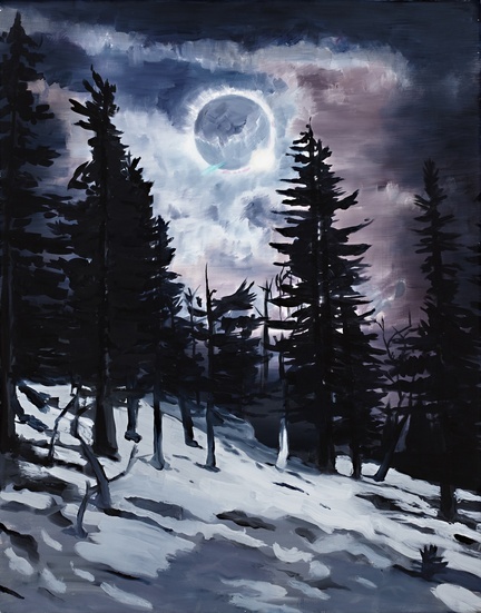
It is a warm humid day in Sydney. The sun streams down from a vivid blue sky.

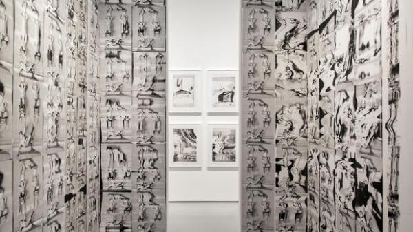
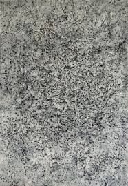
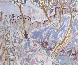
Carriageworks offers an amazing visual space.  Its vastness and clear panels of roofing create a mobile tableau of lights and darks. The walls have been preserved, or rather paused in their process of decay.  Rust gathers along the chrome yellow girders, No L 64, high above the floor level, announces LOADING TO EXCEED 10 TONS.  This girder, its depth and solidity, anchors one end of the building. Two smart-looking fellows are perched at tables, staring at computer screens.  Cutlery gleams inside shiny tin cans.  The napkins are made of brown heavy paper. Light illuminates brick-red pipes which support interior lights.

girders1

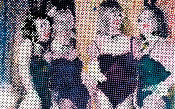
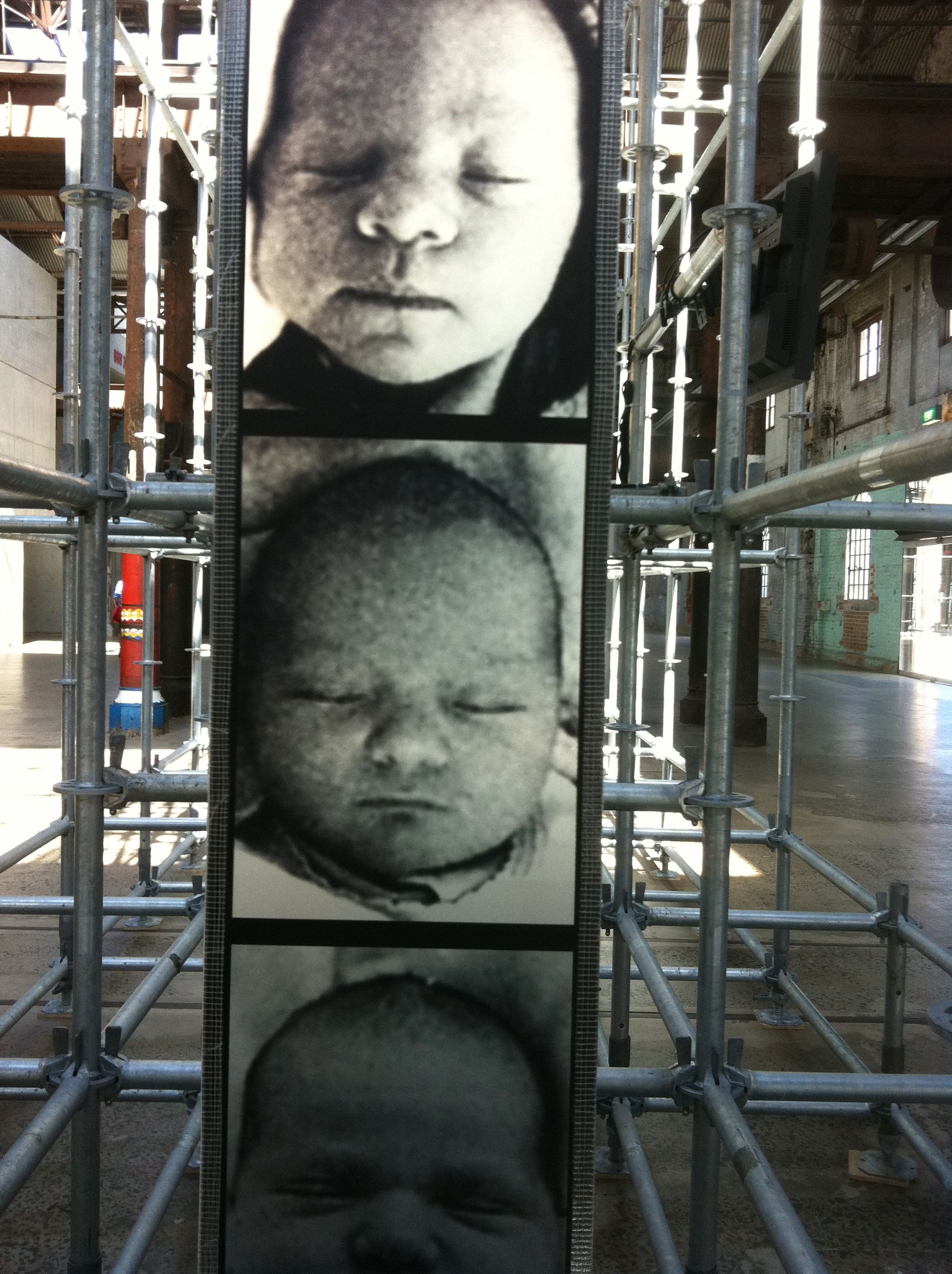
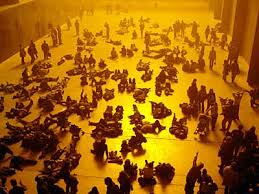
Boltanski’s gigantic work Wheel of Fortune is easily contained here. Sunlight illuminates the bright silver scaffolding, eight metres high, weighing twenty tons. Its intricate assembly creates a layered perspective through which the endless line of enlarged black and white images of newborn baby faces pass.  They move at a steady pace, until a bell rings and the loop of grainy images comes to a halt, the camera capturing one child’s face which is displayed on a screen.

heads reverse

These are photos of newborn babies, taken from the birth announcements of Polish newspapers.  They could be from any age, any place.  Seeing them at the far end of the installation, they are now reversed.  It makes no difference. The intent behind the display is simple: all people are the product of a chance moment, of the specific moment when their parents made love; had it been before then, or afterwards, each person would have been different.  A technical and temporal flash creates us all in our apparent difference and uniqueness.

An employee has to be present at all times to make sure that the machinery governing the movement of images through the vast scaffolding is not interrupted by some mechanical failure. When after the first installation it proved too hot for the glue holding the screen of images together it was necessary to find skilled artisans with large machines able to sew the canvas materials on which the images were printed together (personal communication, staff member, February 2014).

faces1


At each end of the piece, the second element of the exhibit is located high above the heads of the viewers. Last News from Humans displays two digital tallies in real time showing births and deaths around the globe.  The yellow/green shows the number of births, the red the number of deaths. Through the flashing lights we see how quickly lives are created and end.

green nos red nos

It’s sobering to consider the discrepancy between the numbers being born and the numbers dying. At the time of my viewing, 176,000 were born and a mere 66,000 died – or had died at some specific time, although this was not well explained.  My immediate thought:  more people should die. I mention this to the young man overseeing the operation of the machinery.  He seems shocked.  We are supposed to think that fewer people should be born.  There are deep existential and philosophical issues here.

To one side is the third part of the exhibit, Be New. This consists of three disparate photographic sequences, images of the Polish newborns intercut with images of deceased elderly Swiss people.  The latter images came from another Boltanski installation. There are potentially 1.5 million combinations from the three segments.  The viewer presses a button and produces a new human face. This is meant to remind us that we are all composites of our ancestors.


I get this exhibit, in a way I hadn’t expected.  It is disturbing and beautiful at the same time.  But it is also quite banal.  It looks “lovely” in this space, but that’s largely due to the space itself.  The aesthetic pleasure offered by the walls is stunning.

wall1


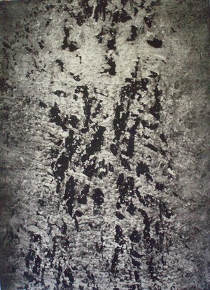
Cross-hatched concrete fills in corners; white brick is rubbed back and scrabbled over with dirt and rust. This is a real monument to generations past – to a lost way of life, a time when human labour alone created spaces like this with real human muscles, sweat, blood and optimism. The net of connections across the state of NSW depended on this place, without it there would have been no railways. I find this thought far more compelling than pondering Boltanski’s anonymous Polish babies.

His sensibility is that of old Europe. There is a place for that, and we should be reminded.  But we are in the south, the humid air of the Pacific washes through the doors, the sun shines. There are definitely too many people in the world, and yes, chance seems to allocate some to here and some to there, a process which is truly “random”.  It is true we would be different – a bit different – if our parents had carried out the reproductive act at a different moment.  Would that matter?  Larger, more urgent, questions seem occluded or disguised by this seemingly philosophical work.  The focus on the individual – on the idea of being “somebody” – pushes the broader historical and political issues aside.  Boltanski’s entire oeuvre has been obsessed with memory and the traumatic residues of twentieth century history. Questions of human existence explored through a post-Holocaust aesthetics may seem at one level to be an ethical stance, but where can it go from here?  Boltanski’s installation is surprising and strangely beautiful, but it made me think far more about why we have no properly functioning railways any more, a question of huge political and ecological significance for the future of this beautiful land, which could provide the basis for a more relevant work of art. This calls for a form of ethical judgment which takes into account the broader role of art. As Nowak comments:

…judgment in general should be understood as intrinsic to the task of art criticism. I argue that judgment is under-theorized in contemporary visual art critical circles and that the ethical judgment of art is of particular importance. My position is something of a departure from dominant understandings of judgment in these circles, for since the end of modernism, judgment (of whatever type) has been widely held to be either outmoded or inappropriate. (Nowak, 2012, p. 8).

Work such as Boltanski’s pushes the viewer directly into a world where judgment is invoked and ethical perspectives are invited.  For this we should be grateful, while recognising that there are historical and cultural factors requiring urgent consideration of the role and value of art today.

References

Boltanski, Christian with Catherine Grenier, 2009.  The Possible Life of Christian Boltanski. 1st ed. US: MFA Publications.

Boltanski, Luc, 1999. Distant Suffering: Morality, Media and Politics.  1st ed. New York: Cambridge University press. First published as La Souffrance a Distance, 1993, Paris: Editions Metaille)

Boltanski, Luc with Chiapello (Ève), 2005. The New Spirit of Capitalism, London/New York, Verso.

Boltanksi, Luc. 2011. Une étude en noir. Tracés. Review des Sciences Humaines, 20, 2011.  On Line 16 May 2013. http://traces.revues.org/5049. [Accessed 1st March 2014].

Borger, Irene and Christian Boltanski. 1988/1989. Interview.  Bomb, 26, 22-27.

Charlesworth, J. J., 2012.  Boltanski. Art Review, 56, 52.

Fox, Gerald (Dir). 1988. An Exploration of Art on Film.  English, Pal, VHS.

Franzke, A. n.d. Christian Boltanski. Artist biography. Tate Modern.

http://www.tate.org.uk/art/artists/christian-boltanski-2305

[Accessed 15 Feb 2014].

Nowak, Jolanta, 2012. Judgment, Justice and Art Criticism. Contemporary Aesthetics,10, 8.

Solomon-Godeau, Abigail, 1998. Mourning or Melancholia: Christian Boltanski’s Missing House. Oxford Art Journal,21, 2, 20.

 Catalogue Essays:

Christian Boltanksi, 1978. Reconstitution. Exhibition Catalogue, ed. A. Franzke and M. Schwarz, Karlsuhe, Bad. Kstver.

Christian Boltanksi, 1984. Exhibition Catalogue, Ed. B. Blistene, Paris, Pompidou,

Christian Boltanski: Lessons of Darkness, 1985.  Exhibition Catalogue, Ed. L. Gumpert and M. J. Jacob; Chicago Ill: Museum of Contemporary Art.

Photographs: All photographs taken by Annette Hamilton at Carriageworks February 2014 unless otherwise credited.

[1]  The casting of doubt in artistic works is highly characteristic of many forms of art in the late twentieth century, often with reference to the Holocaust and its aftermath.  In literature an outstanding example is the long writing – novel, memoir, fantasy? – Austerlitz, by W. G. Sebald (2001).  In Austerlitz, Sebald not only writes about somebody who might or might not exist telling the story of someone else who might or might not exist, he presents series of photographs which the reader is invited to take as visual evidence of the “truth” of his narrative, even though the source of the photographs is unacknowledged. This profound unsettling of the boundaries between “truth” and its representation is very evident in Boltanski’s work, as is clearly evident in his strange insistence on obscuring his own identity and taking on guises such as “the Preacher”.

[2] This tendency to self-mystification, or at least to obscuring elements of biography, contrasts with the usual pattern of self-disclosure common among fiction writers and poets.  The insistence by “the public” on knowing everything about their artistic heroes does not recognise the legitimacy of such distinctions.

[3] His self-construction wavers but he often claims the conditions of Nazi occupation in Paris as a source of his artistic themes. In conversation with David Walsh, owner of Museum of Contemporary art in Tasmania, he spoke of himself as “a sort of survivor”.  He describes how his Catholic mother hid his Jewish father under the floorboards although this feels as if it could be an apocryphal story. See http://www.au.timeout.com/sydney/art/features/12957/christian-boltanski-on-chance


Elisabeth Cummings: Slow Art

DSC00206

 [Photograph:  Annette Hamilton 2012]

 Elisabeth Cummings (b. 1934) is not well-known among the general art-going public.  She has been devoted to her art practice, mostly painting, for over fifty years.  Few of her works appear in any public gallery collections in Australia.  Based in Sydney and its bushland outskirts, she has travelled and painted in outback towns and in remote Western and Southern Australia.  In 1996 she was given a survey exhibition by the Campbelltown City Bicentennial Art Gallery, but at that time she had only one painting in the collection of the Art Gallery of NSW, while one work in the National Gallery of Australia had been transferred to Artbank. Nothing had changed six years later.  Recently her work has been receiving more recognition.  Several smaller public collections hold paintings, and she is increasingly sought by avid collectors. She has won a number of prizes, and recognition of her importance as an Australian landscape painter has grown.  The 2002 Art Collector Magazine list placed her in the 50 most collectible Australian artists.

In 2012 she received a major survey exhibition at the S. H. Ervin Gallery titled Luminous: The Landscapes of Elisabeth Cummings.  One of her largest works, Edge of the Simpson Desert, was a highlight of the show.

 Image

Edge of the Simpson Desert, 2011.  Oil on canvas, 175 x 301 Private Collection

 This is hardly conventional landscape art.  It is edgy, figurative only in places, filled with spaces and lines which demand patient scrutiny before the forms reveal themselves. It is something like Slow Food.  Hers is a slow art: slow to be painted, and calling for close engagement and patient appreciation from the viewer.  She works with the local, and paints where she is.  Whether travelling through the remote deserts or sitting on her verandah in her studio at Wedderburn, or inside with the light pouring on the mud-brick walls, her faithful black dog at her feet, Cummings is resolutely there in the moment.

Image

Inside the Studio.  Photograph: Annette Hamilton 2012

 She has been called The Invisible Woman of Australian Art (Frost 2002).  But she doesn’t really care about visibility, or profile, or her “career”.  Now in her late seventies, she continues to work and live as she has always done.  She paints, and teaches these days in the occasional workshop (see for example Champion 2012).  She hates being interviewed especially about her personal life.  One journalist from the Sydney Morning Herald insisted on an interview while she was confined to a wheelchair following an operation on her right ankle. He tried to force her to reveal elements of her emotional life, on the grounds that this is  “the fundamental raison d’etre of any artist”. She found this an absurd proposition, and managed to be so unpleasant to him that he left with his irrelevant curiosity unsatisfied (personal communication, and see Meacham 2012).  Cummings is the last person to want to be a celebrity, although she has many close friends in the art world and always has invitations and events to participate in, if she wants to.  But she likes a quiet life, and loves her “bit of bush”, even while mourning the fact that it is being encroached on by the endless march of suburbia.

Image

Sydney Morning Herald art critic John McDonald has been one of the few vocal supporters.  In Art Essays, January 21 2012, he pleaded that a new show from the National Gallery of Australia of landscapes to be held at the Royal Academy London should include those artists who are making an outstanding contribution to Australian landscape art today, the foremost of whom is Cummings.  He deplores the short-sightedness of Australian public collections.

“While galleries have been queuing up to buy works by a handful of fashionable artists, they have treated landscape painting as if it were a purely historical phenomenon.” (McDonald 2012)

Cummings herself has nothing to say about the “fashionable” contemporary arts. Her positive frame of mind does not dwell on endless comparisons or bother to condemn the fetishization of certain forms of current art-making and the implicit rejection of the unfashionable genres.

An excellent video interview in Wedderburn, with Peter Pinson, puts a frame around many elements of her life and art (Pinson 2012).  Her father was an architect (as is her son now) and her family supported her interest in art as a profession – unusual for a woman in those days.  She attended the National Art School in Sydney, and won a Travelling Scholarship in 1958 which allowed her to spend time in Europe, staying in a villa with friends near Florence.  In 1961 she studied under Oskar Kokoschka, a late German expressionist associated with Egon Schiele and Gustav Klimt.  Kokoschka established his “School of Seeing” at the Internationale Sommerakademie für Bildende Kunst in Salzburg, thus re-establishing his ties with the Austrian milieu in which he began his career, and Cummings was able to spend time there exploring the highly distinctive, and disturbing, post war European sensibility.

Image

Oskar Kokoschka.  Bodegon with Affair and Rabbit.  161 x 118.  1914.   www.wikipaintings.org

Cummings is often referred to as “reclusive” (Frost 2002).  Her Wedderburn studio is the site of an artists’ community established in the early 1970s.  Two of its founders died in 2013, Roy Jackson of cancer in July,  John Peart in October, a sudden and wholly unexpected death at the age of only 67. Other artists who have worked and lived there include Joan Brassil, Sy Archer and David Fairbairn.  A strong community living on land donated by art lovers Barbara and Nick Romalis in the 1970s, the Wedderburn artists’ “colony” continues to offer a refuge and resource almost unique in contemporary Australia.

In the bushfires of 1994 Cummings lost her studio, a blow which might have stopped a lesser person.  But she soon built a bigger and better structure which served as both studio and home.  The house and bushland around often apear in her work,  as though the whole life-space is part of a continuous still-life.

Her large oils are notable for their heavily worked surfaces and colouring surprises.  They offer secrets:  spend enough time with them, and there is the reveal. The forms of the natural world appear through the scraping and marks on her surfaces.  Her palettes seem tasty.  Some, especially those reflecting the bushland around Wedderburn, are full of delicious soft pales and shadowy greens and browns. Others, in remote and outback places, are bright and hot, like a hit of chili and vinegar.

She isn’t immediate, or obvious.  Comparing her visual impact with another little known but successful Australian landscape painter, Jason Benjamin, we see two aspects of the Australian heritage.

Image

Jason Benjamin.  This is Love.  Oil, 434 x 291.  www. Artistsandart.org

Benjamin works on a vast scale with immediately recognisable subjects, in a style securely located in European classicism (albeit with a strange surrealist quality).  Cummings, on the other hand, hovers between the gestural demands of post-war European modernism and the meditative mysteries of the Australian vision imprinted with an Asian sensibility.  There is Ian Fairweather in her slippery calligraphic marks, and Fred Williams in her itchy surfaces.

Image

Ian Fairweather.  Outside the Walls of Peking, 1935.  Oil and pencil on board, 49 x 57 cm.  Private collection, Perth.

Cummings has long been represented by King Street Galleries, now in William Street Sydney.  She feels strong loyalty to the gallery, which has supported her work with well-mounted shows for decades (personal communication, February 2012). She has exhibited in some competitions and group shows, but most of her professional output has been sold through the gallery. Current listings at King Street have some of her recent works available, for instance Sir John Gorge Mornington, 2013, oil on canvas, 135 x 150;  $48,000.  The recent oils are quiet reflections on landscapes visited in the past.  A beautifully delicate work, The Pink Outcrop, 213, 105 x 130, presents a lyrical pastel shaded landscape, tender and responsive.  It sold for $35,000.

Image

Photograph: King Street Galleries.

Her works from the middle 2000s show a strong sense of line and composition.  Studio in the Bush (2006), 115 c 130, is a striking work based on her perception of the context of her life-space at Wedderburn. Journey Through the Studio (2004), 150 x 300, likewise offers a stunning meditation on the process of inhabiting the artist’s world, with its red and orange cadmium hues, the outline painting of a dog in the foreground, and the heavy dark wood-stove at the lower right.  A strangely disturbing painting, it repays long scrutiny and engagement.

Image

Journey Through the Studio (2004), 150 x 300. Photograph:  King Street Gallery

Cummings also works in prints and etchings.  Her 2009 Hill End Glimpses is an artful tracery with several images seemingly hidden in the surface busyness.  A woman stands, washing her hair.  Two dogs trot along in the foreground.  A large bird perches on a fence.  Another woman lies reclining, perhaps in her sleeping bag.  The square dark building with its enigmatic figure at the opening could be anything: a shed, or a house, or a storeroom.  These are the painters, on their plein air excursion, taking the measure of the town of Hill End, made famous by the paintings of Russell Drysdale, John Olsen and others (see Australian Government, Hill End painters, n.d).

Image

Hill End Glimpses. 2009. Etching, set of 25.  Image: King Street Gallery.

Arkaroola Landscape (coloured etching, 2005) uses a limited, traditional desert yellow to great effect. This remarkable piece was not hung in the Wynne Prize to which it was submitted that year, but towered over the other works in the Salon des Réfusés (McDonald 2012). Flinder’s Farm depicts the overwhelming quality of the semi-desert landscape and the futility of human efforts to farm there.

Image

Flinder’s Farm.  Coloured Etching 2009.  Photograph: King Street Galleries

 She speaks more about her etching and print-making in an interview, during a residency at COFA and work with Cicada Press (Butler, 2012).

She is always seeking new inspiration.  Recently she has spent periods in India, working with children in a remote village, offering informal art training.  She seems to accept no limitations: age, physical health, the effects of arthritis, the death of her close friends – she dwells in an intensely felt but manageable world, living through her own time and in her own places, which you can share through her art, if you so choose.  What a privilege that is.

Image

Real Still Life in the Studio.  Photograph: Annette Hamilton 2012.


References

Australian Government.  Australian Stories.  Hill End painters – Donald Friend, Russell Drysdale, John Olsen, Margaret Olley and their legacy.

http://australia.gov.au/about-australia/australian-story/hill-end-painters

[Accessed 22nd February 2014].

Butler, Angela.  Interview: Elisabeth Cummings. November 27, 2012.

http://cicadapress.wordpress.com/2012/11/27/interview-elisabeth-cummings/

Champion, Stephanie.  Pushing the boundaries with Elisabeth Cummings. http://www.bluebanksia.com/artworkshop-reviews/168-review-elisabeth-cummings.html) [Accessed 22nd February 2014).

Frost, Andrew.  Elisabeth Cummings: The Invisible Woman of Australian Art.  Art Collector.  Issue 22, October-December 2002.

http://www.artcollector.net.au/ElisabethCummingsTheInvisibleWomanofAustralianArt. [Accessed 20 February 2014].

McDonald, John. Elizabeth Cummings. Art Essays, January 21 2012.

http://johnmcdonald.net.au/2012/elisabeth-cummings/#sthash.14IbTk1z.dpuf [Accessed 22 February 2014].

Meachem, Steve.  Landscapes and private views.  Sydney Morning Herald, January 4, 2012.  http://www.smh.com.au/entertainment/art-and-design/landscapes-and-private-views-20120104-1pl1i.html

[Accessed 22nd February 2014).

Pinson, Peter.  Peter Pinson Interviews Elisabeth Cummings. Wedderburn, February 2013. http://www.cultconv.com/Conversations/Cummings_Elisabeth/HTML5/testimonybrowser.html [Accessed 21st February 2014].

The New Shock of the New

THE NEW SHOCK OF THE NEW

robert hughes b and w

Robert Hughes, eminent Sydney-born art critic, published his highly acclaimed book The Shock of the New in 1980. His longstanding position as art critic with TIME magazine gave him unprecedented access to artists around the world.  His criticism was often contentious and he was viewed as a “conservative”, although he had no particular philosophical axes to grind. In this DVD, he offers a revaluation of what has happened to both “shock” and “newness” since that time.  You can view the video at:

http://art.docuwat.ch/videos/the-shock-of-the-new/the-shock-of-the-new-09-the-new-shock-of-the-new/?channel_id=0

Hughes died at age 74 in New York in 2012 after a series of tragic events including a terrible car accident in Western Australia, which resulted in serious injury to Hughes and the three young men in the other car, and a court case.  It seemed Hughes’ position as an expatriate Australian and a high profile intellectual were enough to make the Australian press furious and accusatory. Details about the accident and the case are contained in the interview with Jana Wendt here:

http://sgp1.paddington.ninemsn.com.au/sunday/cover_stories/transcript_1445.asp

No doubt this terrible experience sharpened his perceptions and focussed his mind on issues of Being, life and death, and the moral obligations of the artist.

It is clear from the way this video is constructed, and from many of his interview questions, that he regarded much of the work of the contemporary art world darlings as a degradation of art, aimed at making the artist into a marketable commercial celebrity.  The kind of “shock” the art world produces today is mostly absurd, ugly and pointless, from his point of view.  He gives fascinating examples through interviews with stellar figures in today’s art world – Jeff Koons for one – and then offers examples of contemporary artists who in his view carry on the essential virtues of art.

His interview with Jeff Koons is really brilliant.  What comes through so strongly is that Hughes is teasing or sending up Koons,  who, in his well-tailored suit, is so sure of his own significance that he doesn’t realise it.  Hughes draws attention to the fact that Koons regards himself as a direct descendant, or perhaps even reincarnation, of Michelangelo, and looks at his Pieta-like sculpture of Michael Jackson with a very jaundiced eye.  I found this sculpture actually quite fascinating, and not horrible at all, although a lot of Koons’ work does seem to me trite, overblown and ridiculously overvalued.

Jeff Koons Pieta

Some of the other artists he considered included the little-known Paula Rego, b. 1935 in Portugal, whose brilliant disturbing images seem rich with narrative and engagement in a scarily familiar universe.  The idea of a “discreet undermining” and the confessional/psychiatric tone of her work opens a different kind of viewing. The violence of folk tales and the terrors of childhood, the truth of families and the fear of never knowing what is under the bed (a pig, in one case!) envelop her works.  Her work is political, traversing the line between private conscience and public responsibility.  Her paintings especially of the 80s and 90s seem to some degree close to Lucien Freud’s, but I see her real affinities to be with the German figurative post-socialist Neo Rauch.  She is a very fine painter technically, her figure work and composition is outstanding.  It is clear why Hughes would want to contrast her with the vapid posturing of the Britpack artists; on any measure she is so much the better artist, yet she has been almost entirely “off the radar”.  Her images are too deep, her vision too disturbing, and she is a figurative painter and a woman.  At least three strikes against her.

Below:  Celestina’s House.  2000-2001.  Pastel on Paper: 200 x 240 cms.  Look closely at the details of this amazing work, go to:  http://www.saatchigallery.com/artists/artpages/rego_paula_celestina_house.htm

celestinas house

Other painters discussed by Hughes included Anselm Kiefer.  Another political artist, it is much clearer to see his politics than in the case of Paula Rego.  One work discussed, Den Goldenen Haar Margarethe, is based on the poem by Paul Celan, Death Fugue,  which includes reflection on the phrase in the poem “Death is a master from Germany”. The inmates of the death camps will rise as smoke and their graves will be in the clouds.  The lines are:

He calls out more sweetly play death death is a master from Germany

he calls out more darkly now stroke your strings then as smoke you will rise into air

then a grave you will have in the clouds there one lies unconfined.

For the full poem, see:

http://www.english.txstate.edu/cohen_p/postmodern/Literature/Celan/Hamburger.html

kiefer-dein-goldenes-haar-margarethe

Kiefer’s painted images are dense and complex.  In many of his paintings he seems determined to pull the viewer into the recognition of perspective, even if it is only of railway tracks heading for the death camp, or some empty barracks stretching to the horizon.  Kiefer and Rego represent the need for an art which refutes the sterile irony of contemporary representation and asserts the primacy of a moral imagination.

Kiefer railway

Other better known artists discussed include Lucien Freud and David Hockney. I enjoyed these discussions less than the earlier ones, and felt Hughes himself had been drawn into a kind of hero worship. It was particularly odd to me that he went on to include such a long discussion of Sean Scully.  Scully is an Irish-born New York based printmaker and artist working from a downtown studio.  He has been nominated for the Turner Prize, and has had exhibitions all over the world, including in Australia.  Best known for his huge abstract colour field images he seems to me a kind of overblown Mondrian.  For his exhibition Colour of Light at the National Gallery in Canberra in 2004, he was quoted as saying of his paintings:

There’s a lot of physical force to them, a lot of tactile sexual energy, a lot of sensuality.  But there’s a lot of uncertainty about what the relationship between the parts actually means and I think that that’s a very important aspect of my work. I mean if I have to choose a course between Puritanism and extreme romanticism, I think it’s clear than I’m going to choose extreme romanticism. But I think what I can contribute is something that has both in it, something that has the possibility of both in it, and it’s that extreme stretch that I want to try to achieve in my work. That’s my ambition.

http://nga.gov.au/Exhibition/Scully/Default.cfm

Sean Scully 1

Scully seems to be well-regarded by fellow Irish expatriates and admirers, but the case for his art seems much less strong than that of others in this discussion.  What Hughes liked about it was the sense that it was meditative and contemplative, with its opaque and stone-like surfaces, density and lack of space.  His art looks like architecture, Hughes asserts. Without standing in the same space with these gigantic works, it is almost impossible to grasp them.  Yet, with a Rothko, you can look at almost any reproduction of one of his colour field paintings and feel immediately what it is doing, how it is drawing you in, what it means to think about meditation and contemplation.  To some degree this is true even of the great “black” paintings in the Rothko Chapel, Houston, although to see any image of them is nothing like standing or better still sitting in that mystical space and watching the apparently black surfaces begin to breathe, move and emanate the life force.

Rothko_Chapel_1

Hughes closes his revaluation with some very strange remarks, as if someone scripting his show has insisted that he make some comments on very banal and boring issues.  Can Art create Revolution?  Or just social change?  Is it enough to be “beautiful”?  Do people need beauty?  Are Museums (Art Galleries) the new Cathedrals?  Closing with images of the Weather Project in the Tate Modern, the suggestion that this represents a new Sun God worshipped by art lovers below seemed tacky and almost stupid.

weather project Tate Modern

I felt deeply sorry for Robert Hughes by the end of this show.  One of the greatest art critics of his era, a highly individualistic and sensitive man, Hughes seemed to be struggling against the very forces which he was condemning at the beginning of the film.  It would be so interesting to have a documentary showing the “behind the scenes” of the making of the New Shock of the New.  It might even be very shocking.