All posts by annettehamilton82

After life as an anthropologist, including years of fieldwork in remote Australia and Southeast Asia, I am now working on painting, photography, art and cinema and publishing fiction, memoir and children's stories. I spend most of my time in the Blue Mountains west of Sydney and at a house on the Hawkesbury River, where my family has lived since 1923.

Ryan Hoffman Paintings: “Third Person”

Ryan Hoffmann:  Liverpool St Gallery Sydney 11th August – 3rd September

Ryan Hoffmann is a young artist from Sydney’s National Art School, one among few to have been given a solo show in a reputable gallery while completing his Masters of Fine Arts degree.

There has been a buzz around Hoffmann for some time, and this show gives him an opportunity to demonstrate why. It doesn’t entirely succeed although the concept is great. But the “hang” and the lack of documentation are a problem. Most pictures in gallery shows exist in their own right, each with its unique qualities, capable of standing alone. Hoffman’s are part of a larger vision and the viewer needs to know more about how they relate to each other and we should care about them.

As pictures they are of varying quality. Overall they seem barely painted, more like gestures, although they look much stronger as photographs for example on the gallery website. The images are thrown together on varying supports, some very small. The smaller paintings are no better resolved than the larger ones, if anything they are even more random and sketchy.

The gallery wall is covered with what looks like cloth or paper or maybe paint in a vague wash of pastel colours. Most of the paintings are hung close together in what seems to be a random array, large and small, bright and monochrome, square and rectangular. A few of the larger paintings – the “hero” pieces- occupy spaces of their own and two of these are especially striking (more on this later). Art lovers like to see paintings in a show as separate entities, each existing in its own terms, able to be translated to a different space, for example to a wall at home or in an office. Diptychs or triptychs are fine, creating a single visual statement, but otherwise each painting is seen as its own entity. Are these images telling a story? Is there something we should know but haven’t been told? Well yes there is, and it is quite complicated.

Installation, Liverpool St Gallery

Hoffman has exhibited these, or related, paintings in at least two previous shows.  While Artist in Residence at the Glasgow Art School earlier in 2015 he offered a similar show with more paintings, at least fifty.  Some of them, many in fact, are also being shown here.  The concept for the hang was the same: a single wall, a lot of pictures jammed up together in seemingly random order.

Later, in a show called RREALITY PROJECTIONS, part of the requirements for the MFA at Sydney’s National Art School, the same layout includes many of the same paintings. An exegesis accompanied the show, called “Readymade digital photographs: Virtual reality as autobiography”.

The show is engaged with digital photography, and is telling a kind of autobiographical story. This story can be told in many ways. No images take any particular priority, they can be arranged in any order. They are not art photography but the kind of images which everyone now shoots on their phone. If they bother downloading the images at all they can rearrange them in any order, make new “albums” from them, send them round the world in various forms, pin them on Pinterest, send them to their Instagram account. These seem to be paintings of casual snapshots on the digital device, to be treated in the same random way.

NAS final show

Ryan Hoffmann, RREALITY PROJECTIONS (exhibited as a requirement of a MFA at the Nation Art School accompanying the exegesis ‘Readymade digital photographs: Virtual reality as autobiography’ )  room #2, 2015; oil on linen; dimensions variable (Photo courtesy of Peter Morgan).

Earlier still a show called The Inter Galactic Image Factory at Liverpool Street brought together four of the NAS 2014 cohort including Hoffmann (with Seth Birchall, Mason Kimber and Conor O’Shea). Hoffmann’s paintings in this show are different to those in the later shows but clearly show the same impulse. An artist’s statement appears on Hoffmann’s website which explicitly connects his practice to the use of smart technologies and the Internet. While this statement is in a rather tortured form, it illuminates what this work is about.

Images are now simultaneously representing, existing and omnipresent as a form of “virtual reality”. 
By regarding the digital image as a form of readymade imbued by its time, place, culture, Hoffmann’s practice investigates the potential for a new paradigm in painting which courts a contest between photographic representation and painterly application. Through the negation of linearity and hierarchy in subject, Hoffmann locates images in painting from this “virtual reality” to form an autobiography. 

And so we see that, without explicit reference, Hoffmann is in Gerhard Richter territory, struggling with the same issues about reality, image, painting and autobiography, now in the digital age.

It would have benefited the Liverpool St show if something to this effect had been made available in the catalogue or on the wall. There is an argument against spoon-feeding the art public but in a case like this the “sense” of the work shifts into a radically new position when it becomes clear that we are looking at deliberate engagement with a specific problem in contemporary representation. There is a difficulty with work which lives on the border between commercial art practice and art theory: how to connect the results of such a practice with the conventions of the art-buying public. Around less than half of these works had been purchased in the first two weeks of the show. Some were the smallest works, barely sketches, priced very modestly. The others were the strongest and generally the most “stand-alone” pictures in the show, with the very strange exception of the main hero-piece, “Penumbra”, which in spite of its striking qualities and painterly aesthetic had not been snapped up.

Penumbra. Oil, polyester, wood and copper.99 x 78 cm

 Penumbra, 2015, oil on polyester canvas, 90 x 78 cms

 By far the most effective works for me were those expressing the manifold possibilities of semi-monochrome. Small works such as Alpine Resort shine with hidden depths as, on the very small canvas lights beam out in pale reflection.

Alpine Resort 2015

Alpine Resort, 2015, oil on linen, 30.5 x 35.5 cm

 Some of the most interesting works feature grids and shadows on windows, or views through windows into empty spaces. In the relatively large-scale I forget where we were there is the sense of the sudden experience of light and dark which opens up to an unexpected which could be anywhere.

I forget where we were I forget where we were, 2015, oil on canvas, 63 x 138cm

In the tiny very sketchy Passing the viewer looks out of a window at a building in a snowy landscape. Inside, there is a sense of enclosure or capture, but also a feeling of relief at being safely in an interior while the outer world is unknown.

Passing 2014

Passing, 2014,oil on polyester canvas, 26 x 31 cm

One of the most effective pieces in the show is the graceful, well-balanced landscape Tracks. The eye moves between the snowy peak on the horizon and the network of traces proceeding from the viewer’s position into the distance. The trees form a kind of entryway into the mid-distance, where the traces disappear. The absence of human figures is contradicted by their presence, the landscape could not look like this had they not been there but now they are evacuated. The subtle colouration in this painting is picked up clearly in photographs although in bright sunlight on the gallery wall it is much harder to discern.

Tracks 2015

Tracks, 2015 oii on canvas, 94.5 x 115cm

Among the numerous small pictures are several sketches which suggest the reality of a journey which could be universal, any airplane, any seat, any destination. The composition in Untitled is very powerful but on such a small scale and with so little depth on the canvas it is hard to feel engaged. If this was a painting on a much larger scale – one which emphasised the abstract aesthetics of these moments of everyday life – it would be extremely effective. As it is, it is easily overlooked.

Untitled 2015

Untitled, 2015, oil on polyester canvas 61 x 89cm

Another striking image is offered in Sniper. In earlier work Hoffman clearly reflects on military themes. But this sniper might not be military. He (or at a pinch it could be a she) is sighting down the barrel at an unknown target: it could be people coming out of a picture theatre or some other expression of the random mayhem in the contemporary world. The thin vagueness of the paint and the limited use of tone and colour in this little picture makes it particularly effective.

Sniper 2015

Untitled (Sniper), 2015oil on linen43 x 56cm

This brings us to the key issue of whether the conceptual qualities of this work can engage with the commercial market. The ideas behind the project are compelling, but the images need to be able to stand alone, unless of course someone chooses to purchase the entire suite of works, which would make best use of them. Many seem to be barely painted, which creates an interesting quality at one level but is not what the art buyer is accustomed to. Hoffmann has a lot of raw talent and strong presence on the wall but the work needs to be re-oriented or harnessed differently if it is to move forward into the fraught terrain of post-art school life.

Anne Judell “Void” – Review.

Anne Judell. “Void”. Janet Clayton Gallery, 2 Danks St. Waterloo NSW 2017. 10th September-4th October 2014.

Anne Judell Void 2


Anne Judell is a quiet presence in Australian visual arts. Her public profile and challenging works are seldom out front in the hurly-burley of the contemporary art scene. Even those who deeply appreciate her achievements struggle to articulate what it is that compels and enchants them.

Her recent exhibition at Janet Clayton Danks St gives a glimpse of her subtle technique and surprising mark-making. Yes, these are “drawings”, but not in any ordinary sense. Two forms of vision are offered. Layers of pale pastel on Canson paper create an effect which seems to hover at a microscopic level while expanding into universality. These pastel works are small in size and mounted in white frames, so they seem to blend into the wall-space. The mixed media works on Hahnemuhle paper are loosely attached, the heavy paper slightly curved in places, creating shadows and depth behind the work itself. The pastels are profoundly dense and subtle, calming; the mixed-media pieces, constructed mainly in multiple dark and light tones, demand a different kind of attention. These works use acrylic, pastel, charcoal and gesso, worked deftly and pushed repeatedly into the surface of the paper. (Above, Left: Void 2). Judell has said:

 I spend half my life closely observing the natural world. The other half I spend in the studio, attempting to translate this experience into two-dimensional form. I am always drawn to the minutiae exposing the evolution of form. Fragility, intimacy, cycles and sequences are what interest me, as opposed to the heroic and the sublime. (Judell 2005).

Judell’s work requires time: time to produce, and time to view, to sit with it quietly and let the subtle effects engage your consciousness. A somewhat noisy gallery is probably not ideal. The initial impression can be puzzling. What are we looking at here? A comment by Stella Rosa McDonald is offered to gallery visitors. She speaks of comparisons and similes, suggesting that Judell may have “figured out how to hit pause on the universe”. A lengthy interpretive essay by Luke Davies goes straight to quantum physics and Heisenberg’s uncertainty principle, seeing Judell’s work as embracing a negative capability, a border-zone between abstract and figurative, the felt and the known, the seen and the heard, the physical and emotional. Davies speaks of meditation and trance, suggesting that her work offers “portals” into another frame of experience, between “outward expansion and inner compression”.

These are strange claims for works created in small scale on paper. Such works are often associated with a feminine delicacy, and certainly Judell refuses the usual apparatus of heroic masculine art. Yet this work is far from gentle or decorative. The mixed media works have something of the visual impact of the older indigenous desert women’s dot paintings, without the colour field. Designs and suggestive associations emerge from dense marks which offer many possibilities. Nos 18 and 19 especially have an animal quality, reminiscent of fur or scales. Others might be reflections of the surfaces of tree-bark or the earth itself. Strong, deep shapes emerge without warning. Paleness, greyness, hints of blue, dark stripes in stipples, “Glory be to God for dappled things” (Gerard Manly Hopkins). We could be traversing roads, mountains, depths of earth, the night sky, the infinite universe, maybe even the reflection of stars in different galaxies of darkness.

Anne Judell Void 1

And there is the “thump” of Rothko, especially the Houston chapel works. It may seem an odd comparison, the grandeur of Rothko’s huge paintings and these seemingly modest works on paper. But in both cases the longer you view the more a sense of shimmering depths and a shuddering emerges, almost as if we are at the edge of emergent Being itself.


Anne Judell, Void 1.

The title of the show, “Void”, points directly towards this philosophical realm. More than just a cute title, the idea of the Void has been emerging recently into a new significance for metaphysics, artistic and creative expression, and in scientific debate around the nature of human experience. The idea of the Void is usually seen as a manifestation of nothingness, associated with the contemplation of emptiness. An awareness of a void at the centre of phenomenal existence has long been central to Asian metaphysical traditions. In the Heart Sutra, “form is emptiness and emptiness is form”. The idea points towards an apprehension of a whole reality, before it is sliced up into concepts, especially via the effects of language. Yet the Void also points to a presence, rather than a lack of it, involving particles and antiparticles erupting into being, a constant hidden dimension of which we are usually unaware. Artists have tried to point in this direction: Alberto Giacometti’s Hands Holding the Void (Invisible Object) 1934 was an early example, while Yves Klein’s Leap into the Void 1960 tried to capture the sense of something in nothingness as the human body engages with space and gravity.

Recent research at the University of Ljublana, Slovenia brings together the need to redefine the problem of the Void, in particular the idea of the generation of “something” and ultimately of Being and the universe. Empty space, it turns out, is not empty but the seat of the most violent physics. The theory of relativity and quantum field theory have altered our understanding of the fabric of physical reality, in which the void becomes the key element in the structural functioning of existence itself. Heidegger, in his essay “The Thing” (Das Ding) poses the void as the deep essence of thing, as opposed to its manifestation in the form of material objects as such.

Ann Judell’s work seems to be guiding us towards these unsettling perceptions. The limitations and potentials of the human body, the vision system and its links into the sub-microscopic level of cells and life-forms are called into action in the contemplation of her work. It is as if she is telling us to Be carefully and cultivate our own awareness of the absolute mystery behind everyday existence.

OLYMPUS DIGITAL CAMERA
Anne Judell, Moonlight 3. Mixed Media.


Anne Judell, 2005. http://marsgallery.com.au/anne-judell/

Mr Turner: very Artistic but what about the art?

Turner with mystery painting

Mike Leigh’s film Mr. Turner, a soi-disant biopic concerning the final fifteen years of the life of Britain’s most famous artist , was released in the UK on 31st October following its premiere at the 2014 Cannes Film Festival where it competed in the Palme d’Or. Timothy Spall playing Turner won Best Actor; cinematographer Dick Pope received the Vulcan Award for his outstanding work.

This is without doubt a very artistic film. It drips and oozes its credentials from first to last, with scene after scene composed and shot in homage to famous paintings of the past. Some of these scenes especially the hazy glowing skyscapes on which the camera lingers so peacefully could be Turner paintings. Others are constructed as if we have entered into interiors painted by Dutch or Flemish masters of the previous century.


Film Still Dutch style

Joseph Mallord William Turner was born in 1775 in London’s Covent Garden and died in 1851. Best known for his romantic land- and seascapes in oils, he also worked in watercolour, producing remarkable works of astonishing scale and detail.  The contemporary art world seems to be increasingly enraptured by Turner. This is strange, considering the turn away from classical and traditional forms and the critique of painting which has dominated our cultural consciousness for decades.

The film is being released to coincide with a major exhibition at Tate Britain, from September 2014 to January 2015, a blockbuster entitled “Late Turner: Painting Set Free”. For those who don’t do their sums, the movie covers almost precisely the period of the works being shown in the exhibition. As the intro explains, the show “celebrates Turner’s astonishing creative flowering in these later years”. The fine work of this period was “controversial and unjustly misunderstood”. So, we might say that the film illuminates the life, while the exhibition illuminates the work. Side-by-side, they should open out, reveal, the reasons for a new appreciation of the remarkable talents of this scion of British art.

Why should it matter? Why do we need to engage with Turner now? There are several clues. The first key is in the sub-text to the exhibition title: Turner’s is “Painting Set Free”. The blurb accompanying the exhibition is at pains to position it as a challenge to the myths and assumptions around his later work, to highlight his “radical and exploratory techniques”, and to connect his perceptions of modernity – the machine age – with the deep historical and mythological themes arising from the cultural traditions of his era.

In this revisionary art history discourse, Turner turns out to be okay, even though he was a painter who did pictures of sea battles, ancient cities and historical narratives – Agrippina Landing with the Ashes of Germanicus, Dido and Aeneas – as well as the extensive hazy sky-dominated landscapes for which he is best recognized today.

Agrippina Landing with the ashes of GermanicusAggripinia Landing with the Ashes of Germanicus

Just to emphasize the point, one of the few late paintings remaining in private hands, Rome, from Mount Aventine, sold for over thirty million British pounds in December 2014, the highest auction price ever for any pre-20th century British artist.

rome from Mt Aventine

Rome from Mount Aventine

To understand what this all means requires a familiarity with the changes in art historical and critical discourse which has been going on hesitantly in recent times. There has been a slow creeping up of representational painting almost hidden away behind the continuing domination of installation, performance and video art since the turn of the millennium. Because of the vast level of financial investment in contemporary art, especially in Britain and the US, it has been impossible to grasp openly the implications of this shift. The writing has been on the wall for a while though. Julian Spalding in 2012 gave reasons “Why you should sell your Damien Hirsts while you can” and the commercially driven imperatives of the late global art market has been attracting more and more bemused critical attention from the artistic world itself – see Isaac Julien’s film Playtime for instance. Could it be that we have to take painting seriously again?

According to the received wisdom of most of the last century, Turner’s late work was pretty terrible. The decline in its quality was thought to be the result of many factors, notably a fog of poor eyesight, ill health, gloom, and personal disarray. The death of his father, who took care of all the most important but invisible elements of his painting practice – he selected and purchased the pigments, ground them, made up the frames and the canvas supports – was a significant loss. The film makes much of this, by the way. The lack of representational accuracy, the domination of his palette by an extremely unsubtle use of chrome yellow (which so disturbed the young Queen Victoria, a scene also featuring in the movie), his vague and hazy outlines, seemingly confused compositions and bizarre methods of working – being strapped to a ship’s mast in a snowstorm for instance – were all seen to explain the strange and disturbing quality of his late work.

steamer in a snowstorm

Snowstorm: Steamboat at a Harbour’s Mouth

Because he was a much appreciated figure in the art world of the time, in no small part due to the enthusiastic support of critic and aesthete John Ruskin, he continued to be hung in the annual Academy exhibitions, albeit in a back room or annexe. His art still sold, due largely to his name and to the patronage of high-born figures such as the Third Earl of Egremont whose lavish family seat in Surrey was the site of many visits and exhibitions. Nevertheless, the late Turner was until recently a rather sad footnote to a brilliant artistic career.

Now, though, we are asked to revalue this work. Late Turner turns out to be a father of Impressionism. His very vagueness and haziness are to be seen as part of a deliberate strategy of radical innovation, a means of overcoming the stringent, boring and traditional practices of British art in order to usher in a new kind of vision consonant with our current understanding of what good painting could be. His late style, the energetic brushwork, the lack of details and the modern subject matter of some works of this period surprised his supporters and lent abundant material to his critics who compared his pictures to lobster salad, soapsuds and whitewash. We moderns however can see beyond this strait-laced view and embrace the late Turner as one of our own.

The British critics so far love the film. Without didacticism or any clear plot or narrative strategy, the points for revaluing late Turner are made clear in scene after scene. Mike Leigh of course is another favoured son of British art. His films are unique in their approach and resonance, built on character rather than narrative and characterized by an almost total lack of screenplay. The actors go beyond Stansilavski, especially those playing the main characters, Turner, Mrs Booth and Hannah the housemaid. The film is very long, at 150 minutes, but never drags or loses the viewer’s attention, in spite of the lack of story arc which is typical of a Mike Leigh film but very unusual in mainstream popular cinema. Given the general public and critical enthusiasm, it seems picayune to complain about the way it depicts Turner as an artist.

If the viewer knows nothing about painting or the practices of plein air work or the use of pigments in oil and water or the physicality involved in working on a large scale in a studio at an easel it all seems so very easy. Turner rushes about with a little leather satchel and produces a pencil from it, drawing something or other in a little notebook. He holds the pencil near its end. He never seems to need to sharpen it. We never get to actually see what he puts in the notebook, or how it relates to the picture he ultimately paints from it. Although he worked astonishingly well in watercolours as well as oils it is impossible to tell what medium he is using at any one time, although when he asks Mrs Booth the landlady at Margate (with whom he finally shacks up) for a bowl of water we must assume those sea views are being painted or sketched in watercolours. When he stands grumpily and half-bent over at an easel scrabbling into the canvas surface with a thick stubby brush we might imagine this is an oil-painting but then he starts spitting on it. Why? Would an artist spit into oil-colour? Surely not. So this must be one of his watercolours, but if so why would he be working at an easel? We are given occasional glimpses of half-finished canvases but they are obscured and the glimpses are transient. We do see some of the finished works – are we to assume these are in fact the very works themselves, or copies of them? – and we see him daubing onto a canvas while the picture is already hung in the annual Academy exhibition. Actually we see a lot of painters daubing away on what seem to be finished works. This would be very strange. Finished paintings were meant to be dried and then varnished before entry, and certainly retouching them in the exhibition itself would be most peculiar.

The publicity for the film makes much of the fact that the actor Timothy Spall went to great trouble to get his painting and drawing right, taking art lessons for two years. If so, his art teacher has a lot to answer for.

I was, in short, astonished that an artistic film about an artist would take so much artistic licence with the art itself. I then came across an excellent piece in the Guardian by Andrew Wilton, “A brush with Mr Turner: why can’t films about painters get the painting right?” (The Guardian, Monday 27 October 2014). Wilton is a world expert on Turner. He is on the Turner House Trust and was consulted by Mike Leigh and his team, but already they had decided what they were doing with the film and any advice Wilton may have given them was apparently superfluous. Wilton called it a “deeply moving and beautiful fim” but, modestly, commented that “it’s not quite the Turner I know”. He gave his reasons, which are simply stated and based on the art itself. For example, Turner’s sketchbooks are full of tiny water colours full of topographical and atmospheric detail, showing delicate and subtle observation. His oils, for example the famous “Steamer in a Snowstorm” (exhibited 1842) were painted with great care, although you’d never know it from the way the act of painting is shown in the film. As Wilton comments, Spall’s depiction of Turner’s painting practice is full of smears and spits and swiping, which is what modernism has asked us to believe, because we are meant to see this film as a demonstration that Turner, great British artist, was after all a modernist, like we are today, and not one of those boring traditionalist representational painters who worried about technique and composition. Wilton also addresses the myth that Turner was some kind of abstractionist. Although the Tate show claims to do otherwise, it reinforces it, casting Turner as a rival to the American abstract expressionists. Wilton is so right: this draws us away from the real quality of Turner’s art.

Wilton’s comments infuriated many readers. It is a real education to go through all 106 of them. The great majority pour scorn on Wilton for failing to recognize that this is a “film”, not a “documentary”, which means apparently it doesn’t matter in the slightest whether it gets the details of the art right or not. According to this logic, Turner could have been painting Jackson Pollocks for all it would matter to the viewers. As one said, “why can’t art snobs appreciate artistic licence?” and compared the problem to that of World War 2 movies using the wrong tanks. A few commentators tried to bring the issue round to the key question, namely the fact that how you put paint on canvas makes a difference to the results you get. But the majority thought these arguments smacked of elitism. If you know how art is produced you are an “expert” and so you should shut up about “movies” because you make it less fun for others. So art critics are not allowed to be film critics, because they don’t understand that “screenwriters on non-documentaries” can put in and leave out what they please.

There is a problem, though. What people see in a film, especially one which claims to be about a real historical artist and how he made his actual artworks (ones now worth millions of dollars) is likely to be what they understand to be the truth of it. This is not the place to discuss the contentious problem of historical truth in cinema, but it certainly warrants some more consideration than the viewing public is willing to give in this case. It seems, rather, that what they like is the depiction of an artist who is ugly, unattractive, badly dressed, poorly spoken, gross and often vulgar, having it off with the unfortunate eczematic housemaid at random intervals, enjoying himself with his landlady and generally behaving just like an early nineteenth century Bad Boy might be expected to behave. Yes, that is the artist we like to see today, and if it means we think he spent his time spitting all over his canvases, that just adds spice to the mix.


Jason Benjamin. Everyone is Here.

Jason Benjamin.   Everyone is Here.   Bathurst Regional Art Gallery, 1st August – 28th September 2014.

Benjamin She's Searching for You 2013

Jason Benjamin She’s searching for you too (Adaminaby NSW)                       2010, oil on linen

This touring survey exhibition, curated by Gavin Wilson, offers 35 paintings and drawings from Jason Benjamin’s recent work. The media release “talks up” this selection as a re-affirmation of a landscape tradition “at the heart of the Australian experience”. Edmund Capon, in the catalogue introduction to the show, speaks of scale and the infinity of time and space in the work. The collection suggests an intense feeling of being alone with the earth, an entry into the space of a particular form of nature, spare and haunting, a poetic reverie said to be saturated in poetry and beauty.

Benjamin 2

Jason Benjamin, The Waiting Garden, 2011, oil on linen, 180                       x 180 cm.

The exhibition is moving around several large NSW centres including Cowra, Wagga, Bathurst and Katoomba. The arrangements for such a touring show must be complex and the motivation for an artist such as Benjamin to engage in the venture are not exactly evident. Certainly it is great for the rural NSW art-lovers, but there must be more to it than this.

Benjamin is a brilliant and unique artist. When I first saw some of his work exhibited in a Melbourne gallery a few years back I was astonished by the scale and technical ability of the works, far beyond anything which normally appears as “landscape” in the contemporary art scene. His work is realist, maybe at a brief glimpse hyperrealist, but underneath this superficial impression are layers of profound subtlety. Time and space are expanded and condensed. Horizons tremble, seemingly alive. Skies are overwhelming and absorbing. Details of rocks, leaves, grasses and trees are rendered with what almost seems like love. I thought at once: I want to buy one of these paintings. I had never heard of Benjamin and imagined his work would be at least affordable. Wrong. These large landscapes were selling for $30,000 and up, and almost all in this show had been sold.

Benjamin was born in Melbourne in 1971 and began exhibiting in 1989. At the age of 16 he received a scholarship to the Stony Brook School in New York for a diploma followed by work at the Pratt Institute in Brooklyn. He has won many local prizes in Sydney (Mosman Art Prize, Kings School Art Prize) and has had been a finalist in the Archibald in 2011, 2013 and 2014. He has also had solo shows in Tokyo, London, Hong Kong, Singapore and Rome. His work is far outside the conventional expectations of the contemporary art world. As Maurice O’Riordan commented in an Art Monthly piece in 2010/11, his work at first sight seems to be “acritical”, beautifully rendered but earnest and conventional. This impression was based on seeing jpegs of the images; once seen in the gallery or studio the full impact is a revelation. O’Riordan saw the exhibition Shelter at the Michael Reid gallery in Sydney (4 May – 5 June 2010) and noted the moody colour and obsessive detail, realising the importance of encountering the actual surface of the expansive oil-on-linen works. These were not works of mimesis, but evocations of emotion and psychology.

Benjamin’s career began with an encounter with Jackson Pollock’s abstract expressionist canvases in New York, very far from his current landscape work. The monograph on his work What Binds Us, 2007, goes through the various phases and genres of his work, including his portraits of Tony Abbott, Bill Hunter and others. Nevertheless, he is best known for his landscapes.

Benjamin Tim Rogers 2014

Jason Benjamin, Portrait of Tim Rogers,  I Just Wanna                                        Dream. Archibald Finalist, 2014.

In 2008 Benjamin and his family were invited to stay at the station Burrabogie on the Hay Plains, from which the work in this show emerged. Benjamin considers that this experience resulted in a “drastic shift” in approach (p.11) It is not really clear what this shift consists of. Journey, centred on a huge, partly dead tree, offers a simple composition with an odd centredness. Poem, from the same year, is highly repetitive in structure, with a few dark birds scattered across the detailed sky. One of the most moving works is She’s Searching for You Too (2010). A gently curving road stretches across a rise into the far distance. A setting sun illuminates banks of clouds while the sky behind is a tremulous pale blue. In many works the semi-circular grey granite rocks look like sheep resting in a paddock. The large square composition, Can We Stay Here Forever (2012) again offers a very formal composition of rocks on finely detailed grass, with the same turbulent sky and scattered birds above.

Benjamin Post-History

Jason Benjamin.  Can We Stay Here Forever?  2012.

The material in the touring exhibition does not seem up to the quality of his best work.  His paintings are sometimes criticised for being picturesque or sentimental.  That is not the problem here.  Rather, there is something formulaic and perhaps casual about it. In part this may be the result of the smaller scale of the works, and perhaps the scope of the palette. The introductory interview by Gavin Wilson offers many insights into his thought process in depicting the granite boulders and shifting skies, the sense of elation and foreboding found in the place. The dead tree limbs set up the compositions. Benjamin has studied Chinese and Japanese traditional art and philosophy, which seems to provide inspiration and interpretation especially through the concept of the Zen garden.  The idea is great, but sometimes the execution seems to lack immediacy, the sense of rapidity which underlines Zen/Chang art.

The works on paper are beautiful and extremely elegant. I particularly liked the heads of birds: kookaburras, parrots and owls, rendered in exquisite detail. I have never seen Benjamin’s drawings before so this was a particular pleasure.

IMG_6838

Overall though, in spite of the curator’s efforts to affirm some kind of transcendental significance to this show, it is not at all apparent why we are seeing in his recent art a “gradual transformation of the physical into the metaphysical” (p. 10, Catalogue publication). Or, at least, it is unclear how this show in particular demonstrates this more than his earlier landscape works. On the wall these paintings look far less powerful. There is a blankness to the earth, and a kind of hysteria in the heavens. Somehow the fascinating balance of the Monaro and high plains landscape seems to be just missed here. One hardly dares to suggest it, but what might be needed is a genuinely new approach, one which moves away from the well-established and recognizable Benjamin “style” and leads the viewer to stop, and ask: who is this painter? Whether a change of landscape subject in itself is sufficient to provoke this, or whether some very different grasp of the issues in perception and representation might be called for, is an open question. However, the current tendency, or insistence, on the “signature” of the individual artist in the works may be reaching its limits in Australian landscape painting today, and Jason Benjamin may be the first in line to suffer for it.

References:

www.bathurstart.com.au/…/347-jasonbenjamineveryone-is-here.html [accessed 10 October 2014).

O’Riordan, Maurice. 2010/2011. Jason Benjamin and the importance of being earnest. Art Monthly #236, 68-70.

Marx, Jack. Jason Benjamin: What Binds Us. MacMillan Art Publishing, Melbourne, 2007.


REMARKABLE RAT MAN: LUCIAN FREUD IN W.A.

Freud Naked Man with Rat

Lucian Freud, Naked Man with Rat (1977-78).

Comment on Kitty Hauser’s piece in Public Works, The Weekend Australian, October 25-26 2014, p. 11.

One of the most challenging and “shocking” of Freud’s large-scale paintings – 91.5 cm square – it was quite surprising to see it in full colour in the Weekend Australian. The painting is reproduced in some of the published books on Freud’s oeuvre but for some reason I had never realised it was acquired by the Art Gallery of Western Australia, Perth in 1984. This is another of those super-mysterious Australian art-acquisitions about which I am thinking of writing a short study. My interest in Evariste Luminais Sons of Clovis 11 (1880) has been mentioned elsewhere, and I am writing a preliminary outline. The research I have done to date on Clovis (including at the excellent library at AGNSW) has revealed a lot of short comments and magazine and newspaper reviews published at the time of its purchase in Paris in 1886 but little detail on this surprising decision by the AGNSW – we don’t know who was involved, how it came about, why it was this particular painting and not the second, almost identical version which was acquired, and so on. I imagine the answers, if there are any, must lie deep in the archives, but if there is material there, it should be accessible.

The second example is perhaps the most obvious, the controversial acquisition of Blue Poles (1952) by the National Gallery in Canberra in 1973. This seems to be generally attributed to the innovations of the new “It’s Time” Labor Government. Prime Minister the late Gough Whitlam personally approved the purchase even though the Gallery then did not have authority to sign off on purchases of over one million. James Mollison, the director, believed the painting would be a great start to the new national gallery, at a time when it did not even have a building. The painting was purchased from the collector Ben Heller of New York for the unprecedented sum of 1.3 million Australian dollars. (For some reason the sum of $2 million is now often attributed to the purchase). Clement Greenberg, New York art critic, was Pollock’s particular champion, and had given a lecture on the worth of Pollock’s abstract expressionist works which was challenged by the local theorist Donald Brook but supported by the Melbourne critic Patrick McCaughey.  Local response was largely one of outrage, involving the retelling of various stories current in books and magazines about the circumstances of the painting’s creation. “Barefoot drunks painted our $1 million masterpiece” said one newspaper headline.

Some other less famous but contemporary paintings purchased by Australian galleries include pieces by Willem de Kooning at the NGA, including Woman V of 1952-3. Australian public galleries continue to invest in old masters: the National Gallery of Victoria purchased Correggio’s Madonna and Child with Infant Saint John the Baptist (1514-15) from Sotheby’s London for $5.2 million, the single highest priced acquisition in the NGVs history.

Naked Man with Rat is a very interesting case. I think there is only one other early Lucian Freud painting held in an Australian gallery: And the Bridegroom (1993).   I mentioned it earlier in the context of the small exhibition at AGNSW of treasures from the Lewis Collection. So I guess it isn’t really in the same boat, i.e. the picture was bought by Lewis and then bequeathed to the Gallery, along with the much smaller painting Susie Sleeping (1988-9). It is perhaps a stranger painting than Naked Man with Rat, but both are outstanding examples of the bizarre quality of Lucian Freud’s vision and technical approach, and it is amazing that these two, at the least, are in public collections in Australia.

and the bridegroom

Lucian Freud, And the Bridegroom, 1993

30-cezanne-naples

Paul Cezanne,  Afternoon in Naples, 1975.

The NGA also holds Freud’s After Cézanne, a variation on the theme of Paul Cézanne’s L’Aprés Midi à Naples (Afternoon in Naples) (1875), which was purchased in 1985. This was one of Freud’s “day pictures” which he painted in nine months from December 1999 to August 2000. The painting is famous in part because of its peculiar composition. It was initially painted on a rectangular canvas, but when Freud found there was not enough room to put in the upper half of the maid’s head, he added some additional canvas. This is a completely unexpected mode of approach to composition, which normally takes the boundaries of the canvas on its stretcher as the limits of what can be displayed.

Freud after Cezanne

                                         Lucian Freud, After Cezanne,1999-2000

As far as Naked Man with Rat is concerned, the commentary by Kitty Hauser is short but to the point. She has some good gossip on the painting – this is unattributed but no doubt came from one or more of the books recently published on Freud – I suspect from the excellent and informative book by Georgie Grieg, Breakfast with Lucian (2013) – but also identifies the genre as portraiture, rather than a “nude”. Yes, the subject is naked, but the purpose is to create a portrait, without clothes. The subject is Raymond Jones, an interior decorator from whom Freud borrowed money to settle a gambling debt. Repayment was in the form of this portrait. The viewer is gripped by the very strange posture of the figure, the floppy genitals almost at the very centre of the composition and then the rat (and its tail) which is at first hardly noticeable and then impossible to ignore.

I am not sure what to think about the details of the involvement of the rat in this painting. What ethical obligations does the artist have to his subject, even if it is a rat?   This rat was dosed with sleeping tablets dissolved into a dog’s bowl of Veuve Cliquot for the entire time of the painting’s completion. Freud was notoriously slow and extremely thorough in his work. At the end of it, this rat was without doubt an alcoholic and addict. Nothing in the literature which mentions this picture gives us any further information about the life (and death) of this nameless rat, but we must agree that it is one of the heroic figures of contemporary art, truly martyred in the interests of great art.

Eric Fischl. Bad Boy: My Life on and off the Canvas

Bad Boy. My Life On and Off the Canvas.   Eric Fischl and Michael Stone. Crown Publishers, New York, 2012. 357 pp, Index.

 Bad Boy cover

Books about the life and times of artists are not always what you expect. Biographies are often so dense with detail that you lose the sense of the
story, or tiringly familiarity in tone and observation. In part this is because we already know so many artists’ stories from media, movies, magazines and elementary art history lessons: consider Van Gogh’s ear, after all. And hasn’t this become the high point of the story, the bit we always focus on?

Very few artists write their own story (that is, write an autobiography) and fewer still see it in print while they are still alive and very much kicking. This is just one of the elements which makes Eric Fischl’s Bad Boy such a surprise. The voice of the artist is close to us, in time and outlook and feeling. Reading it, you feel you could make a phone call and discuss things with him, and his responses would make perfect sense. Besides this immediacy, it is a really great read. Whether this is down to Fischl, or whether the excellent writing should be credited to Michael Stone who appears as co-author – or is it ghost? – is not clear. But, beyond its technical excellence – lovely sentences expressing complex ideas, genuine engagement with the processes of memory without over-dramatisation – we enter into Fischl’s story, a long arc which has taken place in our own era and goes from psychologically tortured childhood in the affluent suburbs of 60s America, through an art-obsessed young manhood with the regulation overconsumption of cocaine and alcohol, to his current world of relative affluence and international glamour as a Golden Senior of the contemporary art scene. And we go through the art alongside the life. The one illuminates the other, a rare quality in this genre.

This sounds like a story that shouldn’t be enjoyed. After all we aren’t supposed to admire white male American artists especially when they offer figurative paintings with a lot of naked flesh in them. When I first encountered Fischl’s huge canvases of unclothed bathers on the beaches of southern France (what he painted, not where I was) I thought this was a contemporary Norman Lindsay even if the bodies were more realistic and the flesh more recognizably modern. But a deeper exploration quickly shows that this is not what Fischl is about. His art has grown from his own experience, in particular his early traumatic exposure to a very odd domestic scene disguised as perfect normality, and a sense of engagement with a kind of realism which is always imbued with something more, something deeper, something disturbing even while it forces an aesthetic admiration. As he has grown older the vision has, if anything, lightened. But he still stands as an observer, a viewer, a voyeur, a critic. He pursues surfaces only to insist on what is beneath them. Following his art from its earliest beginnings to the present offers a vista of a society and culture twisting and turning around its own sordid mythologies, centred on its own misguided fantasies, narcissism and self-defeating representations.  Fischl puts it thus in his second chapter, “Childhood, 1948-1965” (p. 11).

I began to experience a profound, dizzying sense of disassociation. I became acutely aware of the disconnect between appearance and reality, between people’s emotional needs and desires and the status symbols and objects they surrounded themselves with …. I became increasingly aware of the differences between what things looked like and how I felt as my world spun erratically and dangerously off its axis. It would later form the basis for much of my art. Almost all of my early paintings deal with the fall-out from middle-class taboos, the messy, ambivalent emotions couples felt, the inherent racism, the sexual tensions, and the unhappiness roiling below the surface of our prim suburban lives.

 This is the context from which his early, famous and controversial paintings arose. He struggled for many years in the art school environment to find a way to express himself. The account of his entry into the art world is vivid and totally believable. He relates his emotional life to the work he was doing, and his search for a viable attachment to a female partner became part of that environment. The connection between his personal, emotional, inner life and the creation of his art is a consistent theme throughout the book, but especially compelling in the first sections.

It was extremely unfashionable to be a representational or figurative artist at Calarts, the prestigious California School of the Arts which at that time (the 70s) specialized in conceptualism and offered the now-familiar critiques of all representational art forms, in the hysterical early post-modernism transferred from late 60s France. His description of the teaching methods at Calarts are dramatic and very funny. He, and a few others, were pushing against the tide of conceptualism, in an environment where manufactured images such as photos, movies and stills merged with the study of Wittgenstein and the French structuralists. He could not accept that painting is an art form necessarily associated with white European males and therefore inherently elitist, antifeminist and racist. He went on painting – abstracts of course – but with increasing disillusion. He dropped his long-time girlfriend Lannie, fell in love with another student, Laura, and moved to Chicago. The affair lasted six months while he spent his days at galleries and was hired as a guard at the Museum of Contemporary Arts. The affair with Laura petered out, he reconnected with Lannie, and they married.

Unexpectedly he was offered a teaching position at the Nova Scotia College of Art and Design. The focus there was conceptual art, but his own background seemed relatively unimportant – they urgently needed someone to supervise classes. He was now making large abstractions, working with oil and encaustic. He became increasingly anxious, swinging between euphoria and spells of black hopelessness. Lannie left him. However he soon met April Gornik, who was to become his wife and partner in an enduring relationship. He writes extensively and with deep appreciation about April, herself a talented landscape artist.

By 1977 he was working in a new technique, using glassine, a milky transparent paper on which he painted in oil. Its transparency allowed him to overlap several drawings at once. The glassine works became the foundation for his explorations into narrative: they seemed like photos, “thinly sliced moments of reality” (p. 100). They suggested rooms, and the rooms triggered an association which he described as being like the emergence of a soap opera. This was taking him back to his own traumatic life and offered a new way of painting narrative. The glassine drawings were depicting relationships within a fictive family, but it was soon apparent that his own family was going to provide the basis for a different kind of art.

Because of his scattered art education Fischl had no formal training in realist painting, but he was increasingly impressed by others involved in traditional portraiture and landscape. His friend Bob Berlind at NSCAD worked alla prima, drawing with his brush. The difficulties of this technique are many, but Fischl was excited by the ability to capture a luminosity and clarity of light and shadow. Bob was an artist completely outside the current trends, but the rich visual experience stayed with Fischl, and was further enhanced by a trip he made with April to Europe visiting the major centres and galleries. In Madrid he studied Velazquez and Ribera’s old men. In Florence they spent their time with Michelangelo and Donatello. They returned to Canada and set up a new joint studio and living space.

In the late 70s they moved to New York. The alternative art scene was centred in SoHo and spilling over to the East Village and TriBeCa at a dizzying pace. The post-studio artists from CalArts had a landmark exhibit in 1977 where Cindy Sherman, Barbara Kruger and Jenny Holzer were making an art of feminist protest, while Italians Sandro Chia and Francesco Clemente brought symbolist imagery and Julian Schnabel offered a neo-expressionist revival with his broken-plate works.

There was a downside to life in New York. Finances were tight, April worked at waitressing, while Eric painted lofts and became an art removalist. By late 1979 things were happening in the art world. Eric was alert to the changes in contemporary art but also was engaged with Manet, Degas, Bonnard, Beckmann and Hopper. He liked the enormous scale of the abstract expressionists and he wanted to do heroic work of his own. The glassines were not offering enough scale or scope, and in 1978 he made the first painting of the type he went on to produce for the rest of his life. Painted on four by eight foot plywood, Rowboat was a simple composition in bright primary colours. “The string of associations which led to Rowboat were mostly unconscious … They produced an image that surprised and transfixed me” (p. 117). He felt what could happen when a painting took off by itself from his own unconscious. It was the first of the “frozen moments”, a state where all the elements of a picture are balanced on a knife edge, harmonious yet about to change.

This was the beginning of his move into full-colour, traditional oil paintings. The next major work was Sleepwalker. On a six by nine foot canvas, an adolescent boy stands in a child’s pool on a suburban lawn at night, in a still darkness. Far from awareness, he is masturbating into the pool.

Sleepwalker ERIC FISCHL

This was the start of Fischl’s depiction of “taboo” subjects. At the time, the explicitness of his images was shocking and destabilizing. Paintings such as Bad Boy (1981) and Birthday Boy (1983) opened up a space which was then, and still remains, largely forbidden. Many of his themes arose directly from his family experiences, especially his deeply troubled relationship with his alcoholic and ultimately suicidal mother. Hypocrisy was to be stripped away, and the viewer was forced into a regime of Truth which modern life systematically obscured.

And much of my work was about skin, stripping away the layers of pretense in which my subjects clothe themselves, exposing the naked or unguarded truth of their lives, the posture beneath their meticulously arranged poses. (p. 199)

The eighties picked him up, along with many others, and swept them on a wave. The demand for new, young, or as we would say today “hot”, artists seemed limitless. Their work was snapped up, and by 1982-3 they started making good money. The early eighties were an amazing time in New York anyway: limitless cocaine, nightlife, restaurants, a whole city of openings, museum events, previews and screenings. The mid-section of the book conveys brilliantly the askew sense of urgency of the era, the narcissism it provoked, and the feuds which arose. Fischl had an especially difficult relation with Julian Schnabel. He was envious and upset that Julian had become the anointed one with an art which seemed to Fischl somehow full of fake emotion, operatic or theatrical in tone, too full of the existential heroic stance typical of the abstract expressionists.

However, he soon developed his own following and success and money flooded in. The economy was blasting through the real estate boom and the new global equities markets, and this produced a novel breed of collectors, moneyed and aggressive, tuned in to fashion and status, hosting movie stars and artists in lavish uptown homes. It was the dawn of the celebrity era. Eric and April now needed several thousand dollars a month for their expenses. He began paying in art works, and had a special budget for his cigar and cocaine bills. Success sharpened rivalries among the painters at the top of the tree. As Fischl says, for those who are ambitious there can never be enough success. The rivalry with Schnabel went on. But a reckless confrontation with a gangster after the opening of his show at the Whitney led him to stop all his drinking and drug use, which was no doubt a good thing considering what was coming.

By 1990 many other artists were challenging him on his terrain, featuring themes of sex, the body, desire, relationships and identity. And the art-market had crashed. Shows had been panned, including one of April’s, and the two of them fell into a state of depression. On the positive side, Fischl was beginning to receive a lot of attention in Europe, and he had done a series of paintings based on his travels in India which had moved away from the personal/sexual/analytic field. In 1992 they decided to move out of New York and away from the art scene. Another wave of the global wealthy emerged, in Russia, Brazil and China, looking to diversify their investments. And the Internet opened up new ways for art to be seen. However Fischl did not join the ranks of those who found success in this new environment. Jeff Koons and Damian Hirst had become the darlings of the art world. The spotlight had shifted away from realist painting on challenging themes. The faddish new work was what was selling. Fischl had not “made the cut” in the art market, and “the art market had become the art world” (p. 280). The process whereby the value of art was determined by its place in the market had begun. Artists had to conform to the dictates of what sells. Fischl went on selling, but not as one of the “artists who matter”. The art world had become part of the entertainment business, and it “favoured product that was splashy, replicable, and attached to an A-list, brand-name artist”. (p. 281).

One of the most interesting aspects of this book is the extent to which other artists enter it. Fischl’s discussion of his relation to Edward Hopper is especially enlightening. He describes the mixed feelings Hopper raises in him. Fischl feels that Hopper lacks painting style. He describes a reductive technique, a kind of directness and honesty in an awkward kind of painting. “He’s not very good at rendering figures. They often seem overworked and turgid, and as such they reveal his puritanical anxiety about flesh; it’s as though he wasn’t in control of his medium”. (p. 299).

In spite of his critique of Hopper, Fischl was forced to accept that Hopper seemed somehow present in his own work. It was the same territory in painting. He had captured something about the experience of being American: “a bone-deep loneliness, a sense of alienation and anxiety that’s the flip side of self-reliance …” (p. 299).

Fischl then entered into a dialogue with two Hopper paintings, Summer in the City and Excursion into Philosophy. They embraced themes central to Fischl’s interests. These paintings were ten years apart but seemed to be telling the same story. They are about distance and abstraction, the gaps between lovers and life. His response was the painting The Philosopher’s Chair, a bedroom scene which enlarges the tension in the Hopper paintings.   This led into a series of paintings based on similar themes, “The Bed, the Chair …” . He used a theatrical or cinematic device to advance the themes. In each picture (eleven in all) he placed different subjects in the same room, so that space became the location of different dramas over time. The series’ principle characters became the bed and the chair, while humans engaged alongside, on, or in them. The discussion of the thought process which went into these painting is almost unique in contemporary art writing (see pp. 300-303).

Thephilosopherschair

This led into the Krefeld Project in 2002, a series of large paintings based on an unprecedented encounter between art and a kind of realism. Two actors, a man and a woman, were photographed performing different scenes in different rooms of Museum Haus Esters, originally designed by modernist architect Mies van der Rohe. Fischl photographed them and finished up with more than 2000 photographs, which were digitized and uploaded onto a computer. Fischl then edited the photos into ten scenes which became the basis for ten paintings. Fischl gives relatively little discussion to this project, possibly because there is an excellent and extensive account of it published to accompany the exhibition. These two series brought together the storytelling devices he had been working on since the late 70s. They functioned like cinematic pieces using montage. Each painting worked on its own, offering an intense individual drama, but together they constituted a larger meditation on the nature of relationship, gender, power, place, intimacy and alienation – the themes which Fischl has been exploring throughout his career.

Krefeld Project 1

In one way, all of Fischl’s work can be seen as the construction of scenes within a series. The link between the elements of the series is not always evident, or can even be seen as deliberately obscured. Many paintings can be read in different ways and the relation between them is not necessarily temporal. If there is a sequence it is formed in the unconscious, so that the artist asks the viewer to make up his/her own mind about the narrative elements, the “what happened when”. Perhaps the pictures function together like a William Burrough’s writing sequence, reflecting back on each other while opening up new vistas.

It has proven very difficult to summarise this book. As in the narrative frame of Fischl’s paintings, the reader is constantly drawn forward into events, which reach a kind of soft resolution but then transform into the next phase. As we know, the full impact of an artist’s work cannot really be estimated until his death. Fischl remains very much alive and has a new show in London (October 2014), depicting sardonically the contemporary art “scene”. To read this book is to enter into a dialogue with art and life in contemporary America and beyond. It is also a philosophical and theoretical thriller, conveyed through wonderfully expressive writing and a sense of ethical engagement. It offers a treatise on the art world today, but more compelling is the sense of the person behind the art and the writing, a person struggling always with a level of truth even when it is distinctly uncomfortable and unflattering.   It would be hard not to admire and enjoy the company of this person.


Juliette Aristides. Classical Drawing Atelier.

Juliette Aristides.  Classical Drawing Atelier. A Contemporary Guide to Traditional Studio Practice.  Watson-Guptill Publications, New York. 2006.

I had noticed this book several times on Amazon, while searching for works which addressed certain key technical issues which I felt were sorely missing in my own work. Drawing the figure is principle among them. Having had only the most rudimentary training in classical drawing, the idea of approaching it through a well-illustrated book written from the traditional perspective seemed very attractive. The reader reviews for the book ranged from quite enthusiastic to lukewarm. Coming across the work in a library gave an opportunity for a closer look, to assess whether it would be a useful manual or source of on-going training and study.

Aristides 1

This book is nicely produced and feels good in the hand. There is a great deal of text, many more or less compelling illustrations, and singularly little actual “training” detail. I have found the same with many other art books. It is often the case that a high proportion of the illustrative material is the work of the author, or of close associates, while outstanding famous examples which one would want to study closely are seldom included. Books with many drawings and colour plates are incredibly expensive to produce and it is understandable that publishers are reluctant to invest in these costs without being sure of recouping them. Since classical drawing and painting techniques more-or-less disappeared in the mid to late twentieth century it is only in a few circles that such works would appeal. However, when looking in more detail at the publishing history and availability of this work, it seems to be one which has been published in several variants and editions, sometimes with a slightly different title, and is now available on Kindle at less than $20. So there is a significant market for it.

The book describes itself as arising specifically from the Atelier context. Many today use this just as another fancy term for a studio. However Atelier refers to a distinct mode of art training, one which was more or less universal up until the twentieth century. Atelier training is rare today. There are some ateliers in the US, one of which is associated with Aristides, and many more in Europe. Atelier training involves not just a technical approach towards realist/representational art, but arises from a philosophy and aesthetic practice, even though this is not often articulated. There are hints of it in Aristides’ book, but no more than that. Her engagement with the deeper aspects of the “break” between classical and modern art is limited to an historical overview approach.

There are some reasons why this book could benefit would-be representational artists. Figuration has been undergoing a significant revival; and while many contemporary artists are perfectly happy to treat their figures with casual gestures, much recent work is moving towards a higher level of anatomical and visual complexity which might suggest that a knowledge of drawing is imperative for the complex large-scale figurative compositions which they are producing. Of course painting is not drawing, and the example of Lucian Freud suggests that the figure can be constructed in paint with no more than a few charcoal lines on the canvas for a drawing. The relation between drawing and figurative painting is an interesting subject for another time.

Aristides’ book begins by offering an historical perspective on artists’ training in recent times, where the idea of an established artistic heritage has been broken. Contemporary artists frequently repudiate any links to the art of the past, while education and formal training are considered “antithetical to genius” (p. xi). Aristides argues for the mastery of craft, and a focus on technical achievement, as precursor to individual self-expression. It is clear that for atelier-trained artists the knowledge and stylistic expression of art in the classical style, dating back to the ancient Greeks, is the bedrock of their art practice. That knowledge in turn was based on other ancient civilizations including Egyptian, Near Eastern and Aegean cultures. Ancient Greece became the standard-bearer for the highest levels of artistic expression, rediscovered in the Italian renaissance, where the humanistic perspective and the idea that man is the measure of all things flourished. Leonardo and Michelangelo remain the measure of great art of earlier times, although the idea of emulating or imitating their artistic practice might seem an anachronistic absurdity. Aristides rejects such a view, and focuses on elements of draftsmanship, for example the use of line in the expression of form. There are a number of useful diagrams and discussions, which lead to an understanding of the way lines are positioned in the earliest stage of a drawing, from which the key elements of composition and the visual hierarchy of various parts arise. The use of block-in in first stage drawing is clearly explained, which leads on to the examination of measuring to determine distances and relationships. The differences between sight measurement and relational measuring are explained.

The book goes on to examine other elements of drawing, including figure drawing from life, portrait drawing, and related matters. All of these discussions warrant close examination and a careful student would take the time to undertake sketches and copies of many of these, so as to get a sense of how the written text and illustrative examples “work” when being duplicated in real time.

Part Four promises to “put theory into practice” and unfortunately this is the weakest element of the work.   A very brief discussion of materials precedes some elementary notes on drawing spheres, for instance. The reader who has bothered to come this far is already likely to be very familiar both with materials and the drawing of spheres. A lesson on “Master Copy Drawing” again offers the barest account of how to go about copying from Master drawings, with only the slightest amount of detail at a most elementary level. Other “lessons” include “reductive figure drawing” in charcoal, and a simple approach to portrait drawing.

The book ends very abruptly, and there is no conclusion or any effort to link the practical elements to a broader consideration of how a revived interest and skill in classical drawing techniques is or might be playing a significant role in the emergence of new figurative/narrative drawing and/or painting. The very slight and elementary information contained in the “lessons” is so far from the aims and expectations of the kind of art student who is likely to be reading it that one wonders about the motivation for the project as a whole.

On balance, this is not a work which needs to be in one’s library. It would be good to ponder, and copy, many of the illustrations, and to be able to apply principles of measurement and ratio as they are explained here, but the ardent art student would be just as well-served by the purchase of less expensive drawing manuals, even if they are nowhere near as informative or well-written regarding the background of classical drawing. Finally, the availability of the book on Kindle may make it more attractive to those who want an introduction to some of the matters raised above. But the limitations of art books in electronic form are notable, especially if you want to use illustrations as a source of study and copy material. This is one of the best arguments for the value of the traditional artist’s library, although other kinds of art books especially biographies and memoirs may be preferable in e-form. This goes especially for the blockbuster biographies which are so thick as to be hard to open and so heavy that you can’t read them in bed. More on these later.


WILLIAM KENTRIDGE at Annandale Galleries 2014

 9 April – 24 May 2014

William Kentridge is now included within the “canon” of contemporary political artists. Born in Johannesburg, South Africa in 1955 he is one of the relatively few colonials to reach such a level of success in circles which remain dominated by Western European and United States’ artists.  Kentridge’s identity as a white Jewish South African anti-apartheid supporter has played a central part in the interpretation and reception of his work.

Kentridge has had a long association with Australia, largely established through the support of Ann and Bill Gregory at the Annandale Galleries, who began showing him in 1995 when he was virtually an international unknown.  His eighth solo exhibition there ran to coincide with the 2014 Sydney Biennale although it was not part of the official program.  This small gallery in Sydney’s inner west remains associated with him even though his international profile is now so high.

Kentridge’s work is both overwhelming and deeply puzzling.  He is best known for prints, drawings and the animated films he constructs with them.  Sheet after sheet of paper is covered with charcoal or graphite drawings, each sheet being photographed and then partially erased and changed, the final sets being made into a film using a kind of primitive animation technique.  He is also a sculptor, designer and interpreter of opera.

There is nothing easy in Kentridge’s work.  The viewer needs an instinctive gut reaction, and some knowledge of South African history and politics, to grasp the intent behind his sparse, rough and expressive works.  He began making prints and drawings in the 1970s with a series of monotypes and small format etchings showing domestic scenes and localities.  Later he made charcoal and pastel works focusing on the blasted dystopian urban landscape.

Between 1989 and 2003 he made a series of nine short animated films, “Nine Drawings for Projection”.  This elaborate project established him as a practitioner of a new kind of visual art. His most recent work, of which the 2014 Annandale Galleries show is an example, is linked to the use of text, word and image in animated films alongside startling graphic images printed on old texts such as the pages of the Oxford English dictionary.

The 2014 show is called “SO”, just one more element of the puzzle of what is going on in Kentridge’s imagination these days.  It fills both floors of the gallery, offering mainly prints and some sculptural pieces, along with a series of three animated films.  The latter, along with some associated graphic prints which make up the components of the films, are shown downstairs, irritatingly close to the front desk and subject to all the noise of a small gallery space as people enter and leave.  This is a great disappointment as the viewing of these films is in my view the key to understanding the exhibition as a whole.

The prints take a lot of looking at and demand intense focus.  “The Hope in the Charcoal Cloud” offers a series of drawings of the artist printed on the pages of an old dictionary, as he steps up and down on a low stool, interspersed with the printed word “SO”, a single red-coloured sheet, and a sequence of four images which look like the earth or the moon, prefaced with a printed statement “TIME IN THE GREY PAGES”.

time in the grey pages

It is hard to avoid the conclusion that this represents a statement of the artist’s own sense of his (and our?) existence.  He hopes every day to achieve success in the charcoal cloud which he creates as he works diligently on his sheets of paper, creating graphic images of himself.  He repeats his actions, going up and down that low stool over and over again.  Having got onto it the first time, he says “SO”, which could mean “so what?” or something completely different.  Off he goes, doing it again.  He runs into the red barrier, which might be his own blood, but off he goes again, and finally realizes that he is facing his mortality as the grey pages he is creating pass by over and again.  The earth, maybe a dark moon, and a globe on a stand complete the sense of Time and its passing.

But this is just one interpretation and there is nothing in the work to encourage us to think that any one might be better than any other.  It is almost like encountering a Rorscharch test.  One wonders if the same sequence was shown to twenty others, how many would come up with a similar interpretation?  And to what extent is this, or any other, interpretation dependent on the written texts that bookend the images?  It is a kind of narrative art which refuses to disclose the narrative.

Kentridge has long been fascinated by trees, particularly the species indigenous to South Africa.  This is something Australian viewers might find particularly compelling.  Many of his recent images, including those at the Annandale show, involve a combination of prints forming images of large trees.  These were obviously popular with the audience as most were sold.

Big Tree-2012-Linocut

Universal Archive: Big Tree 2012 linocut

Davidkrutprojects.com/artists/William-kentridge-universal-archive

The sense of intrigue in the work, evident in the Charcoal Cloud discussed above, becomes even more compelling in the animated films.  These works invite the viewer to consider them as a philosophical event.  In the midst of striking images and forms, texts appear which seem to suggest a platform or conceptual grid beneath the surfaces.  For example, in the midst of an animated film certain messages suddenly appear and disappear:  ANYTHING TO SAY?  With the question mark hand-drawn clumsily.

anything to say?

Universal archive:  Ref 52, 2012.

Or, in the midst of a series of images printed on the old pages of The Universal Technological Dictionary, a lively black bird carries a sign:  WHICHEVER PAGE YOU OPEN THERE YOU ARE.

whichever page you open

RETURN TO THAT PARTICULAR MOMENT, 2013

INDIAN INK ON UNIVERSAL TECHNOLOGICAL DICTIONARY: OR, FAMILIAR EXPLANATION OF THE TERMS USED IN ALL ARTS AND SCIENCES: CONTAINING DEFINITIONS DRAWN FROM THE ORIGINAL WRITERS, AND ILLUSTRATED BY PLATES, DIAGRAMS, CUTS, &C, VOLUME 1 AND 2 BY G. CRAGG, 1823
40 1/8 X 39 3/4 IN. (102 X 101 CM)

His use of three old book texts and their pages in the 2014 film work also invites philosophical discussion.  The pages of the Oxford English Dictionary provide one support.  The second (above) is the Universal Technological Dictionary;  and the final one is Richard Burton’s Anatomy of Melancholy.  Do the images and interspersed texts relate to anything specific in these works?  Is the film printed on Burton’s old work, one of the first discussions of depression in English writing, to be interpreted as a meditation on the meaning of sadness and sorrow, or even as the product of a period of depressive illness?  There is nothing to tell us and no way to know, and it is especially frustrating with the films as there is no way to slow them down and “read” them through a narrative grammar, even though one is implied by the very form of the work.

Kentridge’s use of animated film seems to be accepted by most critics and commentators as just another element in his diverse art practice.  Arguably, though, it is the key medium through which he has approached the political underpinnings of his work. Like most white South Africans he has been forced to confront the issue of white guilt.  In the 1990s he made a series of nine remarkable semi-autobiographical films, including Felix in Exile (1994) and History of the Main Complaint (1996).  This series is read by Erickson (2011) as being shaped by the confrontation of two strong needs, to acknowledge white guilt and to find a means of redemption. In these films the key structural elements of gender and race undergo shifting patterns.  He creates two characters, both of which can be understood as elements of himself.  Soho Eckstein represents the dominant white male, Felix Teitlebaum the artistic and sensitive male.  The only real female characters are both black females, a woman called Nandi and a black nanny.  Hence the fundamental model for white-black exchange lies in transactions between a white male and a black female.  In Tide Table (2003), Kentridge goes into his past to retrieve the memory of his own black nanny seeking for a tentative act of blessing through gestures of recognition.  Erickson’s fascinating analysis unpacks clearly what is going on in this series of films which traverse themes of guilt and redemption in surprising ways.  Today, though, this series of films seems to have virtually disappeared from critical comment on Kentridge.  It is as if the in-depth exploration of a deeply disquieting personal memory, infused with a horrifying history and politics, is many steps too far for our contemporary awareness.  That era, and those questions, seem now to have been repressed.  Perhaps, for Kentridge, he has gone through them and has nothing more to say about it.  His recent animations reflect his earlier pre-occupations only in the most minor register.

Viewing his three animations in the 2014 show, one is struck by their apparent incoherence.  Boer (2013) offers a highly nuanced account of what is going on in these and other of his films, from the viewpoint of a history of film animation. She shows that Kentridge uses many familiar stylistic features and techniques of this medium, which Krauss has referred to as “stone-age film-making” (Krauss 2010: xiv et seq). Krauss concludes that Kentridge’s work is even more “primitive” than the first forms of Disney cartoons and the thaumatrope.  Boer describes the elements of commonality between Kentridge’s Drawings for Projection and the early black-and-white Disney cartoons (Boer 2013:1148).  Without an extended commentary on her very subtle and ingenious essay, it is helpful to note that the intersection between art, violence and technology is exactly the intersection where Walter Benjamin, in The Work of Art (1935) situated Mickey Mouse.[1]  A full comprehension of the import of Boer’s analysis makes the reception of Kentridge’s film work even more problematic than it would seem at first glance, which is the only glance which most viewers of his work will ever have, that is, a quick view of some flickering scenes in a gallery somewhere.  Following a careful analysis of specific scenes in some of his films (eg Weighing … and Wanting, 1998 and Tide Table (2003) Boer suggests that Kentridge is drawing attention to the artificiality of reconstruction and questioning the idea that reconciliation, both personally and in the larger South African context, can paper over cracks seamlessly even while leaving them intact.  The technology of animation allows for a visual demonstration of this idea, so that “the viewer is called upon to view these shots with suspicion, exactly because they seem to erase the consequences of the oft-violent events that took place on-screen during the filming” (Boer 2013:1167).[2]

To what extent can the traces of this political past retain an equivalent vitality today, or has his concern with the chaos of those years transmuted into a more indirect autobiographical direction in his later work?  Terry Smith (2011:48) raises the question of whether today “we”, and the artist, can “relax a little” and “enjoy the fruits of his protean creativity”.  His major recent show (2010) offered a comprehensive survey of his career and toured many of the major museums and galleries around the world, including a show at MoMA in New York.  This show integrated his graphic and other works with a production of Shostakovich’s opera The Nose at the Metropolitan Opera.  Kentridge studied mime and theatre in Paris in the early 1980s, and the show Five Themes brought together a kaleidoscope of imagery in sixteen acts, referencing the constructivist scenarios of the early twentieth century.  This work used no direct elements from the political context of South Africa, although Smith argues that it retains a form of activist uncertainty and a sense of political art, which, in his own words, is “an art of ambiguity, contradiction, uncompleted gestures and uncertain endings” (Kentridge, quoted in Christov-Bakargiev 1998: 136).

Nevertheless, in his 2014 show a major piece consists of a 42-panel gridded picture of a tree, called Remembering the Treason Trial (2013).  It refers to the 1956 trial of Nelson Mandela, in which he was successfully defended by Kentridge’s father Sydney.  As McDonald comments “the work is covered in sentences, some portentous … others more mundane” (2014).  McDonald remarks that in this work personal recollection and historical memory have been blended “drawing the private and public realms into one all-encompassing image”.  Kentridge’s use of text and writing is particularly striking in this piece, as if he is trying to blend his graphic art with a form of literary memoir.

The wealth and depth of Kentridge’s work makes it difficult to evaluate in terms of conventional forms of contemporary art.  In combining drawing, design, graphics, print-making, sculpture and animated film, and performance art of a kind if we include his opera-based work, it is as if he offers too much and not enough at once. The show at Annandale Galleries offers a small taste of the oeuvre, familiar in form to previous recent work, but if the viewer is unfamiliar with that work it seems to make very little “sense”.  Should contemporary art make “sense”?  In the case of Kentridge, it feels as if he insists on sense-making with the many texts and ambiguous written statements, while defying any attempt to put the narrative together.  That is, perhaps, his key message: it is impossible to get past uncompleted gestures and uncertain endings.  Or, as Boer (2013) concludes in her essay, Kentridge is using his various forms of paper as a means of wrapping up South African social and political issues without attempting to resolve them. (2013: 1168).

References:

Benjamin, Walter. 2008.  The work of art in the age of its technological reproducibility: second version.  Trans. Edmund Jephcott and Harry Zohn.  In The Work of Art in the Age of its Technological Reproducibility and Other Writings on Media.  Ed.  Michael W. Jennings et al.  Cambridge, MA: The Belknap Press of Harvard University Press. (See Endnote 1).

Boer,  Nienke. 2013. Taking a joke seriously:  Mickey Mouse and William Kentridge.  MLN, Vol 128, 5 1146-1169.

Christov-Bakargiev, Carolyn.  1998.  William Kentridge.  Brussels: Societe du  Palais des Beaux-Arts/Vereniging voor Tenstoonstellingen van net Palais voor Schone Kunsten.

Hansen, Miriam.  1993.  Of mice and ducks: Benjamin and Adorno on Disney.  The South Atlantic Quarterly 92.1: 27-61.

Krauss, Rosalind.  2010.  Perpetual Inventory.  Cambridge, MA: MIT Press.

McDonald, John.  2014.  William Kentridge: SO.  Sydney Morning Herald, Saturday 10 May 2014, accessed 14/6/14].<http://johnmcdonald.net.au/2014/richard-mosse-william-kentridge/#sthash.XmH48Y9P.dpuf >

Smith, Roberta. 2010.  Anger and Angst.  New York Times, 26 February 2010.

NOTES

[1] Walter Benjamin’s famous essay “The Work of Art in the Age of Mechanical Reproduction” (which is more accurately known as “The Work of Art it the Age of its Technological Reproducibility”) discussed the difference between early Disney cartoons as a form of mass entertainment and the role of Nazi spectacle.  This section of his essay was omitted from the well-known English version of the essay published in Illuminations (1969), a translation of the 1955 German version edited by Adorno and Podszus but included in the new edition of 2008 devoted specifically to his writings on media.  For more in this, see Hansen 1993).

[2] Boer’s long and elaborated argument suggests that Kentridge has chosen the medium of animation as a way of engaging in “developed play” since the rules of animation require the operation of visual perception in its relation to the unconscious.  The viewer has to be “trained” to read the arbitrary rules of animation, and Kentridge uses these rules in order to demonstrate their limits.

POLITICAL ART/ART AND POLITICS

POLITICAL ART/ART AND POLITICS: Part One.

Introduction:

 Political Art as a category or genre of art history in the West is generally associated with the 1960s. A Marxist theoretical agenda gave it shape, form and legitimacy even if many who practiced or experienced it were hardly experts in political economy or understood the fine points of communist ideology. In the 1950s the world entered an era of apparently suffocating conformity dominated by the triumph of US politics and economy in the post-war era. This produced a generation of children who had known comfort and security – the first generation to have done so en masse for some time. In response, they turned against the mode of life and ideologies of their parents. This phenomenon first crystallised in Europe, but the same processes emerged in the US, Australia and elsewhere. One of the outcomes of US post-war triumphalism was a series of vicious post-colonial wars (most destructively in Vietnam), the rise of consumerism and mindless conformity at home, and the struggles of non-whites against the position of subordination and exploitation they had experienced for generations. The legacy of slavery within the US, the position of indigenous people in settler colonies (Australia, South Africa, Canada, New Zealand) and the sense of revulsion against the imminent threat of nuclear catastrophe played a part in the emergence of new political movements around the world in the 1960s.

France was the hotbed of the new revolutionary consciousness and the idea of political art emerged from this matrix. Art as an expression “of the people” rather than “of the elites” linked to socialist ideologies which went back to the Russian Revolution and was inspired to a degree by the same writings: Marx, Lenin and others. Among the most famous of the Leftist students in Paris was Daniel Cohn-Bendit, generally known as “Danny the Red”. He took a leading role in articulating the relation between Western capitalist society and political and social oppression, and remains a vivid presence in French intellectual circles today, now known for his environmental activism.

Image

“Danny the Red” in 1968. Source: Haaretz, Israel, April 11, 2014. http://www.haaretz.com

Image

Daniel Cohn-Bendit, now “Danny the Green”. The Independent, London.  Saturday 13th June 2009.


The young people caught up in the revolutionary sentiments of the 60s and 70s regarded a new popular form of art as an integral part of their revolutionary commitment. In Paris where politics was being played out daily and dramatically in pubic places students took over art studios and printing shops and produced a range of posters which appeared overnight on streets and buildings.

ImageImage

“Workers Unite: French and Immigrant”           “Be Young and Shut Up”


Image

Students riot on the rue Gay-Lussac, Paris, 23 May 1968. Photograph: Gamma-Keystone/Getty Source: The Observer, McKenzie Wark Review.

View an 8 minute video from French National Archives summarising the key elements of the confrontation between police and students in May 68.

https://www.youtube.com/watch?v=BcDCsCGdOm4

Following the failure of the revolution, the political movement in France splintered. Ideology, tactics, and the mysterious role of particular individuals (especially Louis Althusser, prime theoretician of the student Left movement) resulted in the loss of any coherent platform or any means of continuing the struggle. The difference between political forms in the late 1960s and the mid-1970s was remarkable. Many subgroups and movements quickly emerged. Some attempted to overthrow the system through violence – including the first terrorist movements such as the Red Army Faction in Germany and the Brigadi Rossi (Red Brigades) in Italy.

Later, peaceful groups maintained opposition to the system through cultural processes.   The “Situationists Internationale” (The International Situationists) took their inspiration from the earlier cultural movements of the twenties and thirties, especially the dadaists and surrealists. They developed a contemporary style of communication which used cartoon and graphic novel styles to try to analyse why the revolution had failed. They did not want to “épater la bourgeoisie” (shock the bourgeois classes) but to work out what had gone wrong with Leftist theory. They combined a Marxist-style political analysis with a libertarian commitment. Theories which emerged from this movement included those of Guy Debord, who wrote presciently of The Society of the Spectacle, and Jean Baudrillard, who focussed attention on how media created reality, especially in his best-known early books The System of Objects (1968), The Consumer Society (1970) and Critique of the Political Economy of the Sign (1972).

Image

Other forms of art which became popular in the sixties and afterwards included abstraction, pop art, installations and happenings. These challenged the conventional gallery-based form of art, almost by definition, but political art needed to go further and directly challenge oppressive and anti-revolutionary social forms.

An enduring result has been a continuing tendency to identify and support forms of art which can be clearly understood as anti-normative. Social movements of the 70s and 80s led into some clearly articulated programs aimed at raising consciousness of moral and ideological issues otherwise suppressed or hidden by social normativity. One of the most powerful and pervasive was the rise of feminist art, or rather, forms of art which challenged the idea of patriarchal domination and demanded recognition and legitimation of feminine experience from a woman’s point of view. Art of course had for centuries been mainly the preserve of men, and women (and children) appeared as subjects of art, not creators of it. The feminist art movement demanded not just the inclusion of women as artists in their own right, but the recognition of women’s experience as a legitimate topic of art. Gay and Lesbian rights movements, the rise of AIDS, the position of immigrants and people of colour and recognition of the rights of the disabled also provided the ground against with a politically committed art could emerge. These elements remain today.

However the question of what is political in art has become far more complex. Theories of the 60s and 70s for instance identified all activities associated with warfare and militarism as an aspect of patriarchal class domination. War and violence were seen as part of masculine culture, to be challenged and rejected by all who sought a more just society. Those who experienced the expression of US imperialism, in particular, were cast as victims and if they were to play a role in this social construction of morality, it would be through their suffering. But the black and white clarity of such a view has faded to Fifty Shades. Contemporary art has moved beyond the simple dichotomies which made it so easy to identify “political art” in earlier decades. The question “What is political art” today is very hard to respond to.

Our analytical understanding of the image world, for instance, might suggest that now there is never anything but political art. Advertising offers an endless cornucopia of imagery directed at constituting our collective self-identities as consumers rather than citizens. Consumption and material signs of affluence have become central to the idea of art itself. Even if we reject the idea of advertising as a form of art (but how can we, when we consider for instance the fantastic creativity which goes into the photographic representation of luxury goods) the meaning of art, especially for its practitioners, has become relentlessly commercial. Artists are graded according to what their work will fetch in the market. A complex and immensely valuable infrastructure supports the circulation of fine art especially. (Isaac Julien explores this issue through his own art (below) and I will discuss the commodification of high art in a later piece].

To clarify the transformations in the concepts of political art from a feminist viewpoint it is interesting to compare the work of two very different women artists working across the period from the 1960s to the present. Nancy Spero throughout her long career created art works which directly challenged the injustices and insults suffered by the victims of US aggression in Vietnam, but went on to express, in dramatic forms, the cruelties and unfairness experienced by women throughout Western history. In contrast, An-My Lê, originally a Vietnamese refugee, focusses on military might and images of warfare from a much more nuanced point of view, creating remarkable images of the aesthetics of militarism.


NANCY SPERO

Image

“Fuck you/Merde”. 1960, gouache and ink on paper.

Photograph: Nancy Spero @ Pompidou

 “I have deliberately attempted to distance my art from the Western emphasis on the subjective portrayal of individuality by using a hand-printing and collage technique utilizing zinc plates as an artist’s tool instead of a brush or palette knife. Figures derived from various cultures co-exist in simultaneous time … the figures themselves could become hieroglyphs – extensions of a text denoting rites of passage, birth to old age, motion and gesture … Woman as activator or protagonist dancing in procession, elegiac or celebrator a continuous presence engaged directly or glimpsed peripherally; the eye, as a moving camera, scans the re-imaging of women.”

Nancy Spero from an unpublished 1989 statement by the artist entitled “The Continuous Presence”.

http://www.artnet.com/awc/nancy-spero.html

Nancy Spero (1926-2009) was a well known New York City artist whose career spanned the years of the 1960s and 70s and stretched into the 2000s. Throughout this time she expressed a consistent political awareness and, working mainly in more ephemeral forms, remained an active participant in an art world which over time moved on beyond her primary commitments. Like a number of other women artists, she was married to an artist, Leon Golub, with whom she on occasion collaborated. His profile was at first far higher than hers and as was customary for the era from the 1940s-1960s she took second place to him, ran his home and looked after the children. But in later years, Leon Golub has been almost completely forgotten, whereas Nancy Spero went on making her remarkable and challenging art works into old age. She was a well-known activist strongly engaged with contemporary political and cultural affairs. She was also one of the pioneers in the representation of women’s personal and intimate experiences, including the delerious pleasures of birth and the cycles of life. Throughout her career she mostly worked on paper, using not only gouache and ink but also handprint and printed collage. This seems to have been a deliberate rejection of the oil-on-canvas forms of art, perhaps repudiating patriarchal conventions.

In the late 1950s-1960s she and her husband moved to Italy. She began to express interest in modernist representations of the human form, using narrative and art historical themes, even though Abstract Expressionism was then becoming the main trend in contemporary art. She was also exposed to and interested in the format, style and mood of Etruscan and Roman frescos and other antiquarian objects. She painted a series titled Black Paintings, depicting mythic themes including lovers, prostitutes and hybrid human-animal forms. In the 1950s she worked on a series on the theme of mothers and children. These heavy, blocked works look strong and contemporary today.

Image

                                                  Mother and Children, 1956.

Returning to New York she was influenced by the images of Vietnam on television, and this led to her War Series (1966-70). These were small gouaches and inks on paper, showing the obscene destructiveness of war. The published pictures of her work of this period is fascinating in its simple schematism and sketchy mark making. While some images were over-blown and unsubtle (Peace, Helicopter and Hanging Christ 1968), others expressed a tentative grasp of the suffering in Vietnam without preaching (Helicopter and Victims 1968).

Image                 Image

Peace, Helicopter and Hanging Christ     Helicopter and Victims

By the 1970s she, like most other politically active women, switched her attention to women and their representation in various media. Torture in Chile (1974) and Torture of Women, 1976 – a long scroll 125 feet in length – wove oral testimonies with images of women through history. Notes in Time on Women was another long scroll (210 feet), and again in The First Language (1979-81) she created a series of hand-printed, painted and collaged figures as a kind of “cast of characters”.   By 1988 she developed wall installations, where printed images were moved directly onto the walls of museums and public spaces. Her wall paintings in Chicago, Vienna, Dresden, Toronto and elsewhere continued to focus on the validity of female experience.

Spero Victimage to Liberation

Victimage to Liberation

By the 1990s her style had undergone a complete turnaround. Rich and complex, sometimes reflective of art of the ancient world (e. g. The Flautist, 1995) her work in the 90s took on more certainty and determination.

Nancy Spero Flautist                                                               The Flautist, 1995


In older age, her work continued to focus on themes of power and war. One recent project created installations based on small images of headsblown up and printed on aluminium, the metal prints then being cut out and suspended.

She died in 2009 at the age of 83. Her political commitment was expressed in the US press after her death, especially her anti-war activism and commitment to raising the status of women artists in a male art world. A retrospective of her work was shown at the Serpentine Gallery in London (6 March 2011), featuring a lifetime of work which questions the artist’s duty in response to violence and suffering.

Her recurrent themes were evident in this show. Iconic feminist figures: Lilith, Medusa, the siren, the harpy, the Celtic fertility symbol with its open vulva were torn from their time and place and placed in conjunction in a delirious feminist chorus of “we are all here now”.   One of her more recent works, Azur, consisted of an entire wall covered with panels assembled in a massive frieze showing vestal virgins, Egyptian goddesses, porn stars and women being tortured.

 Spero Azur

                         Azur, Centre Pompidou Museum Publicity October 2010

She is sometimes compared with Louse Bourgeois. Both were married to more famous men, and both were rejected by the mainstream. Spero was not just an outsider, but much of her work looks like “outsider art”. The thematics of anti-war and pro-feminism are pushed very far in her work, although there is also demonstration of great subtlety and intelligence.

One critic, Laura Cumming, commented that her less overtly political work is her best. Perhaps this is because overtly political work itself no longer has a positive place in contemporary art, at least in comparison to its earlier dominance.[1] Assessment of work so clearly connected with a life-long political commitment, anti-war and pro-feminist, is difficult today especially as the work itself seems rather obvious and its themes generally outmoded or at least by-passed. While there are many admirably aesthetic and socially interesting elements, it becomes increasingly difficult not to turn aside with a degree of irritation at the obviousness of the imagery and its implications. The viewer today is inclined to say: well yes, obviously…

P


 An-My Lê.

An My Le with camera

An example of a very different form of political art, although with some common sources, is the work of Vietnamese-American photogapher An-My Lê. She was born in Saigon in 1960. Her family managed to leave Vietnam in 1975 as refugees and were resettled in the US. Today she identifies as Vietnamese-American and lives and works in New York, but has continued her connection with Vietnam. Her work is stimulating and unexpected. She examines war and its consequences, using elements of traditional documentary photography, frequently in conjunction with re-enactment. At first it is hard to see just where she is coming from with her work. On the one hand she seems to be looking at war as an historical event, showing the full panoply of military power through hardware and organisation, but in another way she forces a kind of beauty and aesthetic pleasure out of this normally severe and patriotic topic. In her on-going series “Events Ashore” – begun in 2005 and continuing – she documents her travels with the armed forces as they move to different sites of operation.

An My Le desert with tanks

“Tanks”  from Small Wars 2001

From jungle warfare training in Indonesia to shipboard scenes her images remind us of the immense global circulation of people, resources, power and capital which continue unabated from year to year. Her eye captures strange moments and juxtapositions: a soldier in uniform sits patiently next to a Buddhist nun in Patient Admission, US Naval Hospital Ship, Mercy, Vietnam (2010). This brilliant shot shows their equivalence in spite of their divergence. Both are bald, or almost so. Both sit facing the camera with their hands crossed in their laps. Both are silent – because no doubt they cannot speak to each other, yet there is a companionable kind of communication going on here.

Hospital Ship

Patient Admission, Hospital Ship, Vietnam 2010.

Although she shows military images which can be recognised at once as part of the canon of military representations in modern warfare, she also documents humanitarian missions such as those to Ghana and Senegal, relief efforts in Haiti, an aircract carriers deployed to Afghanistan and eventless days on a passage through the Suez Canal.

Beach Landing Site Haiti 2010

Beach Landing, Haiti, 2010

Her earlier work consists of careful and very traditionally shot photographs – relying on old style cameras using film resulting in the kind of picture which harks back to the golden days of black and white and to the visual or topographic documentary function of the photographer. Her work is now widely shown in the US, although there is little information available about her current reception in Vietnam.

01-Small-Warsambush-2

Small Wars (Ambush 11) 1999-2002

Her photographs range from expansive to intimate, with machines dwarfed by vast landscapes in an expressive beauty. Her work has a debt to old-style landscape and portrait photography, expertly printed in a middle-gray scalereminiscent of Robert Adams. Returning to Vietnam in 1999 she expressed ideas of a lost homeland, evoking smell, memory, childhood stories and connection to war in the landscape. The alarming beauty of modern warfare, experienced by combatants wherever they are, is never far from her lens.

 An My Le Tracers

 Small Wars: Tracers                                                                                                                Source: http://www.aperture.org/shop/books/small-wars

Her Vietnam images do not document relics but engage the viewer with Lê’s own struggle to reconcile memories of her childhood in Vietnam with the landscape which now exists. In many of her photographs, calm tropical scenes are intersected by disturbing images which might be dive-bombing planes but are instead birds, while fires in the fields and structures on construction sites recall the presence of massacres, graves and napalm. In this way, Lê is using photography to trace a memorial landscape which does not any longer exist but which has left its traces as much in her mind’s eye as in the camera’s lens. This is an imaginative creation of a different kind of war photography.

At the end of this project she became aware of the existence of Vietnam War re-enactors in North Carolina who restage battles as well as the daily life and training of soldiers – both ex-Viet Cong and US forces. She photographed and participated in Vietnam War battles for four summers. Both documentary and staged, the work is conceptually rigorous and fascinating. Re-enacting soldiers sit for portraits and battle compositions reproduce classic war photojournalism. [2] These men have a passion for military history and take a formal approach to the precise re-enactment of specific battles and situations. Obviously guided by deep-seated psychological motivations, Lê found this a way to enter her own experiences of war “and adolescent fantasies about soldiers in uniform”. She says:

The re-enactors and I have each created a Vietnam of the mind and it is these two Vietnams which have collided in the resulting photographs. Here I experience Vietnam in America as I experienced America in Vietnam: worlds of conflict and beauty.

(Lê 2001 np).

small-warsexplosion

An-My Lê. Small Wars: Explosion.  1999-2002. Gelatin silver print. Courtesy of Murray Guy Gallery, New York.

Her series 29 Palms (2003-7) documents a military base of the same name located in the California desert. Soldiers train here before being deployed to Iraq or Afghanistan. This then is a rehearsal for war, rather than a re-enactment of it.

The importance and uniqueness of her vision is receiving increasing recognition. She will have a solo show in Baltimore in 2014, with twenty-one pieces selected from four of her series, “Vietnam” (1994-98, b & w); “Small wars” (1999-2002, b & w); “29 Palms” (2003-4, b & w); and “Events Ashore” (2005-present, colour).

Her work highlights the role of artist as observer, using artistic freedom to engage with the topic of military action which many would have rejected as complicit with a masculinist ethos. Of course today, with women participating equally in the military at every level, it is hard to maintain that war itself is anti-female. She is exploring a kind of politics, but one well beyond the conventional understandings of political art. Without doubt her identity as Vietnamese-American gives her a subject position which allows the development of this vision. What might seem, coming from another artist, to run the risk of being American hooray propaganda is in this context a kind of meditation on the meaning of war beyond the crude idea of national sovereignties. It reflects connections between past and present, and often opens up the sense of common humanity between those in combat and those they are working among. It is a shame she was not permitted to work in Iraq; the kind of documentation she might have provided would have given a dramatic balance to the conventional war images from television and movies. She gives a profound sense of “Being There”, no matter where that is.

le family photo Hue 1961

Lê Family Photograph, Hûe, 1961. This Long Century.

References:

 An-My Lê. 2001. Small Wars: Landscape Stories. Cabinet, Issue 2, Spring, np. <http://www.landscapestories.net/issue-13/ls_13-019-an-my-le-small-wars?lang=en> [Accessed 17/4/14]

An-My Lê. nd. This Long Century. Photographs. <http://www.thislongcentury.com/?p=4254&c=120> [Accessed 4/4/14]

Centre Pompidou 2010.   On Nancy Spero@ Centre Pompidou. December. <http://artkritique.blogspot.com.au/2010/12/on-nancy-spero-centre-pompidou.html> [Accessed 14/4/14]

Bui, Phong. 2008. Nancy Spero in conversation with Phong Bui. The Brooklyn Rail. July 16th.<http://www.brooklynrail.org/2008/07/art/nancy-spero-in-conversation-with-phong-bui> [Accessed 5/4/14]

Falby, Mac. 2013. The military is not simply the military. Bmore<Art>, December 23.

<http://bmoreart.com/2013/12/the-military-is-not-simply-the-military-an-my-le-the-bma-by-mac-falby.html> [Accessed 12/4/14]

Ivry, Benjamin. 2010. Nancy Spero and Leon Golub: a politically relevant artistic couple. Jewish Daily Forward, 16/4/2010. Retrieved: 7/7/2011. <http://blogs.forward.com/the-arty-semite/127345/nancy-spero-and-leon-golub-a-politically-relevant/> [Accessed 12/4/14]

Mathews, John. 2010. On Nancy Spero @Centre Pompidou. ArtKritique, December 20th.http://artkritique.blogspot.com.au/2010/12/on-nancy-spero-centre-pompidou.html [Accessed 17/4/2014].

Vine, Richard. 1997. Where the Wild Things were. Art in America, May, pp. 98-111.

Walker, Joanna S. 2009/10. Nancy Spero, 1926-2009. Art Monthly , 332,

[1] Source: http://www.theguardian.com/artanddesign/2011/mar/06/nancy-spero-serpentine-azur-review. See also: http://www.artnet.com/awc/nancy-spero.html

[2] This description comes from the bookshop site at: http://www.aperture.org/shop/books/small-wars#sthash.cel7dHmY.dpuf


Isaac Julien: PLAYTIME

ISAAC JULIEN: PLAYTIME

Roslyn Oxley9, Soudan Lane, Paddington, Sydney.

15th March – 12th April 2014

isaac 1

Isaac Julien: Publicity Still

Tucked away at the base of a majestic sandstone wall in Paddington, Roslyn Oxley’s gallery is a long-standing attraction for Sydney art-lovers, reputed for discernment without pretension. Established in 1982 and showing many rising stars, the gallery has moved to an exhibition program largely focussed on Asia-Pacific art, especially new arts of Australia, New Zealand and Japan. Prominent among the gallery’s represented artists are Hany Armanious and Michael Parekowhai (who represented Australia and New Zealand at the Venice Biennale in 2011) as well as Patricia Piccinini, Bill Henson and Tracy Moffatt.

This regional focus goes alongside a commitment to internationalisation. Artists such as Pierre et Gilles (1995), Robert Mapplethorpe (1996, 1997, 2000), Young British Artists Group Show (1996) and Moriko Mori (1997) led this trend in the 1990s, followed by Tracey Emin (2004) and Yayoi Kusama (five shows in the 2000s, most recently in 2012).

The recent installation by British film/video artist Isaac Julien continues it. However, Julien is not just an artist from another place, but an artist whose entire oeuvre has been concerned with the crossing of spaces, boundaries, identities and cultural forms, while exploring the relation between aesthetics and politics.

Image 
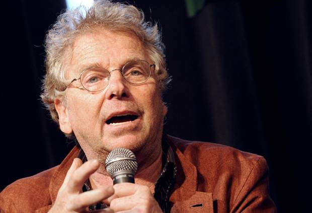
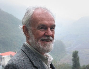
Isaac Julien, King’s Cross, Sydney, March 2014. (Photograph: Annette Hamilton)

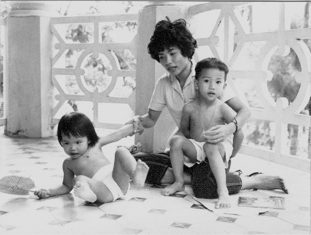
Born in London in 1960, of French Caribbean immigrant background, Julien embodies a bold transnationalism in life and work. Educated at Central St Martin’s School of Art with a BA in Fine Art Film, he went on to postgraduate study in audio-visual art in Brussels. Film, audio and photography in themed installations have become his signature mode, although the traverse to the present has been idiosyncratic at times. His art is well-known in film/video/politics circles, and he was nominated for the Turner Prize in 2001.

He began his work presenting intellectually engaged exercises in pop-cultural analysis which sustained the dynamism and sexy vitality of the era. Drama-documentary Looking for Langston (1989) gained a cult following with its exploration of Langston Hughes and the Harlem Renaissance.

Image

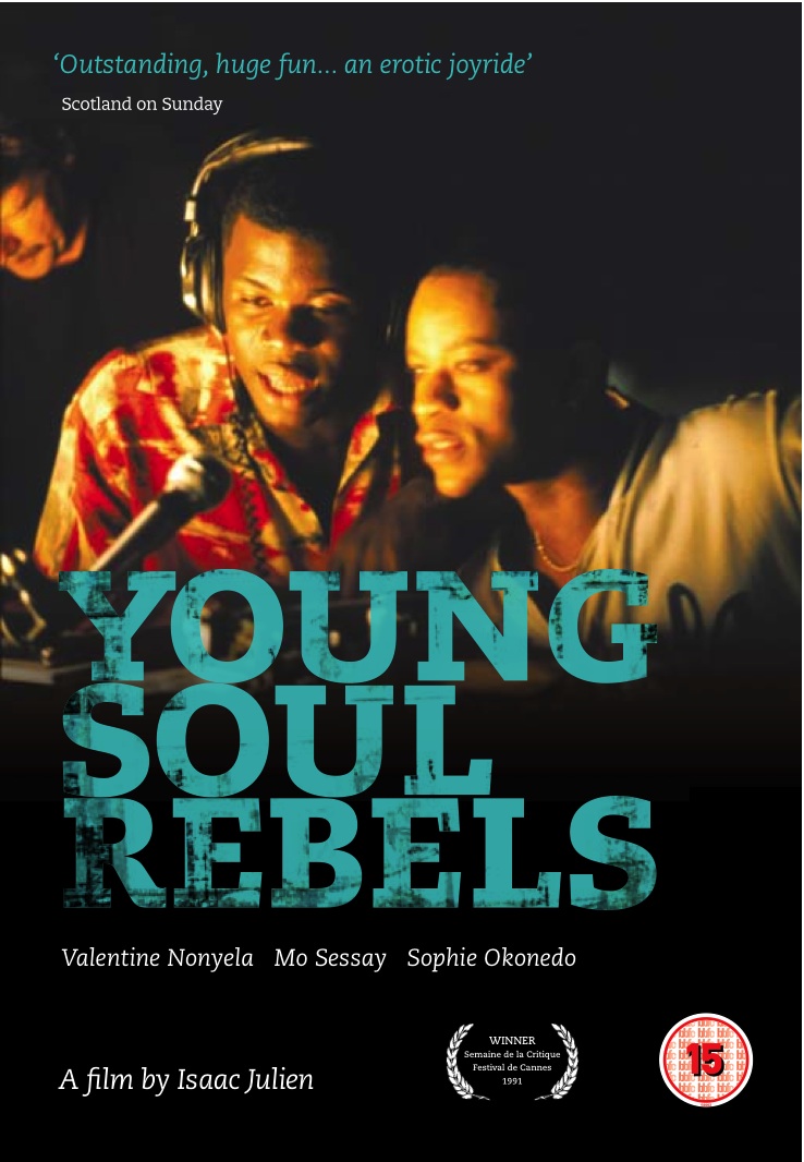
His next major film was Young Soul Rebels, which won the Semaine de la critique prize for best film at the Cannes Film Festival.

Image

Movie Poster

Julien’s work crosses the lines between film, dance, photography, music, theatre, painting and sculpture. He creates powerful visual narratives which draw on elements of these varied disciplines. His earlier art films such as Three (1996-9), Vagabondia (2000) and Paradise Omeros (2002) explore issues in race, class and sexuality, sustaining within his video-art strong allegoric narrative elements. The same elements guided his exploration of mythic images of the cowboy in the context of gay culture and the West, in The Long Road to Mazatlan (1999). Restaging scenes from films by Martin Scorsese, Andy Warhol and David Hockney, he created a three-screen video installation mixing documentary with fiction, starring the Venezualan dancer and choreographer Javier de Frutos (see published conversation with B. Ruby Rich, 2002).

Few viewers of his recent projects would guess that another of his major works was a documentation of US Blaxploitation movies of the 1970s.  BaadAssss Cinema: a Bold Look at ‘70s Blaxploitation Films was released in 2003 by the New Video Group Inc studio, an independent film channel. It included interviews with Quentin Tarantino, Pam Grier and other actors and filmworkers of that era, and artfully intercut clips and segments from some of the famous films of the time. The DVD of the film is still commercially available.

Image

The same year he showed an art-film version of this project in a lush multi-screen projection Baltimore, which added a sci-fi twist to the blaxploitation conventions. Shot on 16 mm film, transferred to DVD and projected onto three big screens, the piece featured Melvin Van Peebles, director of the seminal film Sweet Sweetback’s BaadAssss Song (1971), in a tribute to black urban cinema. Street scenes of a ghetto neighbourhood are presented with a soundtrack including fragments of dialogue from Sweetback, while the real Van Peebles and a Foxy Brown-looking black woman walk through city streets. They arrive at institutions such as the Walters Museum, where they view Renaissance art. They walk through the hallways of various storehouses of artifacts and social styles creating a metaphorical journey through representations of temporal experience in the city. In a central passage of the show, Van Peebles confronts black heroes from the wax museum including Martin Luther King Jr and Billie Holliday (and himself) positioned in a painting gallery full of historical paintings. The film captures both a nostalgic sense of the vitality of black urban life, a perceptual funk scene, alongside a curious conversation between fantasies in historical space and time (Reid, 2004).

Image

Murray (2004, p. 92) comments that Baltimore is “a continuation of Julien’s cinematic engagement with the contemporary exigencies of art history and the importance of the museum as a battleground for cultural legitimacy”. Technically, Murray also identifies one of the distinguishing features of Julien’s work, a visually intoxicating quality produced by the sense of “floating” as the camera moves through spaces creating layers of impressions, clusters of conceptual relativities. His use of multiple screens creates the viewer as individual editor of the text, so the chain of meaning is constructed from the flow of images.

Three films in the mid 2000s offered reflections on journeying across continents and cultures. These included True North in 2004 and Fantôme Afrique in 2005. A third, Small Boats, made up a trilogy which was screened in various venues such as Metro Pictures gallery in Chelsea. These films work from “real” backstories, and then elaborate on the themes raised through the split-screen camera technique. True North concerns the African-American explorer Matthew Henson who was the first man to reach the North Pole, although the white Robert Peary has always been credited with the achievement. Filmed in Iceland and Northern Sweden, the imagery grew progressively frozen and the icy wastes enfolded the narrative. Fantôme Afrique was filmed in Burkino Faso, the heart of the film industry in Africa, mostly taking place in the searing golden light of the desert. Small Boats links dance and film, shown in a single stage-wide screen. The three were shown as a trilogy at BAM in 2007, and an excellent interview with Martina Kudlacek illuminates much about his thinking and techniques (Kudlacek with Julien, 2007). To a degree, this phase of Julien’s work can be labelled “post-colonial”, although he distances himself from association with the label, while acknowledging the deep theoretical engagement which characterises his approach.

Image


In 2008 he completed a film which surprised his fans and dismayed many critics. Titled Derek it offered an homage to noted British film-maker Derek Jarman, who had died in 1994. Critics commented on the extent to which this film lacked the stylistic elegance and subtlety evident in his earlier works. The film was seen as a conventional hagiographic documentary. Actor Tilda Swinton was a close friend of Jarman’s and hers is the dominant voice in the film, which seems to be a didactic exploration of the position of the gay filmmaker in contemporary society.

Image

http://www.zimbio.com  Sundance Portrait Session

Roger Cook (2008) offered a very negative commentary on the film’s political position, describing it as suffused with an “atmosphere of defensive ressentiment” (p. 38). Its “imperious political rhetoric” especially offended him, and his published critique in Art Monthly includes a particularly vicious unattributed quote about Julien himself: “It’s a spoilt bloke making spoilt films for spoilt people” (ibid). Nonetheless this piece does raise questions about the inextricability of politics and aesthetics (following Rancière) and suggests comparisons with Pasolini.

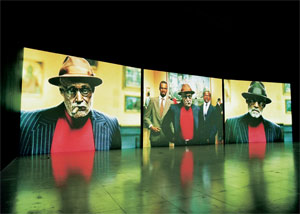
Julien moved from engagement with a single-screen cinema technology to the diverse potentials of multi-channel video installation (see Wu, Gough and Wall, 2012.  His most striking exploration of this form is in his work Ten Thousand Waves (2010), a 55 minute installation designed to be viewed on nine double-sided screens, allowing eighteen different views of the installation. The audience can move around and view from any vantage point. The work moves between China’s ancient past and present, exploring the movement of people across countries and continents, engaged in permanently unfinished journeys. Its primary inspiration came from the Morecambe Bay tragedy of 2004 in Britain, when 20 Chinese cockle-pickers drowned on a flooded sandbank in northwest England. Maggie Cheung, famed Chinese actor, portrays the Chinese goddess Mazu from Fujian Province, the home province of the cockle-pickers. The film recounts the story of 16th century fishermen imperilled at sea. In a reenactment of classic 1930s film The Goddess, actress Zhao Xiaoshi plays the sea goddess who leads them to safety. The film is staged on the streets of modern and old Shanghai and uses music and sounds that fuse Eastern and Western traditions, with contributions from London-based musician Jah Wobble and the Chinese Dub Orchestra. The film took four years to research and create, and has been widely screened and praised around the world (MOMA publicity for installation, November 2013 – February 2-14).

Image

Image

Maggie Cheung in Ten Thousand Waves: publicity still

PLAYTIME

The project bears the same title as Jacques Tati’s 1967 film which offered a lightly constructed expression of dismay at the wreckage caused by modern capitalism (below, left: still from Tati’s Playtime)

Image

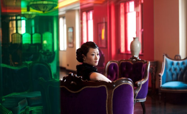
PLAYTIME is a much more serious look at the same theme and is by far the most direct and articulate exploration of contemporary politics Julien has attempted. Although comments on the film frequently refer to it as exploring current debates on the relationship between capital and the art world, this theme is only one element in the piece. PLAYTIME and KAPITAL are shown simultaneously on endlessly looping screens in different but adjacent spaces. It is possible to move between them at any time, an illuminating viewing strategy. PLAYTIME consists of three elements, or chapters, set in three different cities defined by their relation to Capital: London, in the wake of financial deregulation; Reyjkjavik, where the 2008 crisis began, and Dubai, home of one of the world’s major financial markets. The main characters are played by actors enacting roles of The Collector, The Auctioneer, the Housekeeper and the Reporter, played by actors whose scripts are based on interviews between Julien and people affected by the financial crisis of 2007/8.

 KAPITAL, viewed in a dark room with just two chairs side by side and two sets of headphones, offers a documentary-style film of a real panel interview intercut with a variety of scenes reflecting the comments in the panel discussion. David Harvey, author of The Enigma of Capital and the Crises of Capitalism (2010), sits on the stage with Julien at the Hayward Gallery in London, along with an audience of critics theorists and curators.

Image

David Harvey, from  http://www.wideopenschool.com/class/Choreographing%20Capital

What occurs is a reprise of a 1960s Marxist discussion, somehow dislocated by the inability of the classic theoretical apparatus to accommodate the bizarre nature of contemporary global capitalism. This is the terrain Julien wants to take us through, but it is an uncertain journey.  Entering debates so ethically charged and politically problematic is a dangerous manoeuvre.  In his earlier works, which could be interpreted as aesthetic ventures into post-colonial worlds, viewers would not be disturbed from their ideological comfort zones. PLAYTIME and KAPITAL demand a different awareness and cannot be shoeboxed in the same way. Julien is talking about late global capitalism and the operations of the art market as an element in the transnational economy, run by dodgy financiers, fast-talking auctioneers and vaguely stupid collectors, where art fetches stratospheric prices and finishes up being dusted on the walls of luxury high-rise apartments in Dubai where nobody lives. Of course not everybody is going to like it.

Richard Woodward, in New York’s Collector Daily (December 4 2013) doesn’t, and doesn’t pull his punches.

 It takes chutzpah for an artist to satirize the art market while fully benefiting from its largesse.  Isaac Julien’s show is full of this double-talk.  He is apparently upset at the gulf between rich and poor but views clueless collectors with disdain unless, of course, they happen to be shopping for one of his pieces … the artist manages to exhibit many of the hypocritical values his work wants us to abhor. 

The work in PLAYTIME is complex and interweaves thematic elements in unexpected ways. It begins with a vast empty office-space in London. Two men walk about in random patterns, speaking the kind of financial-speak we have come to expect in contemporary discourse. In fact, some of their speech comes directly from David Harvey in the KAPITAL section of the installation. The city is spread out below them: the idea of Distinction depends on the maintenance of Greed. The Boss (played by British actor Colin Salmon) speaks of his need to employ only the top PhD graduates from Universities such as Harvard and Yale. With them he can keep the wheels turning. He explains hedge funds in bizarre terms, using an analogy with men’s underpants. In several strangely beautiful scenes we see a vast airconditioned warehouse full of computers, which is all you can actually see of capitalism: the lights blinking on and off as markers of the market. At the end of the segment the Boss walks about playing the trumpet, perhaps sobbing.

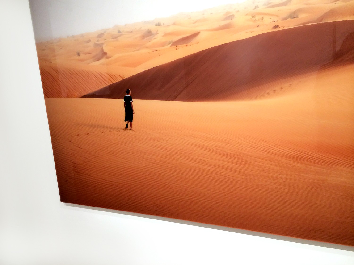
In the Iceland segment, the landscape occupies the entire screen, with plumes of smoke rising and hovering over the water. The central figure is a man who lost his self-designed ultra-modern home in the financial crash. He seems entirely overwhelmed by an irresolvable tragedy, expressed physically through his tortured physicality and desperate expression. How is the vImageiewer to respond? At first the viewer seems invited to identify with his pain. But soon one begins to ask, is it really such a terrible tragedy that a once-wealthy man lost his dream home? Isn’t his anguish and distress absurdly OTT? Why should people devote such passion to the building of “Their House”? What made it possible for him in the first place to acquire the capital which would allow him to engage in such a project? The vast empty premises of the Landsbankinn – one of the first banks to collapse – seems somehow appropriate to the icy wastes beyond.


The next London segment verges on satire. Actor James Franco plays a stereotypical art advisor extolling the value of contemporary art as a perfect investment for the diversification of a portfolio. As he walks up the stairs in a blank white-painted building he calls out numbers: 95, 100, 110, and for a moment you wonder what these figures refer to – but of course, they are millions, which is what the wealthy elites are now payImageing for art. At auctions the investors have advisers and agents on the phone, pushing prices up to astronomical levels supported by the insanity of the global economy. They can bid for and buy art from anywhere in the world, and they do: they come from Russia, from China, from Brazil. We meet the Auctioneer, in this case playing himself, Simon de Pury. He becomes anxious and excited before each major auction, eating an apple for luck.   One “painting” which consisted of a written text on a wall sold for 1.2 million, a super-modest price compared with the 42 million paid for a Roy Lichtenstein in 2011. Art and antiques became part of the equipage of the wealthy class in the post-crisis mistrust of esoteric financial instruments. The Global Financial Crisis helped the art market beyond anybody’s expectations. During the GFC only 50% of items offered for sale were sold: now it is nearer 90%, springing back after the huge Christie’s auction in Paris in March 2009. Chinese star Maggie Cheung, who appears in Julien’s Ten Thousand Waves, plays the role of an eager interviewer. In reality, the two never were together and each segment was filmed separately and intercut artfully.

Meanwhile, in Dubai, the financial capital of the Middle East, a beautiful but sad housekeeper in a black and white uniform walks sadly back and forward through an empty luxury apartment.

Image

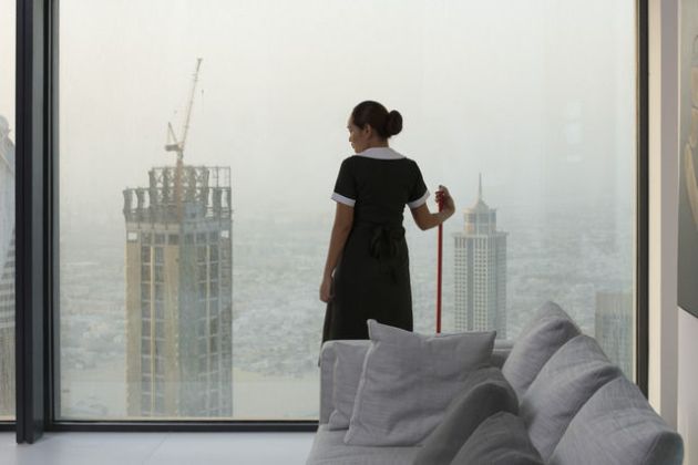
Mercedes Cabral as The Housekeeper: publicity still


Played with a sensitive but unemotional demeanour by Mercedes Cabral, Filipina actor best known for playing in art house and independent films, this sector seems oddly out of adjustment with those preceding it. At times we seem to be overhearing an ethnographic interview, as she explains that she had to pay an agency 150,000 pesos to get the job in the first place. She needs the money to support her family at home. The inhabitants of the vast elegant apartment with its art pieces never appear. She dusts, and gazes. Long periods of silence accompany empty visuals of the vast city outlook with its lights and vehicles stranded in the midst of an empty sand desert, where she stands staring into the distance in the closing scene.

Image


How can we understand contemporary capitalism: is it the same as it was, or are we seeing something  altogether different? Analysis of something so invisible and intangible seems an absurd venture. Images of riots, computers and banks of neon numbers as well as talking heads and actors who may or may not be playing themselves make it hard for most viewers, who may not be able to take in the theoretical issues being debated here, many of which go back to bitter political fights of the 1960s. But is a video installation the right place to be asking these questions?  Or are there other questions lurking behind which we haven’t yet asked?

Some commentators appear bemused. Others, such as Searle (2014) pick up on the uncertainty produced by Julien’s method while appreciating its strengths.

There is brilliance and disappointment in Playtime. A hybrid of fiction and documentary, the film makes it difficult to know what is real. I wander between the screens, lost in Julien’s cinematic subterfuge, and that, I think, is the point. 

Hybrids of documentary and fiction are common in literature, much less so in cinema, although re-enactment has become a common strategy in commercial television of recent times. Still, the breaking down of barriers between reality and imagination seems particularly challenging. For an art film-maker to be giving us a lesson in Marxist theory seems strange today although it was hardly unknown in the 1960s especially in the Latin American revolutionary context. For that lesson to be couched in the method of a hyper-developed media technology and elevated aesthetics is harder still to accommodate. It is hardly surprising If it proves almost impossible to say something which will be widely understood on a topic which is, for most people, entirely ungraspable.  What is fascinating is the extent to which Julien is willing to push the boundaries even while maintaining a certain tongue-in-cheek distancing from them. Unlike Searle (ibid) I didn’t find any longeurs in this work but I would have liked to see a bit more speed and directness in the Dubai section which seemed to link only vaguely to the direction of the other elements.

In terms of strategy of presentation, the use of two separate linked spaces, both lit only by reflected light from the screens, separated the viewer’s intellectual and aesthetic engagement. At Roslyn Oxley9 the main viewing area featured a long wide bench, on the edge of which viewers had to perch. Or, in some cases, lie down. When there were more viewers, they had to crouch on the floor.

Image


This was an odd viewing experience, emphasising a kind of static loneliness in the encounter with the work, unlike previous projects which required active mobility from the viewer in constructing imaginative connections.   Its ability to connect with the intended audience is necessarily compromised by the peculiar position it opens for them. There is a quality of introspection which takes precedence over the usual sense of delerious enjoyment found in his work. It is hard to avoid the conclusion that the great majority of consumers in the art market really do not want to discuss the urgent issues surrounding global capitalism, and Julien’s desire for them to reconsider does not make for a comfortable engagement.  Notwithstanding such critiques, the film is undeniably provocative and very beautiful.


REFERENCES

Art iT 2013 Isaac Julien Part 1.

<http://www.art-it.asia/u/admin_ed_feature_e/n6fMcR3eJU52sQuiTPqF >[Accessed 3 April 2014).

Cook, Roger. 2008. Isaac Julien’s Derek. Art Monthly, April, p. 315.

Harvey, David. 2010. The Enigma of Capital and the Crises of Capitalism. London: Profile Books.

Harvey, David. N.d. Reading Marx’s Capital with David Harvey. <http://davidharvey.org/reading-capital/> [Accessed 6 April 2014)

Julien, Isaac. 2008. The way I see it: artists tackle ten existential questions. New Statesman, June 16,Vol 137 p. 40.

Kudlacek Martina and Isaac Julien. 2007. Isaac Julien. BOMB No 101 (Fall pp. 72-79. [Accessed 26/03/2014]

Murray, Soraya. 2004. Isaac Julien: Baltimore. Journal of Contemporary African Art, Summer, 92-93.

MOMA. 2013.   Isaac Julien: Ten Thousand Waves. The Donald B. and Catherine C. Marron Atrium. MOMA, New York: Publicity Materials.

Reid, Calvin. 2004. Funk Renaissance. Art in America. March, p. 92-95.

Searle, Adrian. 2014. Playtime. London. The Guardian.

http://www.theguardian.com/artanddesign/2014/jan/29/playtime-james-franco-power-money-isaac-julien-capital

[Accessed 4th April 2014]

Woodward, Richard. 2013. Isaac Julien PLAYTIME @ Metro Pictures. <http://collectordaily.com/isaac-julien-playtime-metro-pictures> [Accessed 4th April 2014)]

Wu, Ge, Phillip Gough and Caitlin de Berigny Wall. Multiple-channel video installation as a precursor to transmedia-based art. 2012. Technoetic Arts: a Journal of Speculative Research, Vol 10, 2/3, pp. 329-339.


On post-colonialism in Julien’s art:  (Interview with ART iT)

ART iT: When you were starting out as an artist was post-colonial theory an inspiration for you, and did you actively use it in constructing your works?

IJ: Absolutely. I couldn’t have made my early films like Territories (1984) and Looking for Langston (1989) without it. Along with my peers I read Stuart Hall, Gayatri Spivak, Paul Gilroy, Richard Dyer and, of course, Homi Bhabha’s famous essay “The Other Question” (1983). Then in 1988 I was on the editorial board of Screen journal with the cultural art critic Kobena Mercer. But I wasn’t exclusively interested in post-colonial theory. I was also interested in film theory and psychoanalysis and a translation of those ideas across media. In 1995 it was really exciting to attend the “Frantz Fanon and Visual Representation” conference at the Institute of Contemporary Arts in London, which coincided with the making of my film Frantz Fanon: Black Skin White Mask (1996) in collaboration with Mark Nash, who was also an editor of Screen and a curator for documenta11. Steve McQueen made his first exhibition there and artists like Glenn Ligon and Lorna Simpson were also present in an exhibition that coincided with the conference, “Mirage: Enigmas of Race, Desire and Difference.” Retrospectively, you could see it as part of the formation of a conceptual Black arts movement – some might call it “post-Black” – in which there were these different nuances that developed in different practices.

But of course as an artist you evolve in different directions and engage with other discourses. In 1999 I made the film installation Long Road to Mazatlán, which was ostensibly about two cowboys in the American West and was nominated for the Turner Prize. It was a deliberately Warholian-type work and through it I think I was already challenging what I saw as the post-colonial paradigm. I purposely cast two white protagonists, one of whom was the choreographer and dancer Javier de Frutos, who collaborated with me on the project. Of course, they were queer, and there was this Warholian play with desire and the quotational Pop-art element, but I think I was already conscientiously trying to upend post-colonial expectations. Some of my friends saw the piece and told me, “Oh, that’s a bit odd for you to make, Isaac.” And I thought, “Well, that’s exactly my point!”
That said, I take it for granted that post-coloniality might be one of the themes in my work. It simply won’t be my sole theme of interest. Unfortunately, that’s not everybody’s point of view.