Reading a lot about the animal mind at the moment – an excellent book by Virginia Morell, Animal Wise, published by Black Inc in 2013 talks about recent scientific research which is, very slowly, beginning to realise that animals do in fact have “minds” – and I came across some remarks about bower-birds which add the imprimatur of science to the claim that they are making art.
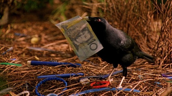
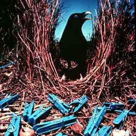
Scientists studying the greater bowerbirds mapped and tabulated the thousands of stones, glass and other beautiful items of decoration the male birds use to ornament their bowers (as described in an earlier post) The Art of the Bower-Bird. One scientist wrote a code letter on each little stone and piece of glass, hundreds and thousands of them even just at one bower. What did she find? The birds weren’t only collecting items of beauty to display to their lady loves, they were actually creating the illusion of perspective in the way they laid them out – the same techniques artists use for landscape painting. The birds put the largest of their pieces furthest away from the opening to the nest and the smallest ones close to it. The female bowerbird inside the nest looking outwards will then perceive them as all being of around the same side. Was this an accident? No of course not. When the researchers disrupted the birds’ careful curation, they found they restored them back to the original order once the researchers went away. Each item had its proper place. “Bowerbirds, the scientists concluded, are artists – the first animal, other than humans, that is fully recognised as having a artistic sense”.
Well I don’t know if that is the conclusion we need to come to. I think the painting primates demonstrate their artistic sense once they have learnt to paint properly, much as humans do. But the point is, that artistic sense, the aesthetic engagement, belongs in the interaction between mind and world, and there is no way we should ever have concluded that humans are alone in this.
Another complex entry to an elaborate bowerValuable real estate needs expensive decor even in the bush!
The palaver about the destiny of the three tertiary art schools in Sydney would be laughable if it wasn’t so serious. Sydney as a centre of Australian art in all its forms is slipping into oblivion. Far be it from me to make pronouncements, but I have occupied senior administrative posts in two Sydney Universities and, at the other end of the spectrum, have recently been a TAFE student in Visual Arts with major in painting. I know how the logic of the market operates in Universities and how this inevitably shapes the options in fields which do not immediately translate into lots of student numbers or ready external funding. It costs a lot to run outstanding art education and the cost per head of student is inevitably going to be far higher than the cost for running a business or standard arts program. And you can’t charge sky high fees (as in Vet Science, Medicine or Dentistry) because a degree in Fine Arts is not going to result in an assured income, or any income at all in some cases. [Although arts incomes in the US have been strongly rising recently].Rising incomes in the US for art graduates
Art education lies at the heart of a community’s ability to support a flourishing creative sector and cultural life. Art courses in secondary schools are mostly taught by teachers who are graduates of University art programs. Professional artists increasingly come from dedicated art schools. In Sydney, the three main tertiary Art programs offer three year undergraduate degrees while serious students go on to the Masters of Fine Art or beyond.
What University management expects is something very different from what artists need. The key institution in Sydney has been what is now the National Art School although in my mother’s day when she was a student under Roy de Maistre and other luminaries it was still East Sydney Tech. Most of Australia’s very best artists – painters, sculptors, printmakers and others – are graduates of the NAS. The great names of an earlier generation came out of the NAS and its more recent alumni are no less distinguished: Guy de Maestri, Luke Sciberras, Fiona Hall to name a few.
National Art School – old Darlinghurst Jail site, Sydney
A few years ago the NSW Government backed an enormous push to move the NAS into what was COFA, then a college of UNSW. This was successfully resisted, fortunately, but the pressure will not go away until somebody “up there” realises that a National Art School should be just that. I fully support the recommendation that the NAS be separately funded by the Federal Government on the same model as the National Institute of Dramatic Art. The NAS should not be a teaching program of a University but should retain its strengths in the training of practicing artists and all the other roles which necessarily go with a flourishing art culture in any great international city.
At the University of NSW the College of Fine Arts had a semi-independent identity but following a huge rebuilding program funded mostly by philanthropy it was fully integrated into the University in 2014 and its new title “UNSW Art and Design”reflects the distinctive character which has developed there, with its focus on new media, design, digital production, cinema and a fair dose of po-mo theory. Don’t mistake me, the old COFA/new Faculty does great work and offers outstanding programs and courses, but the fundamental commitment is not to the production of studio based fine arts such as painting and drawing.
UNSW Art and Design: artist’s impression from Oxford Street Paddington
Sydney College of the Arts was originally established as a College of Advanced Education (CAE) in 1970 and was amalgamated into the University of Sydney in 1990, being given the wonderful old sandstone harbourside site of Callan Park as its home. SCA has many distinguished alumni including Ben Quilty, Bronwyn Bancroft and Locus Jones. Callan Park has been a massive dilemma for the NSW State Government which owns the site and is just itching to do something spectacular with it – new development unspecified. Local opposition to the various plans for the site with the strong support of Leichhardt Council has been able to stave this off for some years, but now that the Councils have amalgamated and with the insane development mania now gripping the NSW Goverment the likelihood of the site remaining as it is goes to zero once the art school is moved off it.
Callan Park Master Plan: glorious harbourside and classic sandstoneSave Callan Park success – but for how long?
Three art schools, each with distinctive profiles, cost a lot to run. It is easy to see why the planners and economists thought it would be a really good idea to amalgamate them all with what used to be COFA and have the whole lot somehow managed by UNSW. But less than a month later after the announcement of this totally unfeasible plan it’s been dropped and the SCA is going to remain with the University of Sydney but will be rolled into the Faculty of Arts.
This actually makes a lot of sense although where on earth the studio facilities and art-workshops will be located on that crowded campus is anyone’s guess. But it’s not impossible to imagine something good transpiring. Carriageworks is located on an old railway site not far away and its stunning spaces host many great art exhibits. If student studio space could be developed nearby it would consolidate the cultural value of the site.
Carriageworks – at the old Eveleigh Workshops site. Amazing space!
While the Faculty of Arts at Sydney no doubt has its own financial difficulties and will not welcome trying to stretch budgets to accommodate a new Arts program, it makes sense in other ways and could open up a much wider vision for the Faculty of Arts itself which is to tell the truth pretty unadventurous. The School of Art, or whatever its name will be, could engage more deeply with other humanities areas and open up a lot of new synergies. This is where the high school art teachers, for instance, would most appropriately be trained. And other students in the Faculty could build their programs to include a new range of subjects. Good outcomes all round there, although there would still need quarantined funding for the studio programs and the various technical facilities which will go with them.
So there is a way forward and it could be a positive thing for Sydney. If only something could be done to redirect the enthusiasm of the new Director of the Art Gallery of NSW towards actually supporting art instead of wanting to be an architectural designer, and if the three art schools could be confirmed in their separate identities with different funding models, Sydney could be restored as a centre for Australian art. As it is now, all the best students want to go to Melbourne.
The Artist’s Studio. 1870. Jean-Frederic Bazille. Musee d’Orsay, Paris
The distance between the art student, the practicing artist, the gallerist and the collector/investor often seems so vast that it’s hard to believe they are all part of the same ecosystem. But of course they are, the product of a complex interlocking network of ideas, preferences, cultural values, economies and desires. Once was a time when artists stacked up their finished canvases in a corner of their studio. If they were lucky enough to be shown in a gallery, then the gallery got a cut, but often enough collectors or art-lovers visited the studio, had a glass or two of absinthe, paid some cash to the artist and walked out with the painting. Perhaps, as in Bazille’s amazing painting (above) a gentleman played piano while the negotiations were in progress.
OK, it’s an oversimplification. But the idea of a “quality” artist selling from their studio is now almost unthinkable. The link between artist and seller is so distant that many artists have no idea who currently “owns” their work. If they do meet up, over a glass of Cristal at a glamorous dinner party perhaps, it’s because the artist too has become a celebrity. Many successful artists never see their works again because they are consigned to storage as part of an investment strategy. Did you know that if you buy art as part of your superannuation you are not allowed to look at it? It must be locked away somewhere, otherwise you are getting a benefit from it before you are allowed to. You have to be sixty and retire first. Crazy! Strict rules govern investment in SMSH’s
A good artist has to have a gallery. Galleries compete for artists, but only if they sell, and especially if they have a rising reputation. Once with a gallery, the artist is no longer free to sell from their studio. They can give paintings away as gifts, of course, but even that is frowned upon. For decades this was the accepted system: an artist, a gallery, a buyer. In the secondary market, where art is on-sold from its first purchaser, auctions were the norm, but there were also private sales.
This was a fairly stable process until round about the 1990s. Then, in a strange contortion of late global capitalism, the rise of the super-elites, including traditional oligarchs, real-estate tycoons, movie stars and glamorous celebrities with infinite wealth saw the system change.
Neo Rauch’s 1998 painting Etappe. Bought by Brad Pitt at Art Basel for one million US in 2009. David Zwirner and Galerie Eigen Art, Berlin/Leipzig.
There were new players awash with funds from the “developing” economies: China, Brazil, India. And with the end of so-called communism funds were flooding around the globe and into the hands of gangsters and various versions of Mafia with their new-style goon squads: armies of suited accountants and investment managers. Gazillions of dollars went into superannuation funds which had to give a decent yield.
Three stock market indices: US$
Periodic panics emerged, as they always do in a capitalist system. Stock markets rose and fell, raw materials markets collapsed, industrial work moved off-shore to low cost countries and then their bloated and unbalanced economies went off the rails. Democratic systems stalled. Military rule came back. Nothing was stable.
Where then could the super-rich, or their financial managers, deposit their gotten (ill or otherwise) gains?
Pablo Picasso’s ” Dora Maar au chat” is auctioned by Tobias Meyer at Sotheby’s New York during the Impressionist and Modern Art Sale 03 May 2006. The painting sold for USD 85 million. AFP PHOTO/Timothy A. CLARY (Photo credit should read TIMOTHY A. CLARY/AFP/Getty Images)
Aha! The art market! What a great idea. Original works of art are just that: original. Walter Benjamin put his finger right on the pulse when he wrote about the aura of the art work in the age of mechanical reproduction. [It is worth reading and re-reading this work – so prescient, yet he had no idea in the 1930s how it would unfold].
The magic is that you cannot duplicate an original work of art. You can make prints of it, of course. Or someone can try forging it. But in the end there can one authentic example of each work, and only a limited number from each artist especially when the artist is dead.
Artists become superstars. A dizzying variety of choices emerge, some of them hard to “collect”, as in the best-known works of Tracey Emin. Tracey recently married a rock in a formal ceremony and they are reported to be very happy.
Tracey Emin dinner hosted by Phillips and Vanity Fair at Cecconi’s at Soho Beach House on December 3, 2013 in Miami Beach, Florida, to celebrate her wedding.
A dense supporting cast in the art world decide which works are important, which styles are great, which fashions are in. The art market itself slides in its preferences from time to time. How to invest in the right pieces? Let the market decide, it is capitalism after all.
The Mei Moses index – reproduced under the terms of fair dealing for purposes of study and research.
And so the glamour auction houses emerged in the main cities of global capitalism: London, New York, Hong Kong. Lesser markets emerged in outliers: Melbourne, Sydney, Vancouver, wherever there were funds to be invested and profits to be made. Some great books have been written about the world of the auction house. I mentioned some time ago the wonderful film of Isaac Julien, with its glimpses of the art market and interview with one of the main players in the British art market. Isaac Julien: PLAYTIME.
Isaac Julien: portrait with still from Playtime 2013
I will add shortly the titles of some books and articles I have really enjoyed, including some fiction.
So here we are today. The profound impulse to make and enjoy art has been ripped away from its base in local cultures and economies. The new Global Art Market is a dizzying beast. In the next few posts I will be looking at some recent trends and think about what it all means for the ordinary artist in backwaters like Australia.
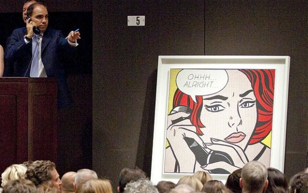
Roy Lichtenstein. “Oh, All Right”. Sold at auction for $42.6 million in 2010.
This post was originally meant to go onto my work-in-progress art site (see link below). It turns out to have been a mistake to use my name for both of these URLs of these sites, because WordPress when it gets tired and emotional doesn’t know which one to put the post in. Still, I thought it might be worthwhile to say a few words about my experience of site development in WordPress as an artist and writer.
The first blog site I ever set up was about life in Sydney, with a focus on food and the inner west. That site is still live and you can go there easily by putting Elinor Entity into Google. It was set up on Blogger which was then one of the only options. Blogger has developed a lot since then and offers great simplicity and functionality but it doesn’t have the Website quality which you get with a WordPress blog.
So I decided to set up a WordPress site when I started studying art at TAFE. I thought I could use it to put my written work up on. But my teacher never looked at the site and wanted me to hand in written papers which I did, but I put various expanded versions and research comments on things that had interested me on the site anyway. I am talking about this site which you are on now, annettehamilton.wordpress.com. It was a very steep learning curve and I went through hours and days of struggle to learn how to use it, but once it was set up it was a breeze.
I now have three sites live and two others I am using as practice although both will go live eventually. One is this site, obviously, which has been a delight to develop and use. I used the same template for my Writing Zone site, which I set up to manage my fiction and memoir publications. These WordPress templates are free and don’t require third party hosting or any knowledge of coding although you can of course make some modifications through the templates. Not all the free templates offer the same range of options so check them out carefully. There are hundreds of them, both sites developed by WordPress and by third parties – most of the latter are not free though.
But using free WordPress templates with a WordPress URL is kind of low rent. The real deal is to obtain your own domain name, either through the WordPress set-up process or separately through a domain name provider, and set yourself up with a paid theme and a hosting service. The domain name, the specialist theme, and the hosting service all cost money.
You can do something inbetween by setting up your own domain name through WordPress, and using WordPress themes and WordPress as your host. Or you can buy a dedicated theme. I wanted a Portfolio site so I thought I would be very clever and do that. I thought I could put all my images up on the site, on grids, and the viewer would be able to click on each one and bring up information about the picture, such as size, medium etc. as well as any other background.
Well that just didn’t happen. I have spent hours and hours trying to make the paid theme I purchased, Qua, work properly. Only now have I realised that the kind of clickable functionality I wanted isn’t available with that theme. It just doesn’t work like that but I couldn’t see this out from the demo. Now I’m stuck with a fairly expensive paid theme which won’t do what I want. Quite often you will be told that you can make things happen by going into CSS or doing some kind of html coding. Well sorry but that’s not in the repertoire of this artist/writer and I’m not going to start paying a specialist to do it.
So I’m stuck with a kind of portfolio site, which sort of/half works but isn’t what I had in mind at all. One of these days, when I don’t want to spend more time painting and writing, I might go back to the drawing board and see if I can set up a better one.
Another idea is to sign up for an Art Archiving service. Again, it involves expense, in this case an annual fee. But you can put all your paintings on it, and track where they are, whether any have been sold, prices and such. Plus I think there is a facility for commenting on the paintings. More on this soon.
Gerhard Richter: Portrait by Lothar Wolleh. Wikimedia Commons.
More thoughts on the Germans. Gerhard Richter is by far the leader in the top ten most expensive living German artists. But even leaving Richter aside, German art, particularly painting, is experiencing a dramatic upsurge in popularity among international collectors. Alexander Forbes writing for Artnet News in April 2014 reported that the power of German art in the market has actually increased since the 2008 recession. There is no sign of it slowing down. Richter himself believes the market for art generally, and for his own art in particular, has gone crazy. Richter criticizes the art market.
Forbes suggests that German art’s penchant for “stringent conceptualism and a highly art historical approach likely proves a safe bet for value retention regardless of economic conditions.
I want to hold that idea. It suggests that art which reflects both conceptual thought – a philosophical element – as well as an embedded engagement with history is likely to hold its value best. On this analysis the German art market is likely to continue to ever higher peaks.
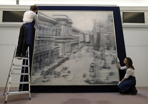
Richter’s mysterious Domplatz, Mailand (Cathedral Square, Milan) painted in 1968 during the height of his blurred monochrome period sold recently for $37,125,000 at Sotheby’s 2013 contemporary art sale. His paintings hold the first 53 places on the top achieving auction sales of German art, 33 achieving over $10 million.
Auction house employees pose for the photographers in front of a 1968 oil on canvas painting by artist Gerhard Richter, entitled: ‘Domplatz, Mailand’ (Cathedral Square, Milan), in central London, Friday, April 12, 2013. (AP Photo/Lefteris Pitarakis)
The range of Richter’s work is astonishing. Probably best known for his “blurred monochromes” of the 1960s, his abstract works have also taken on a special aura of mystery, seeming to move away from figuration and narrative completely. You really need to read Richter’s own writings (which are extensive) to get an idea of what he is thinking in this strand of his work, which seemingly just gets better and better. Cage 5, 2006, (below) is a vastly large oil painting reflecting back on his early vision, yet imbued with endless hints and depths of experience which could be landscape or water-surface or a close-up of a lot of brushstrokes – something he also explored in the 1980s. But he invites us to think of a cage, and that opens up a whole different set of associations.
Gerhardt Richter Cage 5, 2006
The sheer scale of Richter’s work is entrancing, but so is the sense of our shared collective history, that mid-twentieth century Europe with its horrors and excesses which he opens up to us from the 1960s on. Neo Rauch, my second favourite German artist, does the same, although it a totally different way. You can read my academic article on Neo Rauch here.Neo Rauch Post Socialist Vision, Collective Memories
It is overwhelming in so many ways to enter the Richterian world. Fortunately it is also easy, as Richter’s own website is an absolute miracle of clarity, order and revelation. You can find (almost) anything he has ever done there, complete with full references, links to written and audio discussions and interviews, the ability to zoom in onto details, and the complete presentation of his Atlas project, which really is no more than a full record of every image he has collected (or photographed) in his life. Explore the miracle of Richter’s work here.
Unbelievably there is almost nothing of Richter’s art in pubic collections in Australia. The AGNSW at least made some effort and holds three items, a painted monochrome sphere from 1989, a photograph from 1967, and his strange version of a nude descending a staircase, titled Ema, from 1992.
The Art Gallery of South Australia holds one of his luminous abstracts (Abstraktes Bild) from 1977 (Catalogue Raisonne: 424). * (Eric Clapton sold another in the Abstraktes Bild series for 21.3 million British pounds in 2013). One of Richter’s finest 1990’s abstracts CR:752-3, 1990, 225 x 200cm) is held in the National Gallery of Victoria in Melbourne, purchased with corporate funding assistance from Westpac Bank, and the NGA in 2003 purchased Juno, oil on canvas 300 x 250 (NGA 2004.2).Richter’s 1995 Abstract at the NGV
Sold by Eric Clapton: Abstraktes Bild at Sotheby’s for 21.3 million
Gerhard Richter’s work is now so valuable that there will be little or no opportunity to ever acquire it in Australia. Should public collections in Australia be more open to contemporary work from outside Australia? Why German artists, and not those from Romania, Holland, or wherever? Should we just focus on local art and artists and make a kind of nationalist stand? This might be a valid position but when you consider the extent of Australian gallery holdings of recent American and UK artists you just cannot help but conclude that the good old neo-colonial world order underpins every level of public culture, including public art. Sensible use of public assets or parochialism and subservience to a highly limited Anglophone culture sphere?
*Strangely though this rare work hardly features on the Gallery’s site. No image of it is available there. It has been shown only once in public as part of the exhibition “Making Nature: Masters of Early European Landscape Art” (June-September 2009). Why it was included in that collection is a mystery as Richter can hardly be considered “early” and this painting is very far from one of his landscapes. An image of it is available on Richter’s website – just click on the “Abstracts” collection with the CR number 424.
Australia has never had much of a taste for German art. Apart from the epic romances of Austrian born Eugene von Guerard (1811-1901) who towered over all others during his time in Australia from 1852-1992, and produced the most magnificent landscapes unrivalled in scale and grandeur then or maybe ever, German painting has never figured much in Australian galleries or exhibitions. Nor does it feature much on Australian art school curricula although Gerhard Richter turns up here and there.
Eugene von Guerard. Govett’s Leap and Grose Valley, Blue Mountains NSW 1873
It is true that Australian art tastes have generally been conservative and provincial anyway, so perhaps it is understandable that the work of contemporary German artists is of little interest. But in America the impact of German art has been powerful over several decades and shows no decline. The Americans however seem to pick up German artists and movements just as they start fading in Germany itself .
In 2014, New York’s MOMA offered a huge retrospective of the work of Sigmar Polke (“Alibis: Sigmar Polke 1963-2010”). Polke, a contemporary of Richter, is seen as a pioneer of the formal cleverness and ironic perspective which underlies much of today’s painting. The dark irony of much of his work seems to open up a bitter playground where the gesture sits side by side with dexterous painterliness while poking fun at our aesthetic convictions. Polke was both more and less serious than Richter. Put them together and one illuminates the absences in the other.
Bunnies, 1966, acrylic on canvas, 150 cm x 100 cm
Also unlike Richter, Polke played with everything: drawing, painting, sculpture, film, video and sound. Richter was obsessed with the visual image, the photograph in particular, and the peculiar position of painting given the existence of photography. Polke’s work is harder to assess if only because it is so much more various. And influences are far more visible: pop art, American abstraction, psychedielia, a rabid experimentalism which the far more restrained Richter eschews.
Primavera – playing with the framing
All this messing around with materials should make Polke a great favourite among contemporary artists who don’t actually want to paint. Creating abstractions on glass using old lamp soot, flinging about different kinds of paint, and attacks on the picture plane itself all have had a turn. These processes once were shocking although now they do seem fairly routine.
At times Polke seems to hover in Richterian shadows. Frau Herbst und ihre zwei Tochter (Mrs Autumn and Her Two Daughters, 1991) seems redolent of early Richter, with its base in a nineteenth century French engraving on a massive canvas where competing representations alternate across the canvas. Cheap conventional images of German guard posts in the “Watchtower” paintings reference historial trauma, almost mechanically.
Frau Herbst and her Two Daughters, 1991.
No contemporary German artist can challenge the dominance of Richter, but the shame of it is that here in Australia we rarely get the chance to see any of them, let alone Richter, in a full show. My first encounter with a Richter painting in Australia was that wonderfully mysterious painting of Helga Matura with her Fiance. For me, this image is emblematic of everything Richter was trying to achieve in the 1960s. There it was, the sole Richter representative in a rather bedlamatic show, Pop to Popism a the Art Gallery of NSW, in 2014. There was a lot of fun to be had with the usual suspects, Andy Warhol, Roy Lichtenstein and Brett Whitely among them. (What? Brett Whitely as a Pop artist?) It was a good show but the inclusion of Richter as part of a Pop movement seemed very strange and his brooding, magical monochrome painting did not sit comfortably with the other male hysterics around it.
Gerhard Richter. Helga Matura and her Fiance.
Polke responded constantly to changes in technology and their meaning for the reproduction of the image. In the late 1990s he worked on an endless series of photocopied works which occupied whole rooms of display space.
Photocopyarbeiten, late 1990.
These days that generation of German artists is still influential, but maybe fading. The Leipzig school, the great Neo Rauch and his pals, also may be on the edge of exhausting their cred among the avant-garde. But if you don’t spend time in Germany and read the German art press there’s almost no way to find out. The Australian art scene is right to focus on our own, with its distinctive history and brilliant grasp of landscape, light and space. But there is a kind of underground urban sensibility which wells up now and then, and could gain a lot from exposure to German painting. I am thinking of it as opening up a counterpoint to the Australian brightness, a protected area where we can hide from all that light and insistent demand that everything be laid across vast landscapes which dwarf and minimize our presence. Australian Gothic is a recognized feature in Australian cinema. Maybe that sensibility is lurking around in painting as well.
For a really detailed discussion of Sigmar Polke, see:
In an earlier post (“What is Art? February 2015) I made some remarks about animal art. The issues around whether or not animals can make art are far from simple and very hard to research. It is as if the idea of animals being art-makers, or having an artistic sensibility, seems too silly for words to many people. If chimpanzees make drawings it’s because they have been rewarded for doing so by their human carers or otherwise manipulated. It just isn’t “natural”.
Jimmy, 27, a famous artist in Brazil
I find this very hard to accept. When you see talented chimp artists totally fascinated by their painting it’s hard to think they’re doing it for a dog biscuit or banana. And what about the creatures who go to a great deal of trouble to make art without any input from the human world? Jimmy the chimp artist at Rio de Janeiro zoo took up painting to get over his chronic depression. Animal rights activists have used his talent as a basis for obtaining his release from captivity, although so far the case has not succeeded in the courts.Jimmy the artist chimp has fame but not freedom
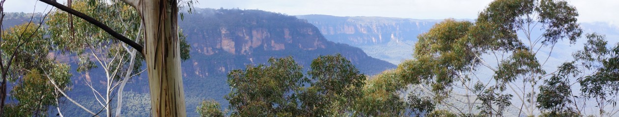
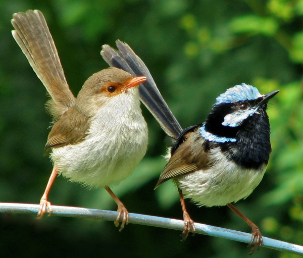
In recent times I have been feeling very close to birds. Spending a lot of time in the Blue Mountains west of Sydney, and on the Hawkesbury River, brings the bird- world very close. The range of species, the musicality of the bushland, the presence of tiny wrens and finches seen so rarely now in city gardens is a great reminder of the richness and expressiveness of the bird-world. And the amazing beauty of the birds themselves.
Female and male Fairy Wrens – once common in Sydney gardens (credit: Scott Contini)
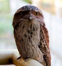
It is true that there are still many birds in Sydney but the range of species is limited compared to the luxuriant birdlife some years ago. All the same at our Sydney place which is just ten or so Ks from the CBD we have kookaburras, currawongs, Australian mynah birds, flocks of shrieking lorikeets and a regular visitor, a tawny frogmouth who sits on the back fence or the front railing uttering soft repetitive cooing sounds.
Tawny Frogmouth
Just recently he and his partner have been raising an owlet in a ratty gumtree at the front of the house. He sits on the railing and stares into the house until we come out to greet him.During the day he rests against the trunk and dozes.
However this post has been prompted by a morning conversation about the Australian bower bird.* The Satin Bower Bird lives up and down the east coast. The adult male is black and glossy, the females and the younger birds are brownish-olive.
Lady Bower-Bird: look at her gorgeous blue eyes
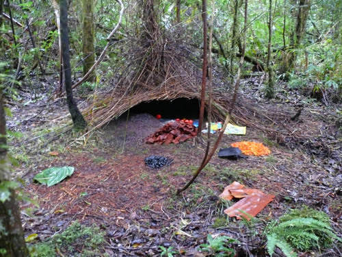
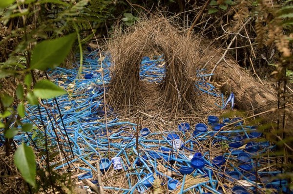
Many bower-birds live in the bush below the Mountain escarpments. The male is a consummate installation artist. He builds an elegant small bower for his lady to rest in and decorates the “floor” in front with a range of found objects in bright colours, an array of reflectivity, and a carefully designed layout. Blue is a favourite colour. I think he likes the blue because it reminds him of her lovely eyes.
Male satin bower-bird with a bright blue feather for his installation
In a documentary I recently watched, the gentleman bird spent hours re-arranging his objets d’art until he felt they were absolutely perfect. Then his lady visitor was ushered into the bower, where she sat quietly while he picked up a range of his favourite objects, showed them to her one by one, put them carefully back and then began an elegant and very moving dance. All this was of course prelude to their love-making which was very rapid indeed. It was the artistic part – the collection, the curation, and the ballet – which was the main point of the exercise, the foreplay if you like, while the mating itself was a kind of boring obligation to be completed as rapidly as possible.
Yes, I know, this is putting things round the wrong way at least from a David Attenborough point of view. But why should we think that the bowerbird is mainly interested in the sex? It looks to me that the art is far more compelling.
An exceptional display, completely surrounding the bower
I have never come across a good discussion of the role of art and aesthetics in animal evolution – rarely enough is it even touched on for humans. But Art’s role in human evolution is a major theme for 2016 Dark MoFo at MONA in Hobart. An earlier exhibition The Red Queen at MONA in 2013 expressed the core ideas which David Walsh, quirky arts patron, has long been interested in. Here’s a short ABC report. More to come on the 2016 program shortly.
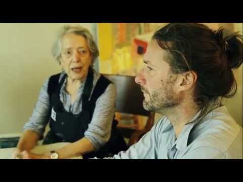
Was so delighted to see the ABC interview with Elisabeth recently. She expresses herself vividly on camera and you get to see a little more of her beautiful bush studio and workspace, and of the bush around which so invigorates her perceptions. The interview was prompted by her participation in the Destination Sydney three-gallery exhibit meant to showcase Sydney and its surrounds. Does this mean she is now officially “discovered”? (Or is this, as she would say, a ridiculous concept?)
The link is here – in an earlier version of this post I used an outdated link, sorry, and thanks to Cultural Conversations for the correction.
And if you go to Youtube, there are some great interview segments with Elisabeth, as well as one with her and Luke Sciberras.
She is showing at Manly Art Gallery and Museum, along with Brett Whitely and Lloyd Rees – stellar! – but the show finishes soon (February 14th) so if you are a Sydney local and a big fan better get there soon.
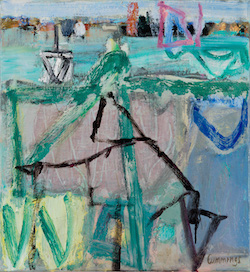
I think this is actually a picture of Darwin Harbour but the feeling could be Sydney.
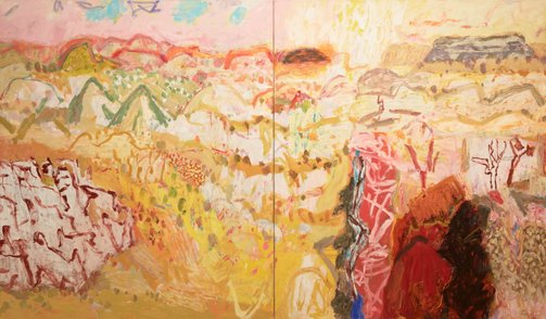
Not long ago I wrote an appreciation of Elisabeth Cummings here (see Elisabeth Cummings: Slow Art, March 24th 2014). The theme of the piece echoed comments by art critic John McDonald, who has repeatedly championed Elisabeth’s work and expressed dismay at its failure to receive the acknowledgment it deserves. He expressed astonishment that her work had not been included in the NGA show of 200 years of Australian landscape painting headed for London in 2013 (SMH, January 21 2012). She had also been excluded from the Wynne Prize more than once, although that was not the case in 2013 when her Sunrise, theKimberley out-glowed everything else on the walls, although it did not win. Imants Tiller’s Namatjira was a puzzling although not unworthy choice.
Elisabeth Cummings. Sunrise, Kimberley. Oil on canvas, 175 x 300 cm.
When I sent my 2014 post to Elisabeth, a personal friend for decades, she protested mildly at my emphasis on the scandalous lack of critical recognition and my reference to her being “overlooked”. She was right to do so. If certain precious art-world critics and habitues had nothing to say about an older woman landscape artist … Excuse me? A what? … many others especially collectors have no doubt about her worth. Her paintings (and prints) sell reliably from her long-time gallery (King on William) at show after show, some at astronomical prices for a living artist.
Over the past couple of years a new appreciation of her work has become widespread. By late 2015 you could hardly move in fine art circles in Sydney without someone mentioning her name. She was being described as “Australia’s greatest living female landscape artist”. At a lively discussion around Luke Sciberras’ Hill End diner table in October the question was raised whether or not the “female” descriptor could be omitted. Hmmm. Luke, her semi-protege, who could reasonably think the title should be his, didn’t know how to respond. This year she and Luke collaborated on a stunning show in Hong Kong, responding to that spectacular Asian city with the same kind of delicacy and intelligence as she had long shown for remote Australia’s dry creek-beds and scrubby sandhills.
From on High 2015. Oil on canvas 91 x 86 cm
Such a tragedy that this exhibition will never be seen in Australia! Most of the pieces have been snapped up by private collectors and will rarely if ever emerge again in their lifetimes.(“Flying Goose Hill” at the Nock Art Foundation, Hong Kong, October 17 – November 14)
Elisabeth and Luke being interviewed for the Hong Kong show, 2015.
Now she is named alongside John Olsen among Australia’s greatest living artists, along with Cressida Campbell, Peter Kingston and Kevin Connor. The summer exhibition (Mosman, Manly and S.H Ervin galleries), offers 140 paintings and drawings celebrating Sydney as a source of artistic inspiration. The SMH arts and books writer Linda Morris hails the group as the living successors of Brett Whitely, Lloyd Rees, Grace Cossington Smith and Margaret Preston.
Both Connor and Kingston have had recent major exhibitions in Sydney while Cummings’ current King on William show ( until 19th December) was an astonishing record of recent work and almost sold out by the opening night.
Stemmed Flow 2015. Oil on canvas 115 x 130 cm
It is so wonderful to see Elisabeth moving to this level of recognition. She has been utterly consistent in her vision and commitment over her entire career as an artist but the development of her work has been powerful beyond expectation over the past ten or so years. She shuns fame and all the hoop-la but we should be so grateful for everything she has offered not to mention what is yet to come.
Gianni Vattimo is an Italian philosopher who has written on modernity and the metaphysics of being. A Festshrift for Vattimo recently appeared under the title of Weakening Philosophy (2007). Although Vattimo’s philosophy seems heavily indebted to the Italian tradition, including its entanglement with Christianity, his ideas can be used to open up some new considerations on art in contemporary context.
The publisher’s blurb says:
Moving away from Jacques Derrida’s deconstructionism and Paul Ricoeur’s hermeneutics, and building on his experiences as a politician, Vattimo asks if it is still possible to speak of moral imperatives, individual rights, and political freedom. Acknowledging the force of Nietzsche’s “God is dead,” Vattimo argues for a philosophy of pensiero debole or “weak thinking” that shows how moral values can exist without being guaranteed by an external authority. His secularising interpretation stresses anti-metaphysical elements and puts philosophy into a relationship with postmodern culture.
Vattimo’s core idea is that although metaphysical power has been weakened under modernity the post-metaphysical world is not completely free and arbitrary. His thought leads away from arguments for absolute randomness, unstructured chaos and indeterminacy. These are important issues for contemporary philosophy, for example in recent thinking on aleatory materialism and radical contingency. No matter how apparently free-flowing thought and moral values might seem, there are lines of resistance which introduce a kind of structure of their own, even though it is not the product of a metaphysical intention (eg the mind of God). These ideas offer interesting perspectives on contemporary art among many other things.
We can take his idea of “resistances” and think about the emergence of global art movements, for example. As the signs carved out and organized in different forms by different cultures have been loosened from their previous determinants (beliefs, practices, cultural conditioning) they have begun to deposit a kind of magma which determines their possibilities of flow. Just as the grain in wood or stone makes the material easier to cut in one direction rather than another, so does thought and human expressiveness develop in ways which create a certain conformity even though this is not intended or in any way “planned”. It is a kind of neutral determinism.
If we follow this line of thinking, we might consider that the condition of being human, with all the animal and cognitive capacities this implies, always/already creates the possibility of flows of thoughts, ideas and interpretations, and the existence of deep structures in language makes this even more likely. This argument is notably contra the spirit of Deleuze and Guattari in Capitalism andSchizophrenia (1972) and, by extension, much contemporary postmodern thought which argues against any form of “determinism”.
Lines of resistance creating the landscape: Yangpo River, Tibet.
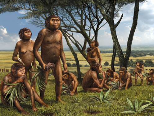
Lines of resistance do not imply that universal laws exist (although at the deepest material level they may do). The productions of human action in whatever form create ebbs and flows which are self-reinforcing, just as a small trickle of water can cut out a creek-bed and finish up as a river. Being should not be thought of as a one-way street, but rather a network of freeways, roads and by-ways which travel in more than one direction. Some result in dead-ends, others become more and more essential, until they dominate the options for existence. But this does not mean that they cannot come to a sudden end. There is no better indication of this than the many recent discoveries of versions of archaic humanity which seem to have appeared, flourished, and then disappeared without trace.
“Hobbits”: reconstruction of hominids found in Indonesia, half human size, long extinct
We can no longer think of the emergence of humanity as a single unified sequence of development with a logic of constant progression and improvement. Rather it seems to have been a winding inconsistent process of genetic networks and climatic outliers only some of which led to the present condition of the species, more or less by accident. But there are species continuities: the recent discovery of a new hominim species in South Africa (named Naledi) seems to have ritualized the disposal of the dead, maybe 2.5 million years ago. But everyone seems to forget that elephants also dispose of their dead, or at least attend the funerals.
Vattimo’s is a radical critique of universalizing metaphysics like that begun by Heidegger, though in a very different time, context and technological capacity.
Nietzsche, considering European nihilism in the summer of 1887 said that under conditions of post-metaphysics those who will emerge and flourish are the most moderate, who have no need of extreme articles of faith, who concede and even embrace contingency and nonsense, who do not need to ascribe overwhelming value to human Being but do not diminish or belittle its significance.
One very interesting connection with art under modernity is the idea that the weakening of metaphysical power in the West was in a way announced by or even presided over by the withdrawal of apparent communication in the realm of art in modern times. Vattimo speaks of Kandinsky in this regard, but a better example might be Rothko. Leo Bersani and Ulysse Dutoit’s discussion of Rothko in their book The Arts of Impoverishment (1993) opens up these horizons (to come in a later post).


